LordDraco3
[10] Knight
I like the first ones better, all of the metal parts on the rest of the design have intricate detailing, so the second one's "plain-ness," if you will, seem to throw that off.
Follow along with the video below to see how to install our site as a web app on your home screen.
Note: This feature may not be available in some browsers.
Thanks a bunch! I try what I can, and I find myself reusing some items inevitably because of the poor quality of others.
OPINION WANTED
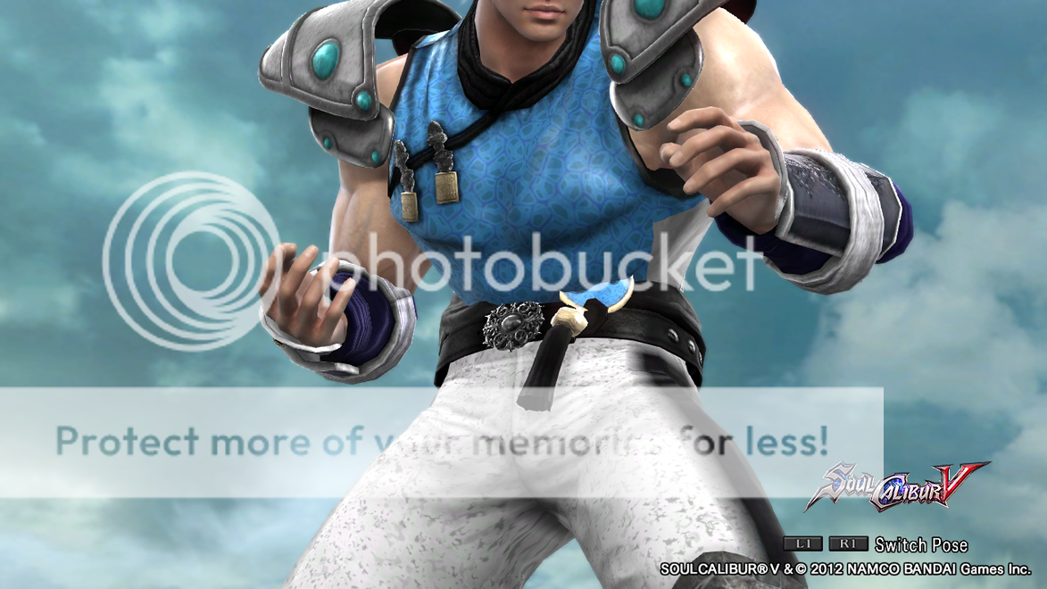
I've made a 2P for Ryo. However, I'm still trying to figure out what shoulder spaulder to give and I hesitate between two.
The first one is the same as his 1P. I like the level of details in it and it has a light armor feel. However, it does make it look bulky sometimes with Pat's armor because of its size. A good thing is that the details on it matches with the rest of the design in some ways, such as the forearm guards. The fur also rhymes with the leather part of the armor (both can't be recolored).
The second one is much simpler in design and at first seems to have a heavier look. However, when put with this armor, it almost look like light spaudlers. Even though it raises higher, that aspect seems to make the overall look flow better along with its simplicity in details, only having more textures on that "circle", which kind of matches with the lynx.
So I want to hear which one I should keep? I'm more inclined to take the second one for the following reasons:
- Simpler look so it's not too busy for the eyes
- Different from 1P
However, I'm still open to your opinions before making a final decision
Thanks all three of you. Point taken!
@Kai: Dirty white huh? I like the sound of that. However, do you have suggestions as to how I should add it? Should it replace the blue-ish diamond-shape thingies or something? I might try using the basic pattern 1 (the gradient) to play with that, but I want to have a clearer response about this first.
@Kai: I'll experiment a bit more and come back with results.
@Draco: Actually anything as white as this, even with the pattern to give a grainy effect, didn't work well for this design. The highest I can go is light grey before it starts looking trippy haha.
EDIT: I forgot to say that I cannot make the scarf green without affecting the armor because it's the same control. I was able to play a bit with that thanks to the gradient pattern, but it's not possible to give that genuine green scarf without changing other things. That's how the casting was done for this part =\
For "dirty white pants" maybe mess around with the speckled/grainy pattern?
Thank you for the feedback again! Let me reply in order now.snip
Thank you very much!snip
And this is why Pocky Yoshi will follow you.Thank you very much!
A healthy dose of competitive spirit can be great, especially when applied thoughtfully for inspiration and motivation!
@Kai: I tried one sticker on Uriel's 2P's skirt just to, again, add a little detail. I want her dress to stay "pure" so I avoid overloading it. As for the "Work in Progress", I think a lot of the outfits are still like that in my mind since I know more good items will be coming (SCV chara. equipment). Few examples I'll consider final are Ryo's new outfit, Masamune and Muramasa's.
Just for fun, I decided to create a young version of Marian A.K.A. directly based on how she looked like in SCIV (such as using Face 1 and having a slimmer build). Since her current incarnation's 1P was based on her SCIV 1P, this one looks very much alike. Since most of my CAS have a 2P, they've taken quite a lot of slots, so I'm not sure I'll make a 2P for Young Marian.