VILARCANE
[14] Master
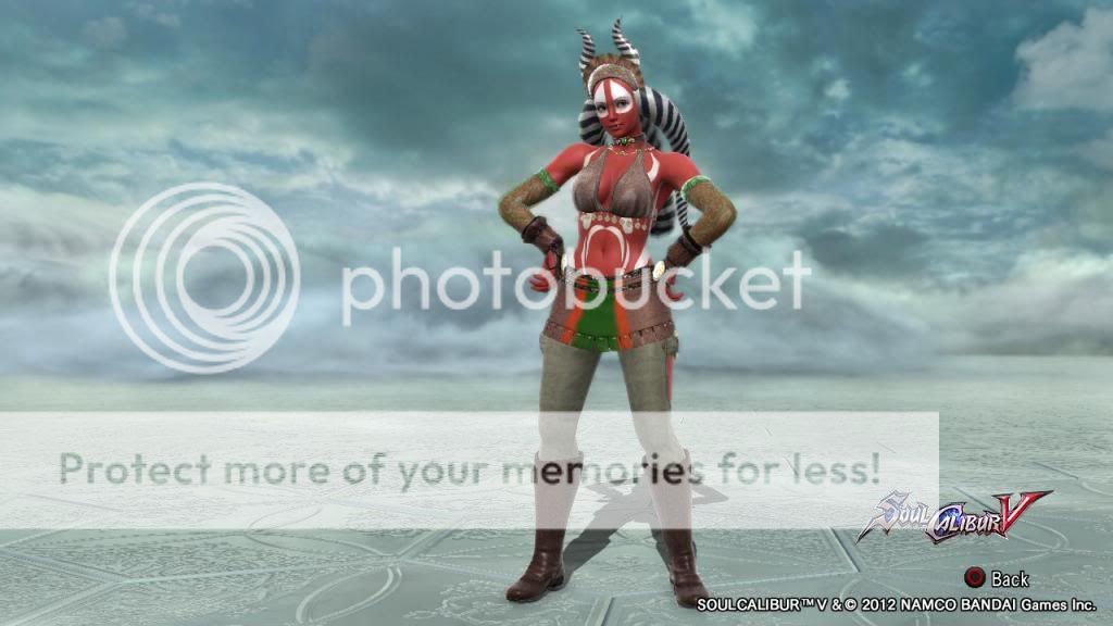
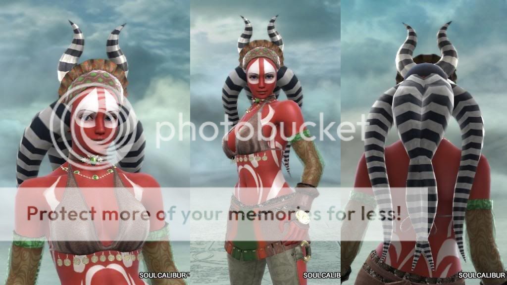
hohoho Pas, this is just assembled pattern + stickers, 2 for the chest portion, one for the arms, duplicated by the editor itself.
nothing fancy here, except it is cleverly done and looks good.
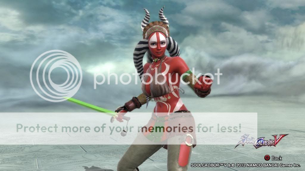
Accusing Wandrian of photoshopping his stuff lol ! Sir, no, sir (*wink*)
nothing fancy here, except it is cleverly done and looks good.
Accusing Wandrian of photoshopping his stuff lol ! Sir, no, sir (*wink*)