Quinion's Customs House

Quinion

[13] Hero
I've checked out this forum for a while, and have been meaning to post a thread of my own for some time. First up, some official 3Ps and others, all based on/inspired by designs from past SCs. Some are straight up recreations, others went in their own direction. Feedback is appreciated!

Kilik (SC 2P)
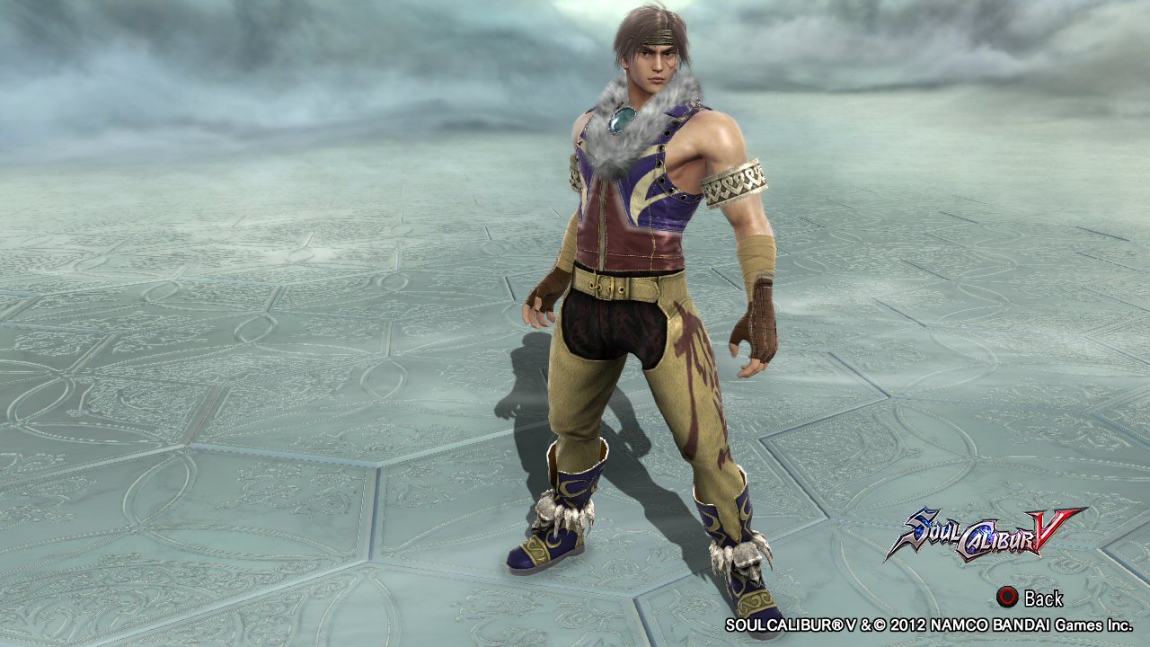
Kilik.jpg


Mitsurugi (SC III 2P)
Mitsu3.jpg


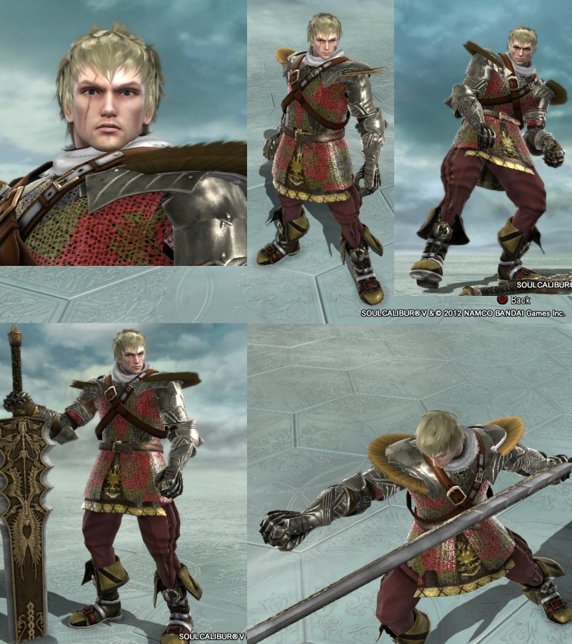
Siegfried (SC III 2P)
Sieg3.jpg


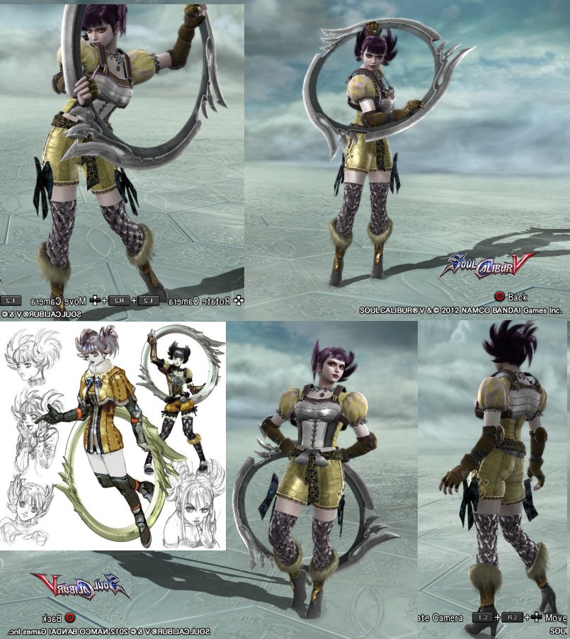
Tira (SC III illustration -unused)
Tira3.jpg


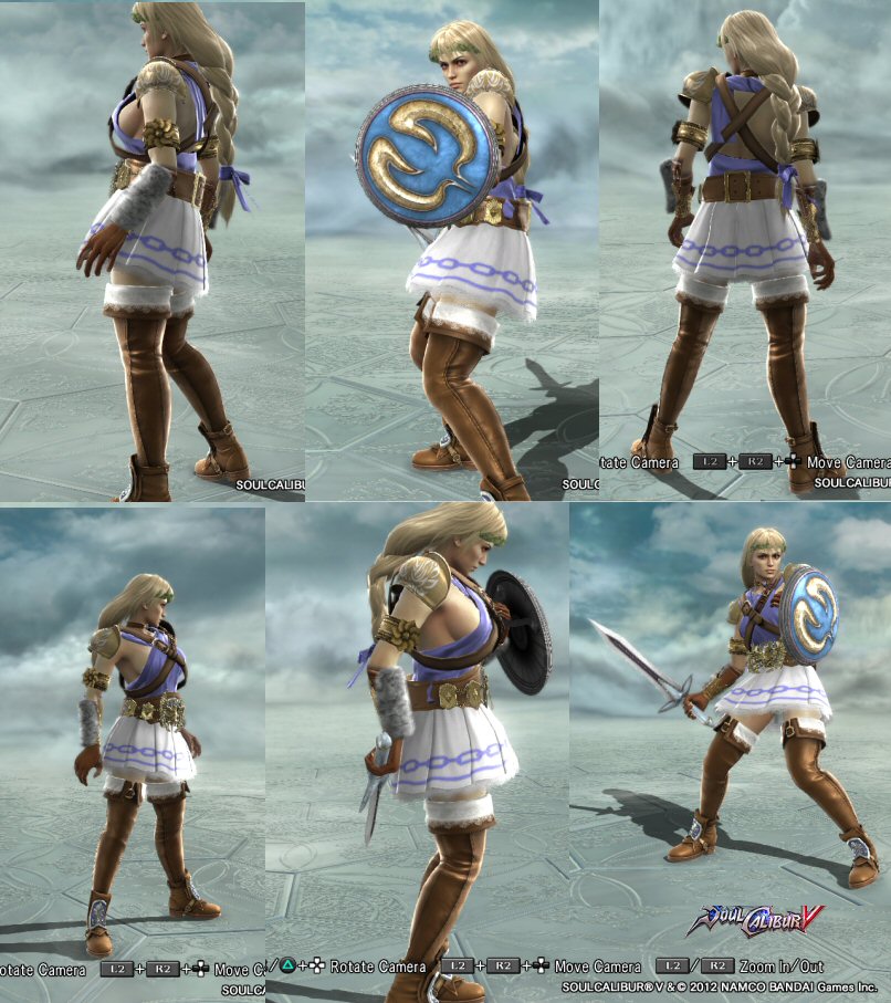
Sophitia (SC 1P)
Sophitia2.jpg


Cassandra (SC III 2P)
Cassandra3.jpg


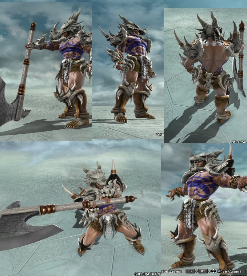
Rock (thematically tied to his SC and SC III looks)
Rock2.jpg
 
Those are so fucking cool. I like a lot how you use the stickers.

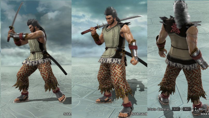
The only thing I don't liike very much is Mitsu pants pattern, excluding that 9/10
 
Thanks for the kind words. Agreed, Mitsu was the weakest of the lot, and a good example of how the most accurate choice isn't always the best one with CAS.

I've edited him a bit in the original post. same pattern, just toned down the saturation and the size of the pattern, as I wanted to maintain that continuity with the original design......hopefully he's better for it.

But.......he still kinda looks like he's wearing a potato sack and a pair of pajama pants fished out of a dorm room dumpster.
 
Little update. Still working to get the kinks worked out of the images I upload, I updated the first post with resized versions...being new at this kinda sucks.

Anyway, this time my Yoshi 3P that I already posted in the Yoshi custom thread, and some originals (two of Gatsu's designs, plus one of my own)

Yoshi 3P, based on nothing in particular
Yoshi3P.jpg


Gatsu's Dougall
Dougal2.jpg


and Yrsa
Yrsa2.jpg


and my own original, Sasori
Sasori.jpg
 
With the holidays over, my updates will be on the weekends from now on. With the one year anniversary of SCV coming up, I think I can do one update per weekend, 'bout 7-10 chars per until the end of the month (countdown to new DLC release? Maybe the long awaited SCV parts unreleased so far? Dream on. I'd love it if they did, but until, I'm guessing NOTHING will happen).

Nevertheless I still want to do a countdown. So Quinion's Question is, does anyone want to see them? I think we have some SC III fans out and about in the community; I'll leave it up to you......what 's up first, SC III bonus chars or Chronicles of the Sword ?

And if you say both, I can do that too, but a much smaller update, 3-4 chars :D
 
Wow, you rock. Best thread I've seen in ages. It's apparent that you know when and how to take artistic license. Sasori is my favorite of the bunch. Kilik would be my second favorite if you did a palette swap. His current outfit seems a bit...flamboyant.

Your characters are all wonderfully detailed...Too much so at times. For example, there really wasn't any need for the scorpion tattoo on Sasori's right leg. Your Cassandra's design is exquisite, but the heavy pattern work on the shirt and loincloth muddles the entire outfit. The same thing goes for Tira's belt, Yoshi's belt, and Kilik's left leg. Solid colors never go out of fashion.

I'm aware, however, that I'm one of the most minimalist (not to mention pretentious) CaSers on the forums, so dispose of my advice accordingly. On another note, I'd be honored for a person of your skill to critique my own work, so stop by my gallery if you have the time!
 
Mitsurugi's haircut struck me silly (probably because i never played SC3) even though the ches portion is so so and could use more details...the rest is well executed, but sorely lacks originality.
I am not sure about face mask of Yoshi, and the colors i am sure i don't like,, but you went a different way than i did, cool...
 
Thanks for the feedback; I appreciate folks taking the time to let me know what they think. The one thing I'll say regarding the comments is that all of my CAS are built for ingame use. I tinker with them endlessly, and run them through versus a lot, especially against officials. I hate that dull, flat look that CAS tends to have, because for me , that's kind of the point...I want to build characters to fight in SC, and nothing derails that faster than a bland CAS. Anyway, wall ends here.

I decided to update my thread with some of my SC III characters. Hope you have as much fun wiht these as I had making them.

Arthur
Arthur.jpg


Li Long
LiLong.jpg


Greed
Greed3.jpg


Miser
Miser2.jpg


Revenant
Revenant.jpg


and last but definitely not least, Valeria
Valeria.jpg


SC III BONUS PIC!! KERES, SCV-style
Keres2.jpg
 
You have some excellent stuff here. It reminds me of what this place was like before it started losing steam. That being the case, I did some detailed write-ups for each of your designs. It took me a while to write, but here it is. I hope you like reading, because there's a lot of it.

I really like Kilik's top. The denim pocket and phoenix stickers add layers of texture while the use of the racoon tails and the large stone necklace really transform the vest into an article of clothing that's unique with the design. I also like what's going on with the bandage wraps. An excellent use of the pocket sticker adds a fingerless glove-like layer on top of the bandages, possible because the dark color of the sticker obscures the lines between the bandages. The bottom half, while not offensive, is not as impressive. The chaps look a little plain and I'm not sure what's going on with the script pattern on the pants underneath. I suppose it adds texture, but I think a smaller size would be better for that purpose. The boots are okay; I think this is the first time I've ever not objected to their use.

I know you said Mitsurugi's top looks like a potato sack, but perhaps a potato sack actually fits, here. The simple, frayed clothing goes well with Mitsurugi's character, someone who's all business, no nonsense, substance-over-style. The pocket sticker layering turned out well, here. In contrast with your Kilik design, I like how the use of the script pattern under the stickers adds an extra bit of grittiness to the top. Also, it took me a while to notice that the top was actually a the linen tunic and two leaves on the shoulders; clever and well-played. The pants fit in well with the rest of the design. The gauntlets and slippers seem stock-colored; I'd usually get on someone's case about that, but it seems to look okay here, so that's not too bad. Finally, I see what you were trying to do with the raccoon tail. It would work flawlessly if it were the same texture as the hair, but since it's not, it just looks off. Just a little bit off, though, not a glaring error.

This Siegfried design may be the weakest of the bunch, IMO. The checker pattern just ends up looking washed out on the hauberk's chain mail. Also, because of the way the boots work, the pants narrowed below the knee, which looks odd when those parts are visible. I'm not sure how I feel about the use of the Centurion's Plumes on the shoulders, especially on that particular shoulder armor. I think they'd look better sticking up and fixed to the collarbone region. However, not everything about this design is bad. The choice of pattern and colors on the tunic under the hauberk's chain mail is nice, along with the placing of the Schwarzwind logo sticker. The denim pocket sticker adds nice stitching detail to the pants. I think you also patterned the boot cuffs; that looks nice, too.

The Tira design, though relatively simple, is quite nice, overall. The soft pattern on the top and shorts holds the design together. I wouldn't have thought to use the breastplate, but it works, surprisingly, especially when taken in the context of the stitching on the midsection. Great use of the DLC gloves; I think that's what they are, but I'm having trouble recognizing what they are exactly. Neverthless, they work well, here. What I can say I don't like about the design are that the top and shorts are visibly separated and that the patterned thigh-highs make an abrupt line with the skin (as though her legs were grafted off of a metal reptile).

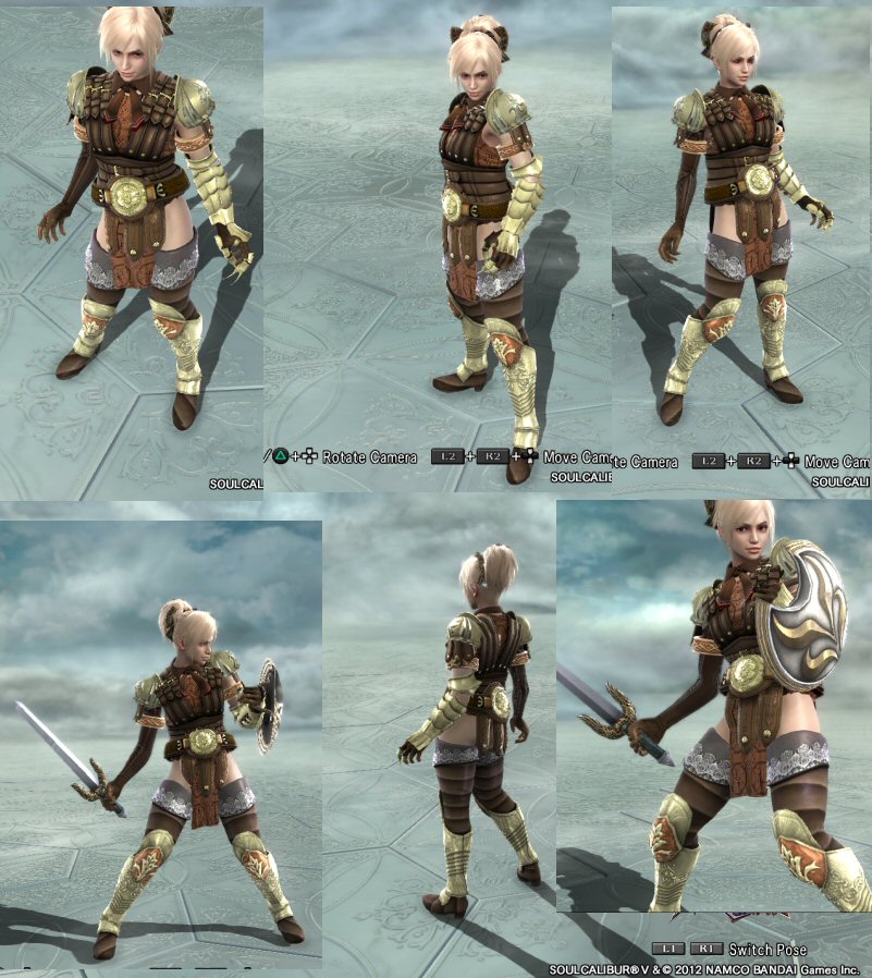
Aesthetically pleasing simplicity is also a strength of your Sophitia design. I like the choice of the chiton as the top. The stickers on the shoulder armor add detail. I also like the use of the raccoon tails on the arm guards. Not sure why you have the wrestling championship belt on there, though. I'd switch it out for something less big and gaudy. It wouldn't hurt to use a soft pattern on the chiton, either, to give it some texture.

Your Cassandra design is one of my favorites in this set. I looked at it once and immediately remembered her SC3 2P. The combination of the New Centurion and the Glory Belt is fantastic. The way you paired the cloth portion of the New Centurion and the loincloth with a monochromatic pattern is great. Again, stickers on the shoulder armor are a good idea. I also like that you've given her what looks like a long leather glove on her right arm with stickers. The pattern on the cloth part of the Honor Boots looks good, but I think stickers that cover the pattern and make the foot section look more like shoes instead of bandages would finish it off perfectly.

What can I say about Rock? He's big, he wears giant bone armor. The tattoos are also a nice way to insert detail onto something that would otherwise be left bare. The job may have been simple, but the result turned out great.

This Yoshi 3P is solid. The sticker on the face looks almost like an actual mask instead of a 2D design mapped onto a 3D surface. The use of the bottle gourd as a puffy arm guard is clever. The red and purple color scheme with gold detailing works well, except maybe on the feet. The horned theme also ties everything together, but I'm not sure I agree with the use of the horns on the midsection. To me, it seems like a random placement that would just get in the way of movement.

Dougall carries the cloth-and-armor look well. The shoulder cloth, the half cape, and the waist cloth look great together. However, I'm not sure the waist cloth works well on this design, given the lack of a thick part to pair it with at the waist such that the cloth doesn't look like it's just magically floating. That aside, the emblem on the abdomen, the shoulder feathers, and the war paint really go a long way in conveying this CaS' character

There some good details to on appreciate on Yrsa. My favorites are on the cape. The oversized patch sticker set at an angle looks great on the frayed cape, dirt stains and all. I also like the use of the angel wing stickers on the vest. It gives it a furry texture that ties it to everything else in this design with fur on it. The scaled belt pairs well with the loincloth, but again, without the thick top, it looks like it's just floating there.

Sasori is just too damn good. The shoulders, gauntlets, samurai faulds, shin guards, and the metal band going across the forehead all group well with each other for use on a ninja-themed design. The parts underneath are all textured very well with good sticker use. The pocket sticker leaves stitch marks that suggest a body suit; the same effect also occurs at the knee. Various designs, like the character on the midsection, the scorpion on the right thigh, the script on the left, and the markings on the hood leave no surface untouched. Just awesome.

This Arthur design is solid and faithful to the original. The New Centurion, the shoulder armor, and the chest armor group well together. I like what I see with the pocket sticker on the left arm. The waistcloth works perfectly well, here, when paired with the width of the New Centurion's midsection. I also like the use of the special equipment as a belt buckle and the use of the pocket sticker on the pants. I'm not sure how I feel about the sticker on the back of the waistcloth, but it does suggest a second piece of cloth on top of the waistcloth itself, so it kind of works.

I'm not too sold on this Li Long. The parts generally make sense, but I think the colors on the changbao and the vest look too washed out. The shoes could use some texture, too. The belt buckle is a clever construction, but seems a bit big. I know it's that big on the original, though, so not much can be done about that. However, I like what you've done with the vest. The pocket sticker on the front with the design on the back yields wonderful detail.

This Greed is definitely a step up from the original! Pocket stickers on the front and sleeve holes add nice detailing to the vest, especially when paired with the brown pattern on the lower regions. I also appreciate the detailing on the pants. I know I usually don't like huge belts with huge buckles, but I like the way the Chamionship Belt works here for some reason.

Miser doesn't look complete, but I think it's a good start. The pocket stickers on the sides create a nice bodice effect. The slit skirt also makes sense when paired with the ring pants. I also like the substitution of the cogwheel for he giant shuriken. However, I think that the way that large portions of the shirt and the upper portion of the skirt are left solidly colored leave them flat.

Your Revenant design is very nice. The use of the pocket sticker over a patterned leather vest suggests leather armor over an ornately patterned noble's shirt. The oversized sun sticker gives nice fold and crease textures to the shorts. The red and crimson of the Oathbearer's Belt looks great against the green shorts and the red and white-patterned leather vest. Finally, the raccoon tails on the bootcuffs is a nice touch, but might look nicer if they were laid flat so as to cover all sides of the cuff.

Valeria seems like another work-in-progress, to me. The use of the pocket sticker to create a cutout effect on the apron was clever, but the textured pattern prevents visual pairing with whatever's underneath. It would also help if the undergarment was extended above breast level, closer to where it's suggested to be by the cutout. I'm also not a fan of the texture pattern on the skirt. The shade of purple you used is too saturated for a shade of purple that dark; I'd tone it down a few notches and see what that does for you. The ring pants, pareo, and boots group well together, but the first two could use some detail.

I'll be honest about Keres; it looks like it was taken away from the direction of a haunted armor and pointed more toward one of those old, tired dark, evil knight types. The armor is just too spikey and messy. Neverthless, the thick armor allows use of the roman loincloth, in turn allowing it to pair with the hooded cape, which is nicely done.
 
Thanks for the feedback, as even the negative is very helpful.

Special to thanks to @ThePascuzzi: Whoa, dude! You really put some thought and work into your review of my stuff...over and above anything I would have expected, and super constructive, helpful, appreciated . Two things in reply-

Greed- the positive side effect of the Champ Belt is that it clips the tails off the vest...the only belt item i know of that can do it.

Keres- agreed on the shoulder armor but I've had a hell of a time trying to get the right look. Very important to me in my CAS recreations is silhouette, to the point that if I'm trying to hammer something out, I may black out the whole char just to focus on the form, wihtout patterns or colors to distract. In that vein, the original Keres had those wide, low-swept shoulders (don't recall the name) that covered the entire shoulder area and was widest along the bottom edge. The Gorgon shoulders are the only piece in SCV that really have the shape I was looking for. I'd love to kill the color on the spikes to blend them into the overall look, instead of that inalterable high-contrast white (Ugh!)

For any that re interested, there's still enough time left to the weekend I think I can get another update up before the weekly grind begins all over again. Stay tuned for a small update of some VERY obscure recreations.......
 
As promised, obscurity reigns; I doubt there are many that remember these. The center image is from an SC III illustration; I couldn't find a good one online, so I had to shoot it off my TV screen. It's the illo of the Olcadan 1P, and these are apparently development designs that were discarded. As they have no names, I'm calling them from top to bottom: Edge Matron , BladeMaster, and Master-at-Arms (Swordmaster and WeaponMaster having already been used in SC).

The red-skinned "BladeMaster" is pretty uninteresting; the only one I'll probably keep is Edge Matron. I think the idea of a female edgemaster/mimic is pretty cool when not grafted onto some weird Oedipal freakshow story twist, and an old lady uber-warrior-type character is the kind of thing I think would work well in the SC world.

3Masters3.jpg


Also, a couple of SC III NPC's, Shadow Master (fits the theme) and a real oddball CAS I'm guessing few will remamber, wiht the lame premise of having similarly named equipment...Dragon!
4ShadowMaster2.jpg


Dragon.jpg
 
Considering how generic the originals look, I think you did an excellent job. I don't think anyone's going oedipal over your Edge Matron lol. Nor have I ever seen this many elderly CaS in one post lol. Keep up the good work.
 
Ok Maybe not as close as I thought to a page bump. This time a real mixed bag:
Some originals, my take on an Official DJ char for SC5, and a recreation or two.

My take on some Middle Eastern fighters. These started off as one character, morphed into a 1P/2P combo, and finally developed enough to where it was two completely different individuals:

Hassan.jpg


Mameluk2.jpg


Toki, Taki's master. Don't get me wrong, this doesn't hold a candle to Chobek's epic wolf-form Toki, which has to be one the most awesome recreations I've seen, but i think a passable run at his human form

Toki.jpg


Last up, my take on an Official DJ character. PS won't make one, so I gave it a try. I haven't really seen anyone else's attempt (just recreations of exisitng Tekken chars) , though i've seen more than a few comments about wanting to see one. Tried to evolve the Mishima family look back to SC time, complete with bare torso and preposterously exaggerated hair features. Has good ingame "flow" with the DJ moveset, but I'll seriously consider any suggestions for improvement.

Jintoku2.jpg
 
These are really good!

Arab 1: Excellent use of that usually drab monk frock (I'll have to try it myself later.) While the entire outfit is tan and brown, you added a lot of really cool textures and patterns. Everything from the striped turban to the armored sandals is highly befitting of a desert warrior. I would simplify the design by removing the snake gear, which clips without really adding much to the character, and removing the brown from the sleeves, since you already have 4 or 5 layers of clothing.

Arab 2: Another exquisite Midde-Eastern warrior. The gold ornamentation, gaudy patterns, and the jug of wine clearly delineates a palace guard. Everything about the design works, like the flowing sleeves, the quiver, and the breastplate, but I'm strongly of the opinion that something must be toned down. It's overpowering as it is now. I would start by significantly darkening the gold pattern on the sleeves and helmet. Then I would remove the flowery pattern on the shoulder guards or replace it with an extremely subtle speckled pattern if you really, really hate solid colors. I'm not particularly fond of the sticker on his left sleeve, but I can see how you and many other people would enjoy the flashiness, so I won't say any more about it. Finally, the phoenix sticker on the waist-cloth noticeably upsets the character's balance. Its brightness and heaviness really wrenches the viewers attention to the waistline and away from everything else. I recommend shrinking the emblem while moving it up or removing it entirely.

Toki: A solid recreation. The bony shoulder guards, furry vest, and the soft colors help retain the original's organic appearance. I wouldn't have minded some brighter colors to break up the grey and red, but I think you were going for an ethereal, ghost-like image. The only thing I would do is to replace the calligraphy pattern on the beads to a subtle tiger stripe or wispy pattern to simulate polished wood.

Official DJ: This I really love. The beard + hair extensions using the butterfly antennae is both innovative and mantacular. The headdress made of the helmet plume and pair of snakes is nothing short of epic. The sticker and pattern work you did on the torso and lower body was detailed without ostentation. Just remove the random sticker on the waist bandages, and he'll look like a character straight from Dynasty Warriors. Magnifico.
 
Back