Advice and opinions on my CAS

FaderPotater

[03] Disciple
Got really into CAS a while back and made all kinds of characters and tried to make each one different and uniqye. After seeing the horrors that are the random CAS in versus mode I had to see what other people could do.

Now I'm trying to go back through my characters and improve them and maybe redesign a few that don't quite hit the mark for me. I never really went much into stickers and I've started to dabble after I've seen the work here. I figured I would get advice on designs I have already started adding too, ones I haven't, and even some that I'm generally happy with.

I took some pictures of three of my characters to show kind of how I've made them so far and what I'm looking to improve going forward. Unfortunately I'm on Xbox and these pictures are kind of rushed any future ones I'll try and make a bit better

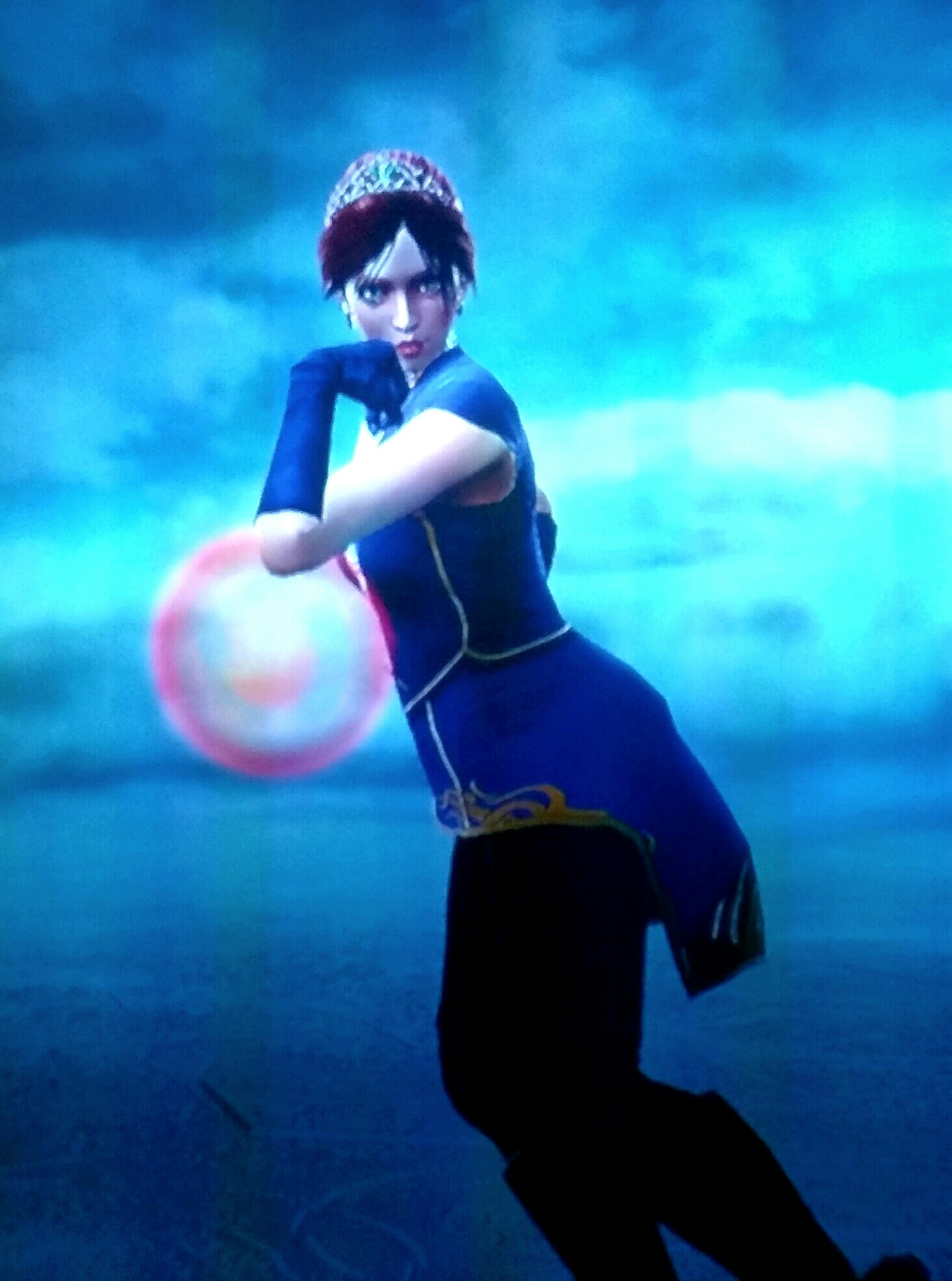
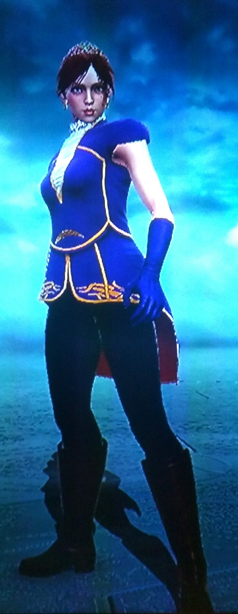
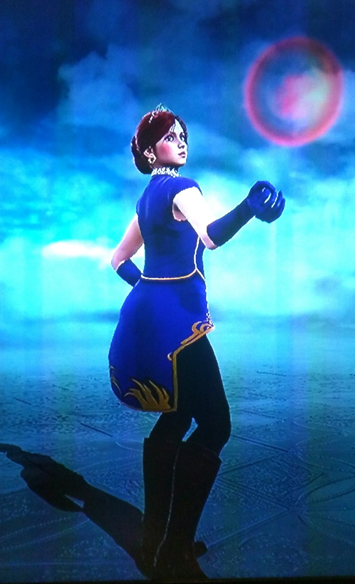
First off is one of my first characters I made after wanting to really make themed characters. General idea behind her is a princess or noble lady, her style is Viola.
IMG_20161119_234429.jpg


IMG_20161119_234545.jpg

IMG_20161119_234609.jpg

She is the first character I went back after coming here and decided to try and spice up a bit. I added some makeup, used stickers to try and add some more to her coat and used the helmet horn accessories to make that mid stomach detail on her coat. I'm fairly happy with her design now that I made her coat more interesting but who knows maybe you guys see some missed potential? I'm lukewarm on her glove color at the moment and it's hard to tell but her boots are brown not black.


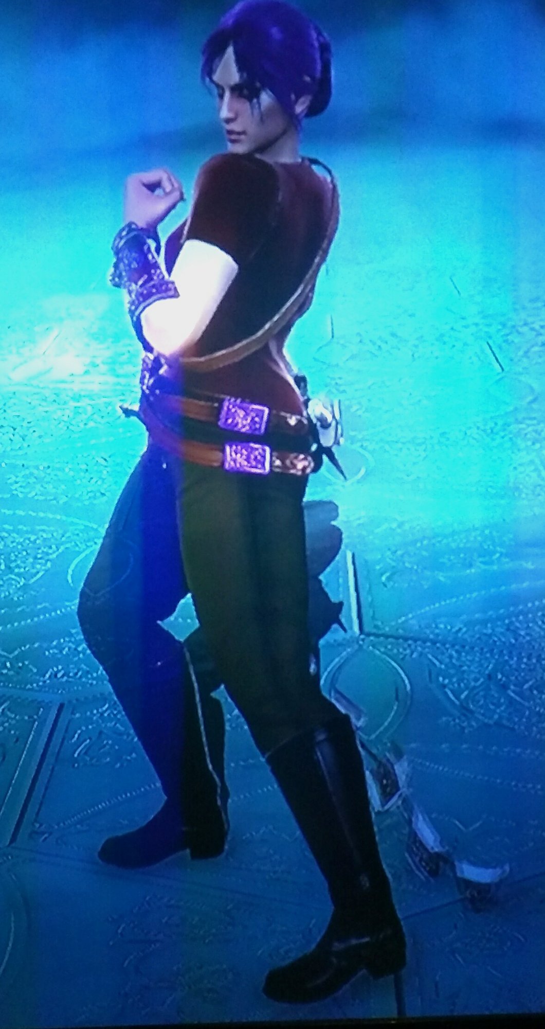
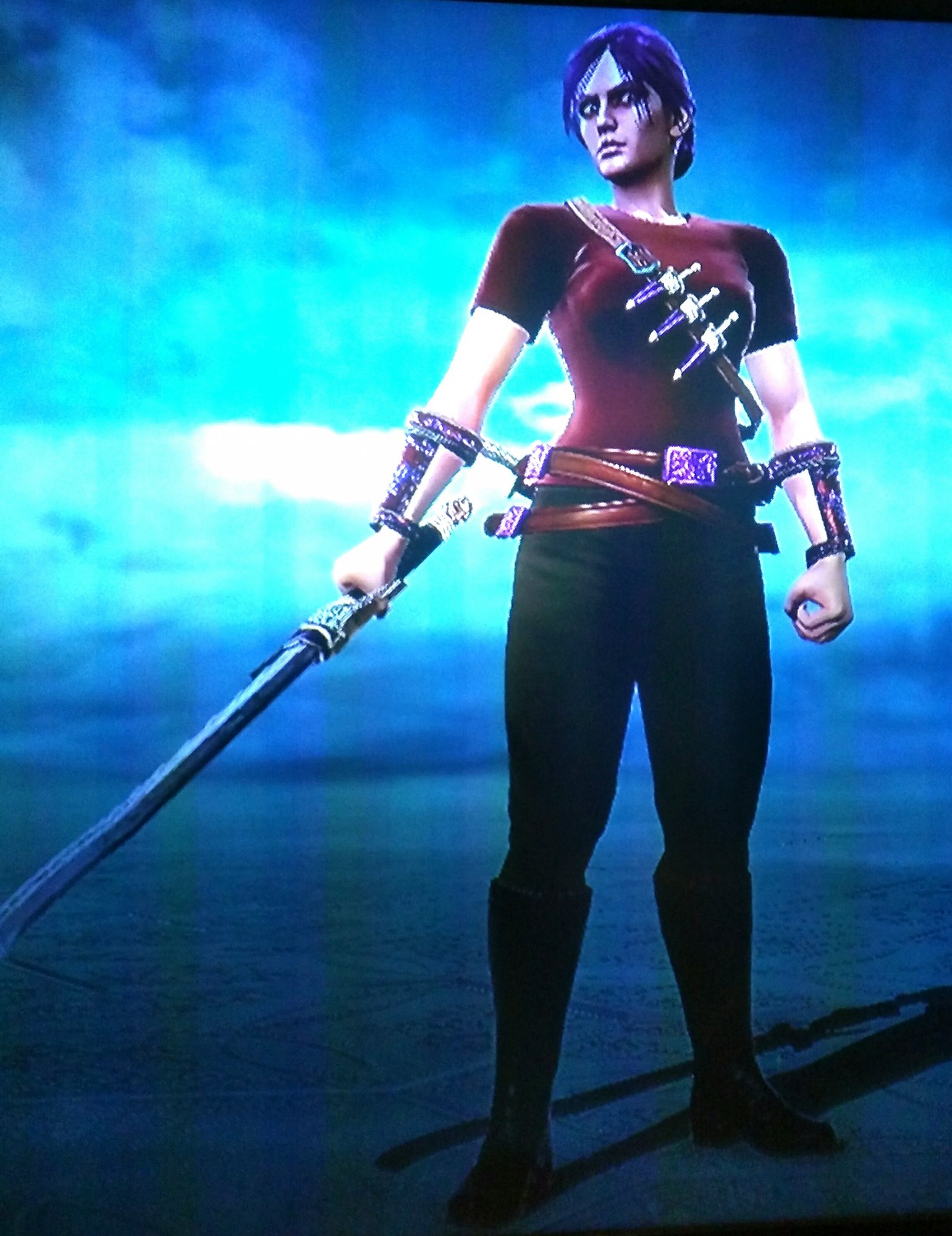
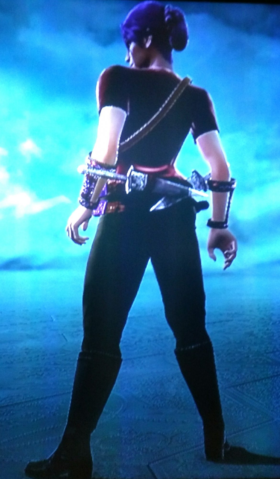
Next is one of the characters I'm having trouble deciding where I woukd add more without cluttering the design. Her style is Ivy and her combat moves almost reminded me of an explore cutting through the bush of a jungle so I made just that.
IMG_20161119_234730.jpg

IMG_20161119_234838.jpg

IMG_20161119_234957.jpg

OK so I'm fairly happy with the feel of her design. I tried to include a few colors without making her too flashy for the utilitarian feel I wanted and I tried to keep from making her a goofy cartoon villain stereotype as well. I'm sure minor details could be added to really complete the look or maybe take some away in one area and emphasize on another instead? What do you guys think?


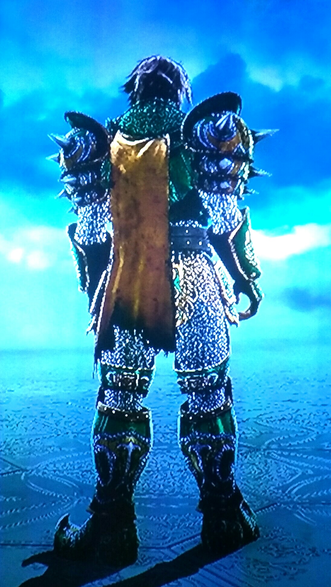
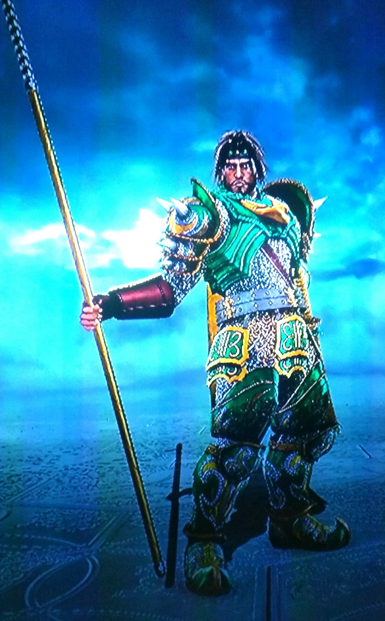
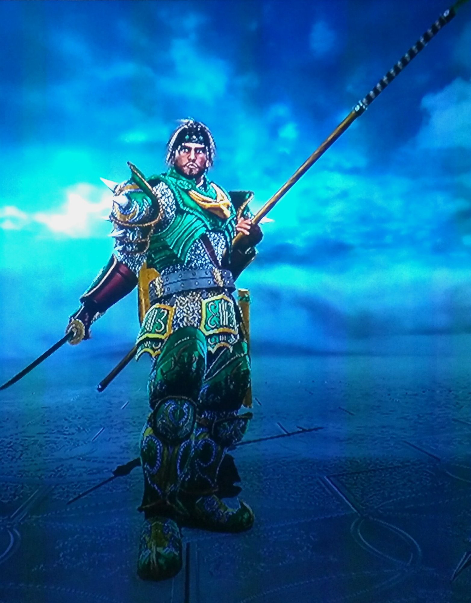
The final design is in a similar vein as a lot of mine as I really had fun trying to fit armor together in different ways to make different feeling characters with the limited armor sets available. The most I can think of to add to these characters would be to maybe use stickers on ones that have a lot of blank armor but well see. For now I'll show you my mercenary leader character that uses Hilde's style.
IMG_20161119_235329.jpg

IMG_20161119_235357.jpg

IMG_20161119_235432.jpg


So those are some of my designs, if you guys want I can post more as I try and update them or I can just post more of the ones I am somewhat proud of.

If you prefer I use an existing thread and want me to move there please tell me and I'll put my inquiries in the proper place, I didn't go straight to the reviews thread as I'm a bit shy when sharing things I make and wasn't quite ready to submit these for full critical review. Hope you guys like these or have some good tips for how to improve my design eye.
 
I like the Ivy character and the Hilde, that one is really cool, except maybe the armlets should be green as well, that's the only thing that doesn't fit to me. But I won't talk into your stuff, there are better people for that here. I don't have any "protips" or anything either. You can visit my CaS showcase for some ideas or inspiration, if you want. :)
 
I like the Ivy character and the Hilde, that one is really cool, except maybe the armlets should be green as well, that's the only thing that doesn't fit to me. But I won't talk into your stuff, there are better people for that here. I don't have any "protips" or anything either. You can visit my CaS showcase for some ideas or inspiration, if you want. :)

Thanks glad you like them, your designs were actually what made me decide to go ahead and give stickers and patterns a try.
 
Going to go ahead and upload these creations in the same way I made them. When I got into CAS I decided I wanted to try and make a female character for every style. Then when I was done I went ahead and did it with male characters as well. I saw it as a fun way to experiment with character building. Looking back I got lazy with some and didn't have much inspiration with others.

Now I'm seeking to fix that. Some I'm just tinkering with SpecEq, patterns, and stickers now that I know how versatile they can be, others I plan to redesign completely. I hope any of you on this forum will join me and see how I (hopefully) improve over time and how I've (hopefully) improved from my bland base designs. So without further ado here are my characters for Cervantes style.


First up is Marie who was actuallyy first CAS ever. It was when my friends still played and I was inspired by their OCs that were kicking my butt online. I chose Cervantes' style as it was the one I planned to try and main. I knew I kind of wanted to make a kind of female pirate captain look and went with the reliable leader voice to reinforce that.

2016-11-29 00.57.40.jpg

I loved the open skirt look and originally had the hip skirt but didn't quite like how much it would clip and how much shinier it was than the other clothing. So for the redesign I added any stickers you see, changed the skirt to Pareo, and made a belt from SpecEq to try my hand at it and add some bulkiness to the center of the design. The gauntlets I felt added a bit of fight to her design, she's not all frills she's got some light gauntlets on.

2016-11-29 01.00.23.jpg


I felt the middle was lacking as it was originally just the black undershirt so I added some stickers to try and create a lacy design, I also felt the chest could use some spicing up and settled on the design you see. Not sure how satisfied I am with it honestly, same with the skirt stickers. I originally just had the bottom hem then added in the second sticker as I worried there might be too much red on the bottom with how predominant the accent colors became on the top. I tinkered with patterns to add to the sleeves as stickers didn't apply well but couldn't find something that served as the border accents that I wanted.

2016-11-29 00.59.43.jpg


In the end I'm marginally happy with this design but feel that there is room for improvement in spacing of the design and it's stickers. Any suggestions would be welcome!

My male Cervantes has not been altered yet. He's one of the designs that I looked back at and went, why was I happy with that level of originality? Looking at him now I can't help but feel like he's just a weird mishmash 3p for Cervantes himself. I mean criminy I even made his hair seem like a short versions of Cervantes' normal hair.

2016-11-29 01.23.07.jpg


As you will see I quite like gold accents in my color schemes. I think it has a sense of wealth or regality to me so whenever I want to make an influential or wealthy character (like an infamous pirate captain) I add gold accents.

2016-11-29 01.24.21.jpg


I think since I went for a pirate feel with the female Cervantes I want to depart from the pirate archetype when I remake this one. Suggestions for your favorites to go with Cervantes style would be great.

2016-11-29 01.25.19.jpg


Well that's it for my Cervantest CASs I'll post these maybe once a week so I have time to try and go through some more of my old designs. I'm kind of randomly picking the designs to redo and for a while most of the redesigns will be accompanied by the opposite genders unaltered design. Once I update them I'll repost them so you guys can see how they have changed. Hope you enjoy.
 
Whoa, great job! I really like marie's colors and patterns. She totally looks the part of a pirate! The undergarment design really completes the look. And the blouse blends in beautifully with the long skirt patterns. ^~^
 
Just got a new TV so pictures will be a bit higher quality now. I got a little lazy with these pictures but future ones will be much clrarer. The color though looks much better on this new TV.

First up is one of my updated creations with Leina. Style is Siegfried and she is supposed to be a hopeful young knight. She's is the foil to my female nightmare style character.
2016-12-01 23.25.29.jpg
I added some detail with the jewel I made on her brest plate and the stickers on her formerly pitch black shiny pants. I changed the waist armor as her previous set didn't cover anything but her sides and I decided that was odd.
2016-12-01 23.34.41.jpg

I added the fur originally to try and cover her butt with the last waist armor I had on. I was going to remove it but the more I look at it the more I kind of like it. What do you guys think?
2016-12-01 23.35.38.jpg

And that's Leina, the young champion. She's been one of my favorites since her creation. I love the look of a small woman with a large weapon, always something badass about it to me. On top of that I think it was one of the first characters where I really liked the armor combinations I ended up with.

The male variant is onve again unedited but is a bit special.
2016-12-01 23.37.33.jpg
Lance was my best friends character, he's an interesting idea and the colors are nice. A little plain but befitting the outfit I suppose. I may edit him one day and spruce him up with some stickers or a splash of color but I don't think I'll delete or remake him because he has that sentimental callback to my college days.
2016-12-01 23.38.31.jpg

Incidentally I think he also made Lance the shortest height because he liked that it said it upped the characters power.
2016-12-01 23.39.24.jpg

Welp there's two more! I have no idea how often I'll upload these but I felt like doing these since I have the nice new TV. Also I've been really enjoying talking with you guys and sharing my stuff. Hope you enjoy.
 
Wow, dude. You have some solid work here. Marie's design is fantastic! Red/black/gold isn't terribly difficult to work with, but I love the whole color and detail distribution. Whatever the fuck you did with the pareo look fantastic too. Asymmetry isn't easy to pull off. The gloves and the aggressive color scheme put a bit of edge to an otherwise feminine design. Good call on the SpecEq belt too. Great use of the butterfly and raven wing stick. Those happen to be my favorite stickers for adding detail. Lots of personality and great fashion.

Your other creations are good too, and I might comment on them later when I find some time. If you're looking to try out some new techniques, check out this thread here: https://8wayrun.com/threads/school-of-cas-advanced-cas-technique.18282/#post-686271. The general idea is blending special equipment, stickers, and normal equipment to create new shapes. Like this one: https://8wayrun.com/threads/a-mini-gallery.12594/page-10#post-674441. Couldn't resist tooting my own horn a bit :P. Anyways, keep the great work!
 

I may not have been here when the board was active but I've been researching like crazy. I was hopeful I'd get to see you Brucege. I'm almost certain I have read through all of those tutorials, at first I couldn't quite see their benefit but as I looked at some of the wonderful works on this board and as I looked at my own designs I saw the limitations of the standard gear and the possibilities of stickers, patterns, and SpecEq. After that I eagerly took all I could from them, I may go back again and make sure I didn't miss any as I read them at work and could have forgotten that I had more to read.

The works I have shared here so far have been some of my least drastic changes. Mostly just adding stickers for slight details. I think that SpecEq belt was the hardest piece I crafted as getting it just right was difficult with how the pareo slanted. Next I'll upload the creation I recently made where I actually tried out the very lesson you mentioned, I was actually really happy with the results as I previously couldn't get the desired affect with the two equipment pieces that were close to what I wanted. It might not be my best creation but it one of the ones that made me feel good.

I'll try and share that tomorrow. It was an honor hearing from you and I hope that my works continue to improve and impress. Maybe if or when SCVI comes around (and if I have the money to get it, or a system for it....) some more of the other legendary creators of old I have been looking at will come back and I can join in on the fun you guys used to have. So many cool ideas like the contests, mirror match threads, best creations, and the reviews that have sat abandoned for a good while. Honestly though when I first found this board last month I was amazed that people were still posting at all with how long ago released, it's been a pleasant surprise that I got to collaborate with wonderful people like dragonffs, nekoninja, you, and a few others.
 
This next character is one where I first tried using Pocket stickers to make a top when the default ones didn't quite make the shapes I wanted.

2016-12-04 17.45.46.jpg


The basic idea behind Eleanor is that I wasn't happy at all with male Xiba and I decided I want to make a cute girl big weapon character without a ton of armor like my previous ones. The style is Astaroth and since i had already made male and female versions of Astaroth she makes 3 characters with that style instead of the normal 2. None of poses where she holds a weapon really looks good with the custom SpecEq shoulder pad I made, and movement looks bad since I take these pictures with a camera.

2016-12-04 17.46.55.jpg


I was quite happy with how the cape turned out. I almost thought I would have to remove the bottom sun sticker as I was running out of sticker slots but then I realized a 1 sticker would work to cover up the bleed on her face from the square stickers I used on her arms.

2016-12-04 17.48.03.jpg


I really liked the look of the corset underwear that's actually kind of like a one piece strapless swimsuit the only tops that didn't completely cover it up also kind of ruined the non bulky look I was going for. While messing with the pocket stickers I realized they finished the top really nicely by making a kind of undershirt. Unfortunately since she didn't have a shirt on like in the example of making a short coat in the CAS advanced techniques thread that Brucege made I had to put square stickers on her arms which bleed onto her face, then I used a skin colored 1 sticker to cover up the bleed. Needless to say this creation was a good lesson in paying attention to the order I was placing stickers. Other things that went wrong include me wanting to use the braided hair style but the pigtails going out to the side looked bad with the shoulder plate. As far as character notes I ended up deciding that she seemed kind of like a bounty hunter, not fully armored, added a bit of personal flair to her outfit, but also isn't fighting in high heels and a skirt. I imagine if she isn't holding her massive axe weapon her marks would underestimate her strength due to her small stature, a useful surprise tactic for a bounty hunter.

Next is abigail who was the first female character that I wanted to try and make a big but still beautiful character. Essentially when I started making characters I didn't want to just make characters I personally felt looked good but also characters that had all sorts of body shapes and sizes that I thought looked good. Since Abigail had Astaroth's style I thought making a tough looking commander with an intimidating hammer would be the angle I took.

2016-12-04 18.07.48.jpg


It should be noted Eleanor is the only character of the 3 I'm sharing today that I have gone back to update with the techniques I learned on this board. While I like to think I made some decent color combinations there won't be as much extra work and flair in these but eventually I'll update them.

2016-12-04 18.09.16.jpg


When I made this I felt quite proud of myself for making the arrow stick out of her shoulder and adding to her intimidating strong women look.

2016-12-04 18.10.21.jpg


I still like her basic look but I'm sure patterns, stickers, and maybe some more smartly placed SpecEq could really upgrade her from a basic CAS to something more intricate and advanced.

Next up is GARBTHOR! Feared emperor of the desert! For some reason when I made him I really had a clear idea of what I wanted him to be, a short guy with a high pitched voice that would constantly shout things like "fear me!"

2016-12-04 18.04.01.jpg


He's covered in armor from head to toe with big giant depictions of fearsome creatures all over his armor because naturally as a tiny warlord you want ever extra bit of intimidation you can get. The wings are there for the sAmerican reason, to try and make him appear bigger and more frightful then he is.

2016-12-04 18.04.43.jpg


I quite like the color scheme I achieved with this character. The main changes I would make is probably using SpecEq to change around the armor and make it more unique than the default equipment armors. Particularly the helmet and maybe the grieves. Unfortunately I only have 3 SpecEq so I'll have to choose wisely.

2016-12-04 18.06.17.jpg


Basically I'm thinking of changing the helmet, the Grieves (feet), and maybe taking away the wings so I can add to whatever changes I make to the previously mentioned equipment. What do you guys think?

As always ideas and suggestions on how to improve any of these characters is greatly appreciated.
 
I've been following you thread since a few days after you made it and what always comes into my mind when thinking about your creations is the first time I read Garbthor's description, scrolled down to the pic and just laughed my ass off because the idea is just awesome xD
That said, you're posting great creations and as I'm trying to keep it short, I'll just post my critique (yay). But don't take it too serious, I'm not really good at creating (that's why I'm here), it's just some personal impression:
First is Eleanor, with one small detail disturbing me: the corset above the jacket. I don't know how this could be changed as it would look weird if the sticker would cover corset and skin, but I just can't imagine that it would be comfortable to wear a jacket under a corset.
Second is one detail about Abigail, the hip armor. Everything about her armor is western whereas that piece is eastern (if I'm right) or at least looks like it. But as above, it's just a small detail that's somehow disturbing me enough to mention it.
Nevertheless that's everything I'd change, I really like your CAS, especially Marie (nice colors and beautiful sticker usage) and Lance (great combination of a neat suit and big armor). Hope to see some more. :)
 
Haha thanks man, I plan on commenting in your thread I just have to find the time to really write it out. I like to think it's not a jacket so much as a skin tight spandex type material under Eleanor's corset. But mostly I just put it there because I liked the look of it. Valid criticism I'll have to keep in mind for future works.

For Abigail I definitely have a hard time placing what region she would be from so armor consistency is on the list of improvements once I get to her. I kind of want to make her eastern influenced but I always feel awful because I'm terrible at straying from the default skin color, never feel I get it
 
First i'll repost the way of the Bu(CA)shido :

1/A bad CAS is a CAS which hurts the eyes or has been done to death (ie. Flashy Anime RCAS nobody knows about)
2/An average to good CAS is a CAS with a competent choice of parts and colors and some (albeit vague) art direction.
3/A great CAS (RCAS or OC) is a CAS where parts/colors/stickers/makeup/voice/fighting style/weapon and weapon effects and and ExEq ALL work towards elevating the CAS to a true persona, a unique blend, a soul of high caliber, one that sets itself apart from the most mundane 1P and 2Ps of the standard roster.
To create a great CAS, you firstly need a concept, a fresh idea, a direction (funny / eerie / scary stuff, impossible recreations, transcending genres and eras, etc.).
Then you just need to have enough technique and practice to beat the editor's limitations to a pulp, then carefully field-test in-game and take great pics (also preferrably in-game because what counts is the way it plays, with in-game lighting, in the proper stage), and then post and hope for some constructive artistic feedback...

----------------------------

About the CAS on display here, i would say they belong to the average CAS. Might be hard to hear/read and no it is not picture quality related as the details or lack thereof are perfectly visible (or not :)
Average relates to "rule" n°2/An average to good CAS is a CAS with a competent choice of parts and colors and some (albeit vague) art direction.

I'll take Marie (Mary Read ?) as a use case to provide some tips for improvement.
Damn, i'd even Say Eleanor is a better starting point for a great pirate lady CAS (outfit looking more)
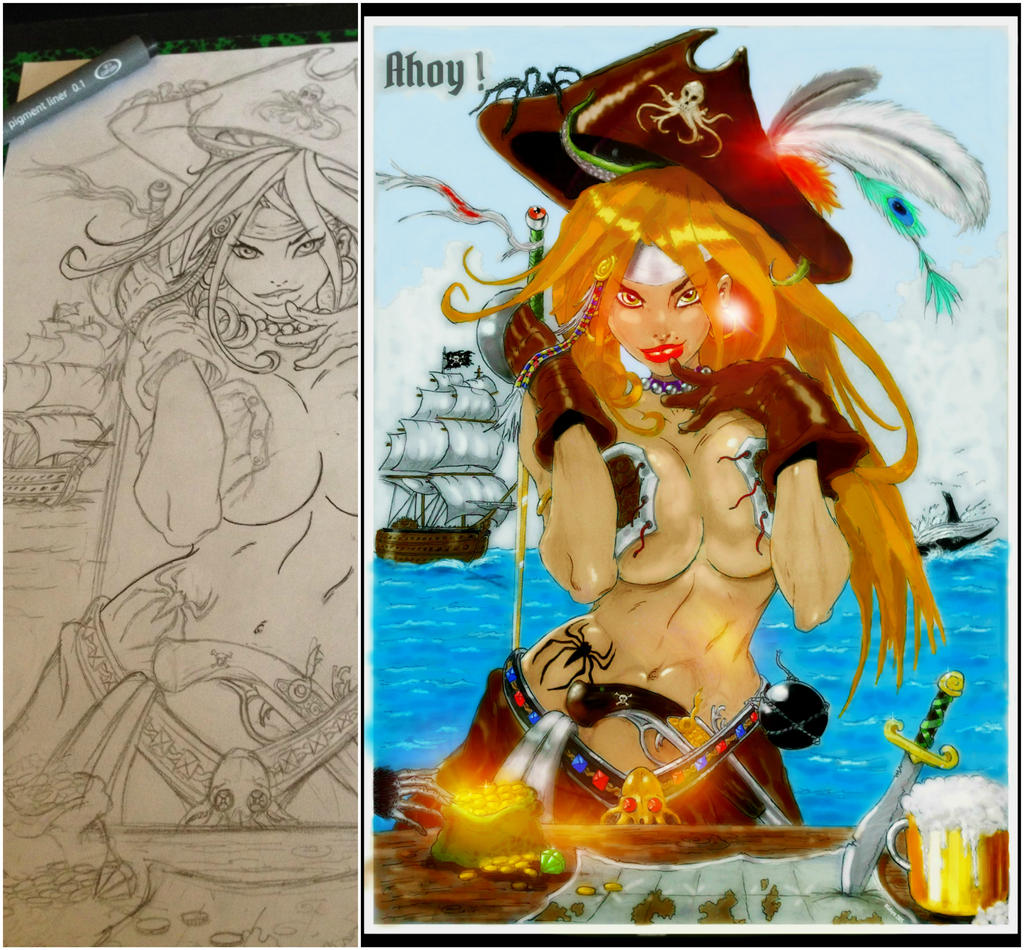
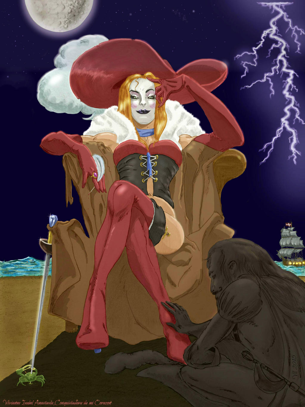
So let us say you want to do a by the book pirate lady using all kinds of pirate pointers (see two drawings for reference below of two different art directions for pirates.
Feel free to make CAS versions of either one of them provided you add your touch to it...). I will remove the drawings upon request, no big deal, just for the sake of giving advice as requested in your PM, one word from you and i'll edit.

1/So, first think about the mood of your character : scary, undead or zombie, sad, sexy, garçon manqué (french google that my friend !), the stuff of your wildest dreams (or nightmares). The concept, as original as a pirate lady can be :)
2/Then pick the presets for the mood and overall direction (like thin or muscular, beauty or the beast etc), weapon style (keep effects for when you are finished with coloring), eye colors (same here), voice tone etc.

3/Build the CAS with pointers. Some i would use for a pirate CAS (and i have done many, cape-tain, undead ones, dog pirates, caribbean lady pirates, cervy 3Ps you name it...) :
Pirate hat or headscarf, pirate stickers, rolled map or map using enlarged/colored dollar bill exEq if you have it, spyglass, earrings, skulls (stickers, makeup, depending if you want to go for scary or sexy (see below :) pirate lady), eye patch, cat made into a parrot (i tried that once, might be hard to pull off without using all exeqs, but i did a parrot head CAS concept once), beer pint, treasure (cf. dungeon crawler CAS for tips), pirate bomb, pirate gun, boots, etc. appropriate clothing (leather gloves, tied knot shirt, whatever fits into the overall direction you wanna go and emotion you wanna create, experiment)
It's better for ExEq to think outside the box and try to mix up things for originality ie. a smoking pipe for a girl (like the one i did on C-ape-tain), a man oufit for a girl or vice versa (cf. second drawing).
In french, it is called artistic "décalage", think of surprises making your CAS, and you'll see the stronger the art direction and the more original it gets, the easier it is to pick colors, stickers, patterns etc.
Pick colors that match the mood and work together and with realistic (low to average) values, unless you wanna go for the goofy / clownesque pirate lady, why not ?

Then, chose the name carefully and make a thumbnail that fits the CAS like a glove, take pictures in editor, then launch an AI on the pirate boat, take pictures in-game (if you are on ps3 it is easier) and post ! In game you'll see if things really work and if your CAS really stands out as coherent and awesome !

Course it helps immensely to have all things unlocked and DLC packs available, otherwise possibilities are more limited...

Do your best, and post something that will blow us away (with your pirate cannon:)...hope it helps, even though i haven't touch SC5 for ages now (a bugger that SC5 still isn't backwards compat on xbox one for instance)

mary_read___sketch_to_finish_by_vilarcane-dan9819.jpg


conquistadorah__by_vilarcane-da0b265.jpg
 
an example of artistic "décalage" pertaining to weapon style :
obvious choice would be to go for raph style for a classic swashbuckler look&feel
but one could aslo think of :
manga pirate lady viola with the fish tank ball :)
sexy pirate lady Ivy with fishbone sword
garcon manqué muscular pirate with nightmare squid sword (then face preset should be obvious)
Asian themed pirate with either natsu or xiang. style (pick your weapon set)
...
sea, an ocean of possibilities, as long as you keep it fresh (like the fish) and coherent in your choice of presets (face is paramount), Eq and ExEq and all.
 
Back