Pascuzzi's Blog Posts About Nothing

So, I guess tonight is Pas' CaS: K-pop edition, which is weird, because I don't even listen to K-pop. I'm more of a hip-hop and jazz kinda guy, though I'll really just listen to whatever sounds good. However, I've had a few songs stuck in my head over the past few days. It has very little to do with the lyrics; I can't understand a lick of Korean. The tracks are just that catchy. I guess that's pretty much what makes a pop song, though.

Music videos for the songs in question are in spoiler tags under either design. If you're musically open-minded, go ahead and have a listen while you're looking at the designs. Feel free to tell me how bad my taste in music is, afterward.

oB88Z.jpg

Dawn comes from a the present-day of a timeline still plagued by the Malfested. Unfortunately for her, her boyfriend suddenly awakened into a malfested state. In the process of subduing him, she hurt him very badly and he was hospitalized with his condition only deteriorating rapidly over time. Refusing to accept this fate, Dawn spent all her time building a time travel device in order to go back in time to destroy Soul Edge and rid the world of malfestation before it could claim her beloved.

Design notes:
- The time travel device on her left wrist is made of a cogwheel connected to the absolution bracelet. Feathers of Strength make up the hour and minute hands.
- The sun and moon on the star-patterned Flight Necktie allude to her time-travelling theme.
- In order to add detail, the top half of a butterfly sticker and the bottom half of a lotus flower sticker adorn the shoulders.
- Natsu's style was chosen for its speed and vanishing/teleportation moves, which are appropriate for a time travelling character.

rAWvQ.jpg

Pretty much the same character from the "Gangnam Style" music video. Go ahead and watch that in order to get an idea.

Design notes:
- Two heart stickers, one black and one the suit color, play a trick on the eyes at a distance, making the peak lapels seem rounded.
- Dampierre's moveset fits hilariously nicely for this character.
 
I expected one of the Gee girls. Slightly disappointed.
Haha, I know SNSD is very popular, but from all of, like, two songs I've listened to, IU is much more my speed. The tracks are upbeat and emphasize melody delivered through a mostly orchestral sound, in contrast to the rhythm-heavy, electronic style that seems to be more popular these days. The singing is also just fundamentally excellent and lends itself to a more saccharine style, rather than sassy.

Then there's Psy. To be honest, I probably wouldn't be so receptive to the song if I hadn't watched the music video beforehand, but his "dance moves" are just hilarious, especially when coupled with his nonchalant attitude.
I'm not really a fan of K-pop or SNSD, but just like other cheap pop songs I like catchy chorus that sticks in your head forever. Also I find some stupid synchronized dances mesmerizing.

IU's song intro looks and sounds like something you could see in the actual game lol. But the rest sounds like your typical anime song (despite that it's a totally different language :P).
As for Psy I like performers with such attitudes and fun videos, I liked some Hindi songs for the same reason. Also now I know where that elevator gif came from.
 
IU's song intro looks and sounds like something you could see in the actual game lol. But the rest sounds like your typical anime song (despite that it's a totally different language :P).
Well, I do like to listen to film scores and soundtracks, too, so maybe that has something to do with it. There's also the fact that J-pop and K-pop kind of have the same sound, not to mention that they probably have overlapping markets. Still, I do find the song definitely different from average modern-day pop. Since the 2000s, pop has gotten more synthesized. It's taken on the same kind of sounds you'd expect from house/dance/techno, even dubstep. The vocals get heavy electronic treatment, too, often to the point where they're purposely made to sound electronic (e.g. autotune). Not that the song I posted has nothing synthesized, but the orchestra and vocals are beautiful and it brings back to mind that unsynthesized sound that I prefer.

LOLWHOAMIKIDDING, I just listen to IU because she's cute.
 
I have a bad habit I'm trying to kick of not finishing games that I've started, usually due to difficulty. This is especially true of JRPGs. Recently, I decided to continue my run through of Persona 4 after an extended hiatus. Initially, the task of trying to keep all my personae current with my character's level was getting dauting, despite having maxed several social links. The straw that broke the camel's back was that I was at the point where I had to fight the strongest boss in the game, (Kunino-Sagiri isn't too bad. All you need are party members with -dyne spells, Tam Lin, and a couple Diamond Shields to deal with Unerring Justice). Anyway, I re-created a few of the girls from Persona 3 and 4. Unfortunately, the guys' Yasogami High Jackets proved difficult to recreate without sacrificing some critical details.
wQwlM.jpg

Design Notes:
- Soul of Leixia is selected for its useful kicks.
- The badges are ends of a Scroll, Horn, and Bolt.
AYpWm.jpg

Design Notes:
- The top part of the uniform was recreated with the Guardian's Neck Cloth colored black and stickered with the denim pocket sticker and a yellow square.
- The fan is an idea stolen inspired by Leona's Kitsune design. Here, it's made of a Centurion's Plume and a Cogwheel. The inner part of the Cogwheel is patterned with tiger's stripes to simulate wood grain.
- Use of the fan and Soul of Viola's Ignis Fatuus weapon reflect Yukiko's in-game weapon and role as a fire caster.
KuWy9.jpg

This design is based off of fanart that depicts a future version of Nanako. The fanart shows the character with longer twintails and a Yasogami High uniform over a pink dress shirt.

Design Notes:
- I wanted to give her a weapon similar to Protag/Souji/Yuu's, but have her use it differently. Thus, Soul of Mitsurugi is used.
- Long, bunched-at-the-bottom twintails aren't exactly a hairstyle choice in the game, so I stuck her with the twin braids as an approximation.
- The Jacket is a Blazer with buttoned pocket stickers on the front and back. The shirt underneath is colored pink through the use of a triangle sticker.
qinU3.jpg

I think this is a good recreation, but it's admittedly plain. I'm not sure if I'll stick with it as it is.

Design Notes:
- Use of the makeup face paint was crucial in improving the look of this design's face.

Also, here's a funny introduction to the plot of Persona 4. There are some spoilers, but it doesn't cover the entire story and if you plan on never playing Persona 4, it'll help give some context to these characters.
 
This past week, I beat three games (Persona 4, Final Fantasy 8, and Portal 2) after playing them on-and-off for forever, so moving on with my massive backlog of games I still need to play and beat, I've recently started Valkyria Chronicles. Tonight, I have a few recreations from the game.
rMwTM.jpg

Design Notes:
- Alicia's bakery uniform bonnet is made from a White Brim, a Sphere, a pair of Demonic Horns, and a Pyramid.
- Two hexagons and a square, all max size and similarly colored, allow differentiation of the top shawl and the uniform proper.
- Two more squares on the fauld were used to impart a center stripe.
- In case you can't see it, the pattern with stripes of different sizes was used to impart a spiral texture on the lance.
qUN69.jpg

Design Notes:
- Two squares cover the majority of the polka dot-patterned Mini Chinese Dress.
- A pair of Long Horns and a zipper sticker make a belt.
- A face guard is used to add some midsection detail.
- A stripe pattern is also used here to impart a spiral texture on the lance.
And just because I can't leave a crazy idea well enough alone, good or bad...
GOcB0.jpg

I gotta believe!

Design Notes:
- An Apple colored black was used for the nose. The ears are a pair of Rabbit Ears.
- Certain body dimensions were altered to give the clothes a baggier look. This was especially effective on the slacks.
- This CaS fights using Devil Jin style. Kick, punch, it's all in the mind.
 
Tonight, I finally have some originals to post. GGs to HolyCarp. Hopefully, I'll be able to provide more of a challenge the next time we play.
KLOUi.jpg

I should thank Pocky-Yoshi for giving me the initial spark for this design. The concept behind this design is something that looks similar to my Pascusio and Celia designs, but with a European-looking character model.

Design notes:
- Two Centurion's Plumes set to the left and right collarbones make up the epaulettes.

- I wanted the design to follow a theme of structures funneling out others. This is seen in multiple places: the Adept's Sleeves funneling out of the Cropped Jacket, the Noble's Dress out of the Cropped Jacket, the bottom half of the Noble's Dress out of the top half, and the border between the Ring Pants and Leather Shoes.

- It was a pain in the CaS to get the stickers right for the Noble's Dress and Cropped Jacket. The problem is that the short sleeves of the dress poke through those of the jacket, so it took two stickers to cover up both spots. Then, a circle and a rounded square cover the front and back of the top half. Four stickers just to give the top and bottom half different colors.
6wPTC.jpg

This design is an entry in the Iron CaS: Baihu Coat contest. It's essentially an alternate for my previous Celia design.

Design notes:
- The Baihu Coat has some pretty cool sleeves. The big problem with them, though, is how they take on a very exaggerated funnel shape towards the opening, so your options are to leave their awkward shape be, cover them up altogether with appropriate arm equipment, or use the Cropped Jacket to narrow the width of the opening, as shown here.

- Two pairs of Feathers of Strength are used here as shoulder armor. A stripe pattern was applied to the bottom part to simulate the cords and tassels seen on the shoulders of old military-style jackets.

- The Baihu Coat is a big piece to work with, so in some sense, it does limit options. However, I found it to be very conducive to coloring/patterning/sticker work. It's like a canvas for your CaS. Here, I used denim pocket stickers on the front and back. The front sticker serves to differentiate between the upper and lower body. The back sticker draws attention to the back curvature of the CaS' figure. An inverted star sticker gives a border and adds detail to the coattails while the wings sticker does the same to both the coattails and the side.

- A belt was used to bring in the sides of the Baihu Coat, making it more form-fitting.

-The checkered European pattern was used to impart the detail on the center flap.

- Finally, the white and gold European pattern was applied to the Mini Dress in order to impart a gold border at the bottom of the skirt.
sAodX.jpg

This design is an alternate for my previous Pascusio design.

Design notes:
- The Martial Artist's shirt might be labeled as such, but it makes an equally good military shirt.

- The basic pattern with stripes of different widths was used on the shirt. Everything except the thinnest stripes are of the same color. After that, it was aligned diagonally; make sure the stripes are aligned on the front and back if you do this.

- Gold-colored zipper stickers placed on the sides of the sleeves and legs add detail.

- I colored the feet of the greaves and the Rubber Unitard the same color in order to make them look like shoes, instead of sandals over socks.
With TTT2 finally out, it's become kind of a hot-button topic around these forums. I don't really have a valid opinion on the Tekken franchise. I've only ever played Tekken 3, which I really disliked because it felt like every move had so goddamn many impact frames. As a result, I've basically ignored Tekken. The only thing I've liked about the franchise was the sound effect that played in Force Mode every time you pick up chicken.
And so, I made a CaS about that.
gAtzS.jpg

This poor hen was one of the many on those farms where they inject chemicals into chickens to make them grow six wings. Apparently, the shipment of chemicals was contaminated with the Devil gene, so instead of growing more commercially valuable body parts, it grew a pair of arms, its limbs stretched out, and became stupidly strong. The farm personnel were overrun in a matter of minutes.

Design notes:
- The DLC plume was used as the chicken's crest. A heart is used as the gobbly throat-thing. A pair of Goddess' Feather Brooches and the bow belt item are used as tail plumage.

- Zipper Stickers on the arms and legs are used to impart a sinewy effect on the stretched limbs.

- You might be wondering where the wings on this chicken went. They show up upon execution of moves like 66BK and 8B+KK.
 
That chicken makes me wanna go a start a poultry farm...really well done with brilliant use of special items ;o)
The others ones are well executed as always, but since i never saw the originals...
 
Tonight, I finally have some originals to post. GGs to HolyCarp. Hopefully, I'll be able to provide more of a challenge the next time we play.
GGs, your CaS genuinely look great in battle. Gangnam (Dampierre) vs me trolling as Yoshimitsu was a personal highlight.

Hm, I find that cropped jacket a little bulky, but the two originals do look really elegant. Your female characters always do look classy.
Also, that chicken! I tried to make a parrot once but it wasn't really happening (I might have to try and tweak it though). When its player card came up, I almost lost my drink.

Speaking of player cards, want to know something weird? Y'know how we both have soul of Pyrrha characters but dressed as Pyrrha Omega? As if it's not strange enough that we have two, most likely, identical CaS, their thumbnail pictures were identical too. Same backgrounds/frames, same pose and identical camera angle/positioning. I noticed when I checked the replays.
 
That chicken makes me wanna go a start a poultry farm...really well done with brilliant use of special items ;o)
The others ones are well executed as always, but since i never saw the originals...
Thanks, I'm glad you like them. The originals for Pascusio and Celia are in the very first post of this thread.
GGs, your CaS genuinely look great in battle. Gangnam (Dampierre) vs me trolling as Yoshimitsu was a personal highlight.

Hm, I find that cropped jacket a little bulky, but the two originals do look really elegant. Your female characters always do look classy.
Also, that chicken! I tried to make a parrot once but it wasn't really happening (I might have to try and tweak it though). When its player card came up, I almost lost my drink.

Speaking of player cards, want to know something weird? Y'know how we both have soul of Pyrrha characters but dressed as Pyrrha Omega? As if it's not strange enough that we have two, most likely, identical CaS, their thumbnail pictures were identical too. Same backgrounds/frames, same pose and identical camera angle/positioning. I noticed when I checked the replays.
I'm glad you and your drink are okay.

That's quite the coincidence with the Pyrrha/Omegas and their player cards. I took the idea from your YoshiMitsurugi, so it's not unreasonable that we ended up using the same methods to achieve the common goal of catching the opponent when they're not paying attention. However, I remember your Omega-colored Pyrrha actually being a recolor instead of a 3P or an "original" character.

Actually, now that I think about it, since it's possible to have a recolor, a 3P, and an original for both Pyrrha and Omega, could you imagine going first-to-whatever with someone who would only choose from those six possibilities? Not to mention that he/she could just as well go straight with 1Ps for either, which adds two more possibilities to the mix. Then throw in another however many into the pool with Omega's 2P colors. I'm confusing myself just thinking about it! That's a great use of data slots, right there.

Also, you saved the replays? I assumed replays are auto-saved for player matches like they are for the GC, but I couldn't find any footage of our matches when I looked. I wanted to get some footage of my chicken using 66BK and 8B+KK, maybe even edit Gangnam Style into some footage of the Ayame vs Mr. Gangnam match.
Actually, she was a Pyrrha 3P edit with the DLC, but I suppose she may as well just be a recolour, since you can change hair colour too in those edits. I went with 3P so I could experiment with glowing eyes, but it wasn't working.

No. Stop hurting my brain.

Sorry, I didn't save the replays and I had a ft-something-or-other today so I won't have the replays auto-saved any more. If you haven't played since, they should be auto-saved, just hit L1 to change to the recent battles screen. Though it only keeps the last 7 replays, so I don't think the Gangnam fight will be there. Though I don't mind staging some battles if you catch me while I'm online at some point.
 
Alright, time for Pas' CaS: Anime edition.

There's a series currently airing that I really like called Jinrui wa Suitai Shimashita (rough translation: Humanity Has Declined). Here's the OP sequence:
Despite the pastel color scheme and all-around cuteness, the premise for the show is actually relatively dark. Basically, humanity has screwed itself over so badly that agrarian village-type settlements have become the foremost societal structure. No electronics, electricity, or modern technology. In addition, we've lost our status as most advanced species on the planet to "fairies," little gnome people who've made technological leaps and bounds within short periods of time due to their innate magical aptitude. The series follows the chronicles of a mediator, whose job is to observe fairy customs and society to add to the body of human knowledge.
hpaOT.jpg

Yeah, I really named it ":D"
Their faces are always stuck like that.

Design notes:
- Their dimensions in the show are very different than what's possible in Creation mode, so I just tried my best. Increasing stomach, hip, and thigh values lend a baggy look to the appropriate places.
- The mouth is half of a circle, whose top half is blocked by a color-matched square sticker.
qfS2C.jpg

The Mediator's name is never given in the show or the source material. Whenever fans want to discuss the character, they refer to her as "Watashi (I)."

Design notes:
- An eye sticker is used to create the illusion of an opening to an undershirt in the vest proper of the Leather Vest.
- The skirt was patterned with the differing-widths stripe pattern. All but the thinnest stripes were colored a pastel orange, then a max-size, color-matched square sticker was placed over all but the bottom stripes.
I also have some Regular Character 3Ps which I'll post in the 3P threads, for now.
 
Tonight, I have two recreations and two anime-inspired originals.

Recently, I bought the HD re-release of Jet Set Radio. If you're not familiar with the game, it's a 3D platformer about skating around the city and spraying graffiti like the rebellious whippersnapper you are. With its stylized visual presentation, awesome soundtrack, and unique gameplay concept, it's very easy to recommend at least checking out. Anyway, I decided to recreate two of the most iconic characters from the game.
a6TOq.jpg


Design Notes:
- I couldn't really find any weapons that look like spraypaint cans, so I decided to give this CaS the Kali Yuga from Xiba's style and pretend it's a very elongated can of spraypaint.

- The headphones are made of a pair of horns and a stretched out Ball.

- It might not show up very well, but I used a zigzag pattern on the lenses of the Intelligent Glasses.
nZrev.jpg


Design Notes:
- Like with Beat, I'm pretending the two daggers are spraypaint cans.

- The helmet is made of the bandit's headwrap and two Balls. The headwrap was patterned with the different-widths stripes.

- There are two max size hexagons on the front and back of the top.

- Likewise, two square stickers on the skirt allow just part of the underlying pattern to be displayed.
I also recently finished Tsuritama, an anime series. I came for the beautiful scenery artwork and nautical theme (I'm a sucker for nautical-themed stuff) and stayed for the character development, soundtrack, and plot. In short, without trying to spoil anything, it's about four awkward high school kids who have to learn how to fish in order to save the world from an ancient sea monster. It's only twelve episodes, so it does feel like some elements of the plot go quickly or don't get touched on when they could or should, but all things considered, I don't remember the last time I enjoyed a series as much as I enjoyed this one; I highly recommend it. In fact, I enjoyed it so much that I took some of the elements from the story as inspiration for a couple orignals.
zdthQ.jpg

"Yoko" is a self-assigned moniker for the human form of an ancient sea dragon. She roams the oceans and is responsible for "Bermuda Syndrome," a phenomenon characterized by the sudden disappearance of people and objects over poorly charted waters.

Design Notes:
- In my mind, the original concept for this character looked like a human female figure emerging out of a consciously movable mass of violently flowing water. Hence, I used the Adept's Sleeves and Long Skirt with he Oriental ocean pattern to simulate masses of water. These parts were emphasized by increasing the appropriate body proportions.

- The Great Wave of Kanagawa sticker was used make make it seem as though the water is being worn off her shoulder.

- The skin is colored blue, but the face and the exposed part of the chest are colored with a square and inverted triangle sticker.
3tktc.jpg

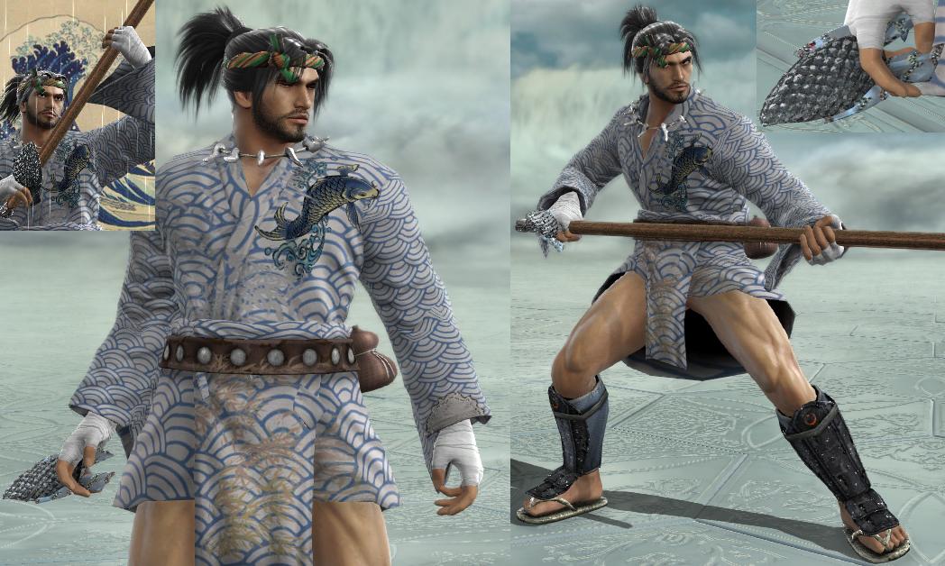
Kichiro is a bit of an unlucky fisherman. Despite that, he enjoys fishing very much and considers himself lucky that he does what he enjoys as a way to make a living. One day, out at sea, a goddess descends to Earth, presents to him a divine lure and assigns him the task of fishing out a sea dragon.

Design Notes:
- Giving the same colors and patterns to the Warrior's Kimono and the Roman Loincloth go a long way in making them look like one article of clothing.

- Low saturation colors and stickers smeared by place-by view give this CaS a ragged and dirty look.

- I settled on Xiba's style when looking for weapons that could pass as old fishing poles. I chose the Kali Yuga and used the tiger pattern to impart a bamboo color and texture. He really looks like he's fishing something out enthusiastically with the 22_88B animation.

- The fish-shaped lure in his right hand is made of a scale-patterned pair of Rabbit Ears and a Bow.
 
Yoko and Kichiro are pretty cool Pas, consistent and fresh (like water ;o)
On a sidenote i love Jet Set radio, so while it was worth a try (the headphones are very well done), the body should be as skinny as possible, with bigger feet and head than arms as well (you can do that using the sliders, and it will then give the right proportions to the body parts you wanna exacerbate)...just my 5 cents, but i have never tried recreating something that whacky (cool idea and brilliant game though)...

make sure you check my latest asian CAS as well if you haven't (Shogun-rugi and Ninja Sieg for instance), they'd go be a fine match for you pair...

the board being very dead, we gotta help each other out right ? ;o)
 
Yoko and Kichiro are pretty cool Pas, consistent and fresh (like water ;o)
On a sidenote i love Jet Set radio, so while it was worth a try (the headphones are very well done), the body should be as skinny as possible, with bigger feet and head than arms as well (you can do that using the sliders, and it will then give the right proportions to the body parts you wanna exacerbate)...just my 5 cents, but i have never tried recreating something that whacky (cool idea and brilliant game though)...
Thanks for your kind words. I haven't been able to make many originals lately, so I'm glad they turned out as well as they did.

Also, Beat is already as skinny as I could make him. All of the body part sliders except for height and maybe muscle mass are already at their minimum value. I suppose I could try exaggerating the limbs a bit in relation to the torso, though I'm not sure how far I can get with that. Beat doesn't wear baggy clothing, so the values for those are going to be a little sensitive.
 
Catching up on threads, and what do I find? Jet Set Radio and Tsuritama mentioned in the same post? YES. I really need to finish watching Tsuritama. And buy Jet Set. And update my stuff. And stay awake long enough to write a coherent comment. And- aaagggghhh.

ANYWAY!

Starting with your originals, I love the draped shoulder effect you have on Yoko; that's a really clever idea and I think it worked well for the concept. I am a little confused by the white and light blue section of her top around the midsection, though; it kind of interrupts the line between the shoulder and the skirt. Really, the biggest complaint I have with the two of them is that the patterning is a little overwhelming in such large amounts; I think Kichiro handles that a little better, since his is broken up with the solid belt. I also rather like his headband; it has this handmade, reed-y sort of look to it that's really charming.

I kinda wish Beat's glasses/goggles were a little larger; they kind of get lost in the headphones to me, and one of the things I'd always associated with Beat was the idea that he looked like an alien with those things. XD Otherwise, though, I think he turned out pretty cool, body size limitations aside; the pattern on the glasses was a great idea and the thought of him using one really, really long spray-paint can as a weapon makes me smile. Gum's rad (is that the appropriate lingo? It's been a while, so I'm not totally well-versed in rebellious whippersnapper) with the patterning on her headphones, and it's always nice to see the Asuka gear being put to good use.

So yeah, good job on these! :D
 
Back