CaS' i made.

Oh gosh, I didn't notice! Sorry (>^.^>

Kitsugen : I like the colors! A good vet samurai look with some demon thrown in I think. Dontcha think he looks a bit cluttered around the upper body? Perhaps the drums and prayer beads clash too much.
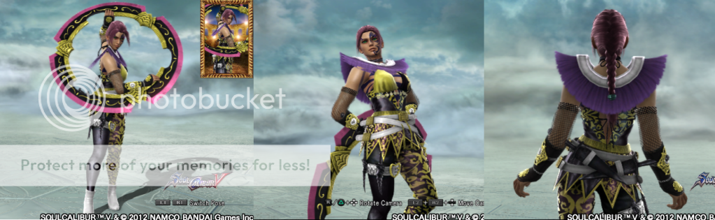
Sun Zhilang : I am... not sure what you did with her arms but that is so cool! She could definitely pass off as Sun Wukong's daughter (or Xiba's sister XD) You're getting very clever with these stickers O.O
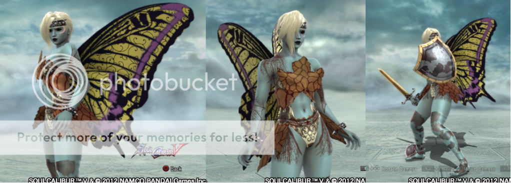
Pyung Hwa : Dunno how to pronounce that XD Simple and gorgeous :) Oooh, so that's what the pocket sticker is for! Unfortunately, I cannot spot the pop culture reference T_T
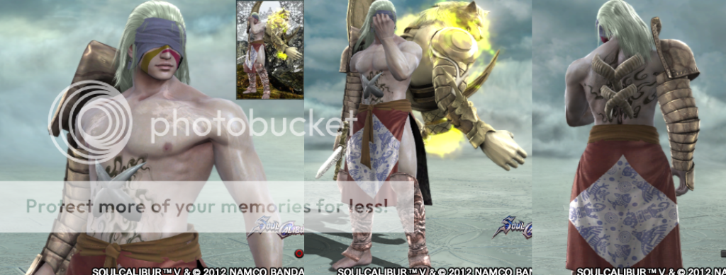
Sundari : Means beautiful in Hindi, right? Nice touch ;) Again, I adore what you're doing with the accessories! Have you tried motif 88 for blood stains? It's pretty convincing.
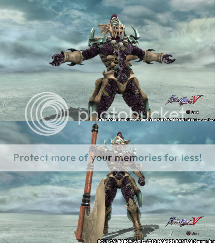
Ungai : Heheh... that thing is creepy. (mario 64 Unagi, that is) In that way, cool homage! I just wish you could give him a gaping red maw XD
 
Hahaha i thought you had forgotten me :D i was kinda getting bummed that after i made CaS with the advice that i got from most people on here, that nobody even gave me any feedback lol but at least u did. Yea i saw that Pocki and Herc like it and i appreciate that they like it, but i'd also like to know what you like about em and what you may dislike.

Kitsugen: Lol i thought that most people wouldn't like the colors even tho i did, glad i was wrong :) Hmm...might be he's supposed to look tank-ish so i made him look a bit bulky on top and i wanted to use the drums, if u think that i really looks wrong i'll remove the beads.

Sun Zhilang: I put fur on em using the raccoon tail :) at first it covered her whole arm area beneath the elbow but i thought it looked kinda weird and ugly seeing how she's a girl, so i just gave her a small patch of fur. Lol thanx.

Pyung Hwa: It means Peace...or was it Love? @_@ Vash: Love and Peace. Well i don't mean that my way of using the sticker is correct, i just put it there bec i thought it looked cool. Hmm...i'll give a not too obvious hint: This manga/anime was the best selling anime/manga until a few years ago. Her design was influenced by it's Main Character.

Sundari: It means both Fairy and Beautiful haha. Oh i dunno maybe i already did @_@ but those aren't blood stains, that is dirt (my fairy does not bleed :@) and i wanted to give her the spiked collar but couldn't bec of the wings >_>

Unagi: I know right? First time i saw it i almost pissed myself T_T (well to be fair, i was about 5 or 6 years old and kind of a scaredy cat). Yea same here, i was trying to give him big teeth by using the metal rooster mohawk special equipment thing (What i used on Kajibana's arm) but to no avail, so i used the mask to give him a more sinister look.

These 5 are the CaS i'm the most proud of, well except for Unagi (he's cool but i like Kajibana a bit more).
 
Here's me at my very meanest since that's what you prefer, lol.

I like Kitsugen alot! He looks like a scary, mechanical samurai.

Sun Zhilang's quite pretty. Her attire fits very well with the Sun Wukong image. I'm not sure what you were going for with the sticker on the bandages though. Is that supposed to be midriff? Her skin's a bit bland, so I recommend keeping the color(2nd #) while maxing out the brightness(3rd #) and the saturation(1st #). The numbers refer to the color coordinates. This gives the skin a healthy glow. If you want to use darker skin tones, you'll have to slightly lower the saturation so that your characters don't look too orange. You can check out these attachments for a comparison.

SOULCALIBUR Ⅴ_2.png
SOULCALIBUR Ⅴ_1.png

The left's with the default saturation of 2. The right's with saturation of 8.

Pyung Hwa's interesting. I'm not too fond of the ninja pants though. I'd prefer a skirt.

Unagi's the most creative of the bunch. Great work with the scale patterns and organic armor! I like what you did with the horns too. I also observe that you've really turned down the saturation. Perhaps he could use a few splashes of bright color here and there to catch the eye.
 
Here's me at my very meanest since that's what you prefer, lol.

I like Kitsugen alot! He looks like a scary, mechanical samurai.

Sun Zhilang's quite pretty. Her attire fits very well with the Sun Wukong image. I'm not sure what you were going for with the sticker on the bandages though. Is that supposed to be midriff? Her skin's a bit bland, so I recommend keeping the color(2nd #) while maxing out the brightness(3rd #) and the saturation(1st #). The numbers refer to the color coordinates. This gives the skin a healthy glow. If you want to use darker skin tones, you'll have to slightly lower the saturation so that your characters don't look too orange. You can check out these attachments for a comparison.

View attachment 13676View attachment 13675
The left's with the default saturation of 2. The right's with saturation of 8.

Pyung Hwa's interesting. I'm not too fond of the ninja pants though. I'd prefer a skirt.

Unagi's the most creative of the bunch. Great work with the scale patterns and organic armor! I like what you did with the horns too. I also observe that you've really turned down the saturation. Perhaps he could use a few splashes of bright color here and there to catch the eye.

OMG *Braces self*

Uh..well...thank you? Now that you mention it...he does look kinda mecha, it's the mask eh? Altho i was going for a phoenix themed samurai lol i guess i failed at that.

Thanks again. Oh no, i was just trying out the Ribbon sticker and made a crappy pattern lol If i removed the skirt thing u could see it more clearly on the legs as well, so it's like i made the pants and bandages unify...i guess. For the skin i went with a Monkey's skin color because she looks more like her mother and to me, monkey's have that kind of color only a bit lighter but i'll try the skin color you just mentioned out and see if i like it :).

Yea, not that it really matters(bec if u dislike it than the name doesn't matter) but those are kung-fu pants lol I won't give her a skirt because she's a farmer and an avid kung-fu practicioner and they don't wear skirts as far as i know. Did you see the reference tho :D? A funny (not actually funny) thing tho, her whole design was built around that Straw hat with the horns on it.

Thank you, i think he's cool as well but not all that good (different strokes again eh ^_^). Uh...Organic Armor? You mean that i made the voodoo stuff look like his bones? With the horns i was thinking FISHBONES! He Needs Em To Look Scary! Yea that's bec i wanted him too look like a grim character, you know....scaring the shit out of people, eating their guts and hiding your stars...doesn't make you one of the most colorful people haha. But i'll play around with the green on his helm and shoulder armor or the stickers on his body.

Thanx for the advice. Much appreciated.
(I was gonna comment on what happened in the Kagome topic....but fuck it, i don't care (no disrespect or anything to you or anyone else).
 
Nice work progressing with your designs. I really like Sun Zhilang. I'm a big 'Journey to the West' fan.

Most of my progress was made thanks to the various people on here that gave me advice on how to use the colors/stickers better and some ideas of their own creations. Oh and thank you.
Really? That's cool, sadly i can't say the same as i've never read the novel even tho i want to :( Everything i know of the novel and Wukong is from Wikipedia. A friend of mine is getting the novel sometime soon tho and i can borrow it after he's done :)

Btw was the leopard/cheetah skin picture of any use to you?
 
This is just my personal opinion, and I'm not trying to bash on you because of your comment on my topic, lol.
I just feel like a majority of your characters have wayyy too many patterns going on at once at it's quite distracting. I feel like some of the patterns would be nice looking on their own, but then sometimes they are clashing with another pattern that doesn't really go with it.
You mentioned how the bright colors on some of my character resemble a "clown", yet your constant use of patterns seems to be more clown like...or maybe that's just me. Again, not trying to sound like a douche, but that's just what it seems like to me.
The one character I am somewhat impressed by though is the Sundari character. But hey, it doesn't really matter what I think or what anyone else thinks. As long as you like your characters then it's all good.

Edit: But I would like to add that your more recent creations are definitely an improvement, so my comments above don't apply to all of them. I'm still learning too though, so I'm not exactly an expert on this or anything.

Thank you for the feedback.

Well, just be honest and i won't mind no matter what u'd say about my chars (Say one bad thing and i hope you DIE!) :)

Well yes, the 1st batch of chars are my experiments lol so i went all nuts with my patterns and stickers on those, the 2nd batch is where i was still experimenting but i tried to make some more solid designs as well like Kajibana and Tybalt for example are ones where i was aiming for a solid design. The 3rd batch is where i was less busy experimenting and focusing more on making a solid design (Using google for basic design ideas like with Sun Zhilang for example, looking up names etc..).

I didn't exactly mean clown but nvm as i explained my self in my latest post in ur topic. However my next 2 chars are pretty much example of what i ment, 1 "clown" character and 1 "serious/realistic" character.

And thank you, i like Sundari as well and also still learning :)
 
@ DokuganRairyu:

Your creations are some of the most impressive from what I've seen so far. Is it because of how you utilize the colors in the most imaginative ways possible...? Or perhaps you were trying to be as original as you can when you create them...? Or maybe you wanted some criticism to make your work better...? Perhaps even all of the above and more...?
I couldn't really tell, to be honest.

In any case, I feel that you've put a great amount of thought in your creations and you're quite talented, too, from the looks of it. There are a few flaws within some of them, but they can easily be remedied, I think. Another thing that I've noticed is that you seem to focus primarily on the use of colors. For me, they really make or break their overall looks sometimes; as well as the difference between a masterpiece and a failure. I believe that you're on your way to mastering the art of utilizing them to flesh out your works; but I think you need to refine, study, and experiment some more. Fortunately, as I've mentioned earlier, these can be easily remedied.

I think I've written too much.... All I could say is that you should continue what you are doing for now, then improve on your work depending on your own taste. :)
 
@ DokuganRairyu:

Your creations are some of the most impressive from what I've seen so far. Is it because of how you utilize the colors in the most imaginative ways possible...? Or perhaps you were trying to be as original as you can when you create them...? Or maybe you wanted some criticism to make your work better...? Perhaps even all of the above and more...?
I couldn't really tell, to be honest.

In any case, I feel that you've put a great amount of thought in your creations and you're quite talented, too, from the looks of it. There are a few flaws within some of them, but they can easily be remedied, I think. Another thing that I've noticed is that you seem to focus primarily on the use of colors. For me, they really make or break their overall looks sometimes; as well as the difference between a masterpiece and a failure. I believe that you're on your way to mastering the art of utilizing them to flesh out your works; but I think you need to refine, study, and experiment some more. Fortunately, as I've mentioned earlier, these can be easily remedied

I think I've written too much.... All I could say is that you should continue what you are doing for now, then improve on your work depending on your own taste. :)
img-thing

Well, the most important thing to do with my CaS', is to make em as unique as i can (pretty much impossibru seeing as how everything has been done already). After that of course, i want some feedback to know my weakpoints and my strengths so i can improve on my CaS'. Speaking of, could u name a few flaws that u saw in a few of my characters?

Hmm...i do focus on colors but the attire is what matters the most to me, so colors would be my 2nd biggest focus.
I am still experimenting, but i focus more on trying to make a solid CaS...and it kinda feels like im running out of tools to use...sadly...
Thank you, i will. Later today i will upload 3 (maybe 4) of my redisgned CaS' and i hope you (and everyone else) will like it :)
 
Sundari: This here is Sundari, she's a moon fairy that got abducted from her home town and was about to be sold off at an auction of mythical creatures.
But all of a sudden a bunch of pirates stormed in, kicking the asses of all the auctioners because their mermaid friend was being held there as well.
Using this distraction, Sundari fled the place. This is how she looks like during the getaway.
SOULCALIBUR_28.png

I actually wanted to give her the spiked neck collar as well but couldn't bec of the wings.

Unagi: I based him off of this bec well...it gave me nightmares when i was a kid lol: http://www.2d-x.com/wp-content/uploads/2010/10/mario64.jpg
SOULCALIBUR_26-1.png
I'm really diggin' these two, Sundari just look so well matched up (leaves flow flawlessly with the hunter bikini, and the skin tattoos look great) I don't think the studded bracelets/headband make a whole lot of sense as a runaway slave though, maybe the arms chains and some other type of headband? Just wouldn't imagine slavers would give studded/spiked anything to their slaves.

Unagi looks awesome over all, but I especially like his protruding ribs. He REALLY reminds me of Abyss (which is a good thing).

LOL You are indeed right about that. The thing is tho, that the whole setting of the world that she comes from is Gothic Macabre themed. Those usually have spiked things so i thought it would fit rather nicely, i thought it was an insteresting idea to take a generic Fairy and put her in a world like that. Sundari is the result of that. The tattoos are supposed to represent dirt :)

That just made me realize that the Voodoo set is based of Abyss O_O, tbh i'm not all that proud of him...
I find it dissapointing that i had to use the complete voodoo set (except for the head) to get my vision of a Humanoid Unagi across :( Yea i don't like to combine preset stuff lol maybe 2-3 pieces (3 is kinda pushing it tho) of one set, but that's as far as i go.

Well im glad you liked em and tnx for the feedback :) OH btw, are there any character that you did not like or think were ugly etc...etc...have negative thoughts about?
 
So, 3 of my chars redesigned:

@Tilse
This is my example of an realistic character (Well what imo is realistic).
Vetala P2: I was thinking, ancient guardian that kind of gives off a boss type character feel. I wanted to give him some kind of sash like the one Kenshin has accross his chest, but i couldn't think of anything :(
SOULCALIBUR_8-1.png

This is my example of an eccentric character (Well what imo is eccentric).
BTW Alfimi, i succeeded at making fishnet stockings :D
Megara P2: I went with the more carnival-ish thief look on her this time, oh and she's wearing eyebrow piercings and the short boots, just mentioning it because it might be hard to see.
SOULCALIBUR-2.png
 
The final character you posted has a awesome helmet modification. I can't believe that those two parts look so good together. Kitsugen and Sazen happens to be my favorite though. Oh and Pretty Guy's crazy costume.
 
The final character you posted has a awesome helmet modification. I can't believe that those two parts look so good together. Kitsugen and Sazen happens to be my favorite though. Oh and Pretty Guy's crazy costume.

So you like Swordsmen i see lol and i had my doubts about that helmet accesory so it's nice to know that it fits.
Thank you for the compliments and feedback. Awesome Avatar btw Cervantes is my fav SC characters as well :D
 
I like your Pyung Hwa, she looks cute and her colors you have chosen look great too *-*
Unagi looks very interesting , he reminds me a little of abyss (maybe because of the color patterns) ^^
 
Back