CaS Review Thread

I find Le Bello, brucege, and ThePascuzzi the best bets. When I read their reviews I'm at ease.

There's also Gatsu but he isn't always judging. However, it's up to him if he wants to help out.

Imho you chosen a very good trio, Le Bello is a fun community dude ever willing to help, and the other two are definitely way above average creators that can not only review but also give good suggestion to improve
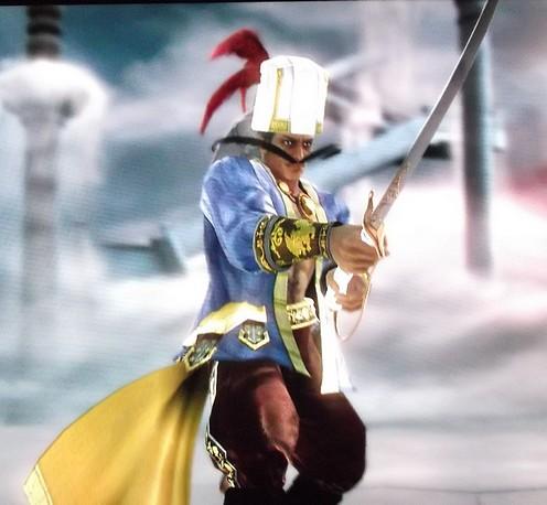
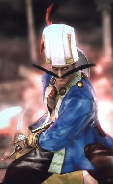
I will add just Chobek because in many of his CaS you can find a lot actual "research", wich is one of the absolute most important things on chara design and still is so underrated/almost never done

This for the review thread itself

For the thread real target, aka resurrect the CAS forum, i don't know
Maybe as mod you can open a thread (not "sticky", i've impression that normal thread get more attention) to collect ideas to resurrect it and maybe even do a list of members willing to keep it alive
On reality don't need even so much, as long you have 20 posters that post a lil bit here and there everyday the forum will keep exist

The thing is that when you have dead days like today, even who is still active will probably get tired soon
 
  • Thread starter
  • Moderator
  • #23
I would like someone to review my recreation of Lucina from Fire Emblem Awakening http://fireemblem.wikia.com/wiki/Lucina
Lucina(fire emblem awakening)
F87B02F4-EC16-4BE1-A214-E3593D45C817-5305-00000A26AD04BD5C_zpsedf6a4f7.jpg
6B0D3B3F-C88F-47C7-A5D4-930AA18B0AE3-5305-00000A26B360C007_zpsf24a3e69.jpg
48B953E5-D8D8-498D-A7A0-4DA339CA4D5E-5305-00000A26B7B7C9C5_zps0ae2f475.jpg
B52A494E-B3F4-4405-86BF-A0867012B92D-5305-00000A26BCA92898_zps0f99c5c1.jpg
1. Aesthetics: It's difficult to critique the aesthetics since it's a recreation, but you did a great job! I love how your equipment is all highly form-fitting. No awkwardly floating shoulder guards or fat tops. You did a good job of breaking up the primary color (blue) by interspersing black (or dark blue) on her flanks, arms, and thighs. In addition, the high variation of patterns and stickers keeps all that blue from getting too boring. I especially love your work on her blouse. The enlarged ornament on her cape is a great centerpiece, providing just the right amount of emphasis (pop) to the outfit. If you haven't done so already, try swapping out the "Lord's Mantle" for the "Black Cape" and the "Cuff Boots" for Pyrrha's boots. Also try bringing that stripe pattern onto the skirt, just like you did for her blouse.

2. Creativity: That blouse in particular was well executed. You re-sized the stripes until you got two evenly spaced lines in the center and covered the rest with a carefully placed pocket sticker. I've seen the technique used before, but the cape ornament, consisting of the halo and the apple, was also nicely done.

3. Coherence: Most of the design's already been taken care of for you, so you can't really go too wrong here. As a soldier, she has a highly utilitarian (practical) outfit, but the cape ornament and the skirt zettai ryouiki (http://tvtropes.org/pmwiki/pmwiki.php/Main/ZettaiRyouiki) remind us that underneath that hardened exterior, she's still a hot babe.

Your finest recreation yet! I hope to see you bring some of these techniques to your originals!
 
  • Thread starter
  • Moderator
  • #24
This.

Also, Koko what did you mean when you were talking about having 3 judges? Was it to say that people would post a CaS, and then the selected judges would be the ones reviewing?

But for now I'll throw something in here, since nobody visits my thread :P

Hakan the Janissary:
Sorry for the lack of angles. The pics Vil takes are all I have. The boots are just Pat's boots with gold detailing.
vsseDrj.jpg

bnAjZpl.jpg
Aesthetics: The red, blue, and yellow all have just the right amount of saturation, and they are tastefully distributed throughout the outfit without any need for matching. The large necklace does a good job of filling up the naked space between the jacket borders, which have a stripe pattern to keep things interesting. The mustache is both masculine and hilarious. The hat is a little large, so I recommend giving him some more substantial hair. While the Patroklos belt works in theory, the clipping through the jacket is just too prominent for my tastes. The bat wings could also use some adjustment. Try angling the bat wings' tips outwards so that they appear to flow out of the hat.

Creativity: Bat wings are a good item choice to simulate the hat cape thingies, and they'll look even better with the changes I recommended above. Excellent use of the butterfly antennae for mustache.

Coherence: Exceptionally good. Absolutely everything contributes to Hakan's image, including the scimitar, the chest hair, the exaggerated mustache, flowing jacket, and puffy pants. No piece of equipment is wasted and best of all, no gratuitous patterns or stickers.

It's clear that you battled with the CaS system's limitations, but the end product was a faithful and mantastic rendition of the Janissary.
 
Highly grateful for the review brucege, I'm glad you liked the character, as it's probably one of my favourites of mine.

The colours were something I was initially worried about - Three bold colours doesn't usually work, but I wanted something that was extravagant and yet subdued at the same time. It's nice to know that it seems I achieved this.

I'll look into changing the hair - The hat DOES sort of float at the sides of his head in retrospect.

The Pat belt doesn't bother me so much, as the clipping is hardly noticeable in battle, but I'll look into alternatives. Originally he had that orange belt, but the shape of the character became too rigid. I'll see what other options I have.

As for the hat-cape, I recently bought some DLC I didn't have, and replaced the wings with the paper talisman. It looks much more effective now, but thanks for the suggestion, it made a difference :D

no gratuitous patterns or stickers.

I live by this rule, so thank you for commenting on it. Mantastic indeed! ;}D
 
Fallen Angel

SO SORRY FOR THE LATE REPLY. Lifestuff and things you know?

Aesthetics:
There's a very BDSM look to this design, from the lingerie to the thigh-high boots and the exposed breasts. Coupled with the blue skin, there's a real twist on the archtypal "fallen angel" trope, thus telling us just what kind of "angel" we're dealing with and how she's "fallen".
The pieces are used well to us the character's story at a glance, without resorting to anything too obvious. It's nicely decorated and simply coloured, which give it enough decadence without being garish. Props for not simply turning the wings black and calling it a day.

Creativity:
The breasts are some of the better ones I've seen in a CaS, and the clever mixture of the head ornament with the chest piece really draws attention to them in a way that still allows you to appreciate the rest of the design. In short, they're a focal point but they're not distracting either. I mentioned the wings earlier, but them being grey as opposed to black or white carries a lot of symbolism with it, which is excellent.

Though I feel the succubus arms/snake shoulder is a little overdone/obvious, it's still really suitable.

Coherence:
Everything that's been added works in tandem with the character, giving her a clear and refreshing synergy. The hair/skin colour compliment each other well, and white/black are always nice choices, with gold being a perfect complimentary colour. The purple matches the blur and means that you have a creation with 5 colours that doesn't look odd, which is difficult to manage.

Whilst such characters don't appeal to me personally, this Fallen Angel is certainly extremely well made in a bunch of simple and subtle ways. You sure know how to use colour well, it's a shame that each breast requires one of your ExEq slots, as I'd like to've seen more non-standard stuff, but ce la vie.
 
So here is a old designer the Bishop mostly based on the chess piece, on its own it reminds a mage but yet the mystical of the Bishop, so he have a dark, blue and grey scheme because of the pieces that might represent anyway, I would love to better the designer because is one of my favorites
.
 

Attachments

  • SOULCALIBUR Ⅴ_4.png
    SOULCALIBUR Ⅴ_4.png
    421.3 KB · Views: 747
  • SOULCALIBUR Ⅴ_5.png
    SOULCALIBUR Ⅴ_5.png
    454.6 KB · Views: 657
SO SORRY FOR THE LATE REPLY. Lifestuff and things you know?

Aesthetics:
There's a very BDSM look to this design, from the lingerie to the thigh-high boots and the exposed breasts. Coupled with the blue skin, there's a real twist on the archtypal "fallen angel" trope, thus telling us just what kind of "angel" we're dealing with and how she's "fallen".
The pieces are used well to us the character's story at a glance, without resorting to anything too obvious. It's nicely decorated and simply coloured, which give it enough decadence without being garish. Props for not simply turning the wings black and calling it a day.

Creativity:
The breasts are some of the better ones I've seen in a CaS, and the clever mixture of the head ornament with the chest piece really draws attention to them in a way that still allows you to appreciate the rest of the design. In short, they're a focal point but they're not distracting either. I mentioned the wings earlier, but them being grey as opposed to black or white carries a lot of symbolism with it, which is excellent.

Though I feel the succubus arms/snake shoulder is a little overdone/obvious, it's still really suitable.

Coherence:
Everything that's been added works in tandem with the character, giving her a clear and refreshing synergy. The hair/skin colour compliment each other well, and white/black are always nice choices, with gold being a perfect complimentary colour. The purple matches the blur and means that you have a creation with 5 colours that doesn't look odd, which is difficult to manage.

Whilst such characters don't appeal to me personally, this Fallen Angel is certainly extremely well made in a bunch of simple and subtle ways. You sure know how to use colour well, it's a shame that each breast requires one of your ExEq slots, as I'd like to've seen more non-standard stuff, but ce la vie.
Great Review! thanks!
 
  • Thread starter
  • Moderator
  • #30
So here is a old designer the Bishop mostly based on the chess piece, on its own it reminds a mage but yet the mystical of the Bishop, so he have a dark, blue and grey scheme because of the pieces that might represent anyway, I would love to better the designer because is one of my favorites
.
I got you on this one, Ramus. Lemme finish my stupid paper first.
 
  • Thread starter
  • Moderator
  • #32
So here is a old designer the Bishop mostly based on the chess piece, on its own it reminds a mage but yet the mystical of the Bishop, so he have a dark, blue and grey scheme because of the pieces that might represent anyway, I would love to better the designer because is one of my favorites
.
Aesthetics: The balance is quite good. You break the primary color of black with a few splashes of grey in the feathers, shoulder guard, feathers, gloves, and bootlaces. You also achieved rhythm by spacing these colors out unequally (which is a good thing, since you don't want it looking like a uniform). For example, while we see a mass of grey on the chest (feathers plus sticker), the grey is only repeated at the very bottom, i.e. the laces. The Baihu coat does seem a little bulky, but there's an easy trick to fix that. All you gotta do is give him a leather belt. For some reason or other, the belt remains mostly hidden under the coat while nicely cinching in the coat at the waist. For an example, search for the Freya in my gallery. Next, you should play around with the body parameters. Minimize the waist and thigh for a more tight fit. However, I highly recommend adding a bit more emphasis to the outfit. All the colors are really soft, so you should add a few splashes of bright color, possibly replacing the blue/purple for a bolder color like gold. You can start with the hat rim, monocle, coat flower pattern, or coat bordering. I also recommend adding some random giant pocket stickers just to add some texture to the Baihu coat

Creativity: It was really cool how you paired the feather accessories with the feather sticker. As noted above, you should consider adding some more bump-mapped stickers for the texture.

Coherence: The tall hat, monocle, and feathers all contribute to the image of a dark mage/heretical priest performing the black mass in front of a mob of Satanists. Sure, it's been done before, but you did it with panache. I do recommend getting rid of that hand ring, since it doesn't really contribute to this image. Try taking them out and adding more feathers to continue that motif. Maybe a pair of the Goddess feather brooches would look good on the shoulders.

Keep up the good work, Ramus! I'd love for you to post an updated version on this thread if you've got the time.
 
Awesome thread idea!

Can you review my Crash Bandicoot? I'm a big fan of the early Crash Bandicoot games. I mostly want to know how I can improve my CaS if possible.

I used a rotated and flattened heart shape and a circle sticker for the snout. For the nose, I put a small bolt through the heart shape. For the rest of the face, I decided to keep it mostly normal except for using white circle stickers to make his eyes look larger. The reason I didn't draw the face from scratch was because I liked one of the eyebrow sets.

SC5Crash_zps79916609.png
 
Awesome thread idea!

Can you review my Crash Bandicoot? I'm a big fan of the early Crash Bandicoot games. I mostly want to know how I can improve my CaS if possible.

I used a rotated and flattened heart shape and a circle sticker for the snout. For the nose, I put a small bolt through the heart shape. For the rest of the face, I decided to keep it mostly normal except for using white circle stickers to make his eyes look larger.

SC5Crash_zps79916609.png

Crash Bandicoot will be a tough recreation. I don't think you (0r anyone ) will be able to pull off a true 1 to 1 given the limitations of the CAS system. So, I will review your CAS with that in mind.

You said>" The reason I didn't draw the face from scratch was because I liked one of the eyebrow sets."
The head is the place where the character and spirit of this creation are conveyed. The eyebrows, the hair and the added animal features do the most to capture the Wily cartoonish nature of Crash. Maybe the impossibility of the large head forced you interpret rather than mirror what you were trying to recreate.... But .... I feel there is a personality to the head that works well.The flip side of that , is this... I think some of the decision making elsewhere was not as thorough, and gets a bit boring.
To be specific, if I were recreating this... I think I would start with body proportion ... he is overall a huge wedge narrowing down to a pair of huge feet. I would max out the chest and upper arms and leave everything else emaciated. I would then look at sticker choices. On the chest you use a square(? ) but as the shape hits the waist it acts against you ... I believe the shape could work for you if it were tapered. You will never be able to have the impossibly thin waist of the actual Crash... but having a large field of light yellow on the belly actually makes that part of the body seem large instead of small.
Playing around with these things could throw the balance off, I could be wrong... or setting you up for all new problems.............but if you are unsatisfied with what you have and are looking to change, that is where I would start.

-don't get me wrong-

I think you did a good Job ... I think of Crash when I see him... so don't take any of this as harsh. I do a lot of recreations myself ... they excite me ... like solving a puzzle, so I just kind of dove in with strong opinions .... take what you can from it.
:)
 
Thanks for the review!
It's probably going to be my final design for Crash, but I might experiment with the yellowish sticker and making eyebrows from scratch for Crash's face. I've tried to adjust the body proportion before, but it became too hard because of the real Crash model not having a human shaped neck. Overall, Im satisfied with my Crash and I'm glad SCV's creation can make him that accurate.

The features and limits of CaS can get very overwhelming when trying to recreate a character almost perfectly, so I try to have an easy strategy for recreating. I keep in mind that all the SC creations have a base body shape of a realistic adult human, so I first check if the character is human shaped enough to make, and then build around the human shape. The way I like to start is with the non adjustable parts. I save the stickers and adjustable equipment for last, because those parts are limited in number and may need a lot of precision work.

I realy like doing recreations too, because it can make SCV feel like a huge crossover that lets you add almost any character you want. I don't usually work very precise on my creations, but I like attempting some of the hardest characters to make. I'm usually more about quantity than quality with my creations, but my Crash was an exception, because Crash Bandicoot is my most favorite game character. :)
 
Yeah, he's real nice. Like I said he makes me think of Crash.... The two pics next to one another have the same vibe so to speak... And that's a real accomplishment.
:)
 
I could never make the dazzling red dress I've always wanted to do without editing actual 3D models, so instead I aimed for something a little bit different.

Mary-card.png
Mary7.png
Mary.png
Mary2.png
Mary3.png
Mary4.png
Mary5.png
Mary6.png


Wanted to add a bit of eye-catchingness with a bit of asymetrical see-through sections and make anyone that sees the character wonder if what's underneath is even more scandalous(one of few characters I've made that are boring when broken: just plain black undies). I can't even say how tempting it was to make this tasteless and have a nip slip instead of the flower covering there, it was so difficult to resist D:


EDIT: Oh man, my spelling and grammar was terrible. She uses Raphael style, BTW.
 
Before I comment further, I have a question. Am I seeing two patterns on the dress? As far as I know, that's impossible. Aside from the see-through portions, the red portions look like they're actually checker-patterned. Is that what's actually going on, here, or is there some post-game capture editing going on? Maybe it's just the picture quality?
 
Back