- Thread starter
- Moderator
- #81
brucege
[14] Master
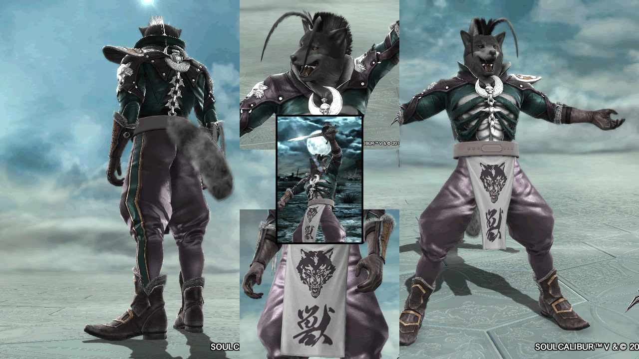
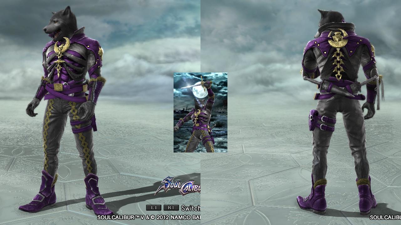
Aesthetics: V only has two colors, and the design is deceptively simple, but the balancing of white and black is masteful. The boldness of the stripes on his limbs are balanced by the relative modesty of the upper body. The high lateral asymmetry (more black above, more white below) and high diversity of shapes (straight stripes, angled jacked) also stave off the homogeneity often associated with black/white color schemes.
Technique: Very high. I can see the tribal sticker around the mouth, but I still can't figure out the nasolabial fold or the eyebrows. Needless to say, if you have me stumped, you've done a pretty good job. Good use of the star (and no, I didn't miss it, even the first time lol) to cut out the jacket and the Chinese characters of write the "V". Oh, and the rosy cheeks with the demon horns and the top hat with the cylinder.
Coherence: V is supposed to be all black, which doesn't really go well in SCV CAS, but this alternate costume does the trick, bringing out his whimsical, trolling side as I mentioned before. The sharp cuts of his tailored clothing is both theatrical and elegant, fitting for the man who blew up the Old Bailey in time with the 1812 Overture. Excellent work.