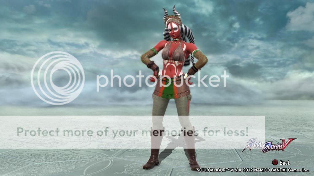
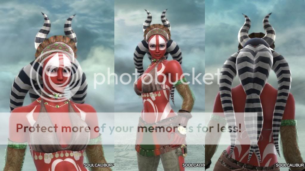
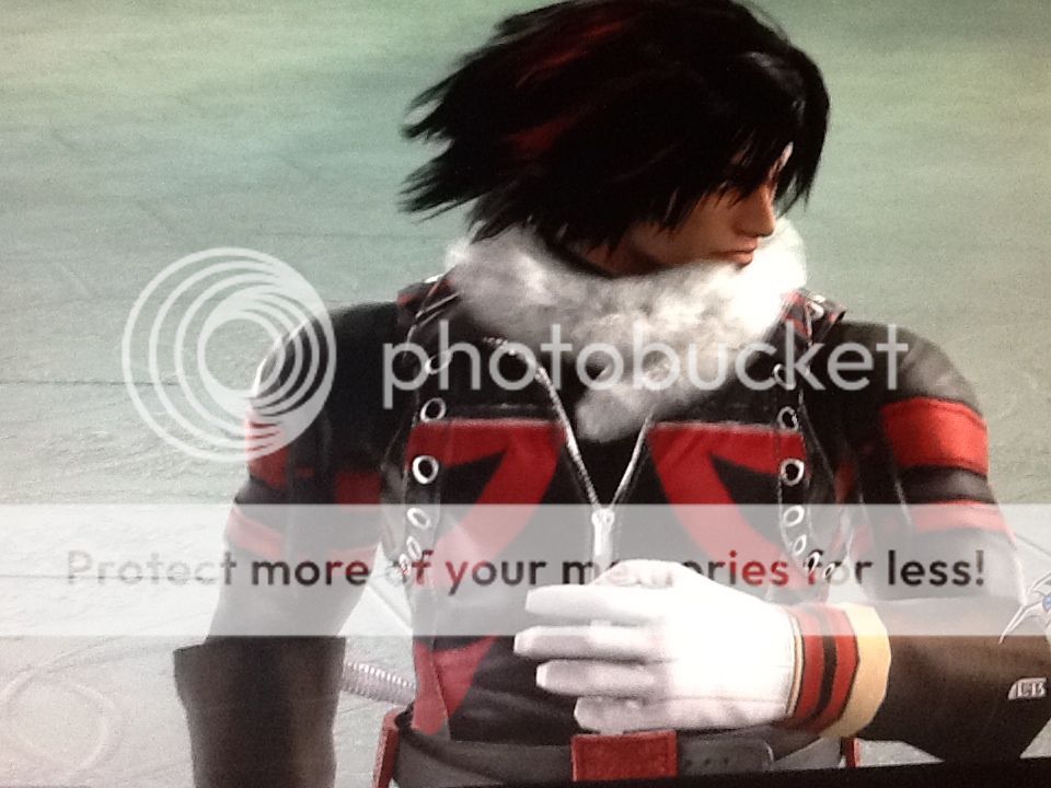
I could never make the dazzling red dress I've always wanted to do without editing actual 3D models, so instead I aimed for something a little bit different.
View attachment 31462View attachment 31461View attachment 31455View attachment 31456View attachment 31457View attachment 31458View attachment 31459View attachment 31460
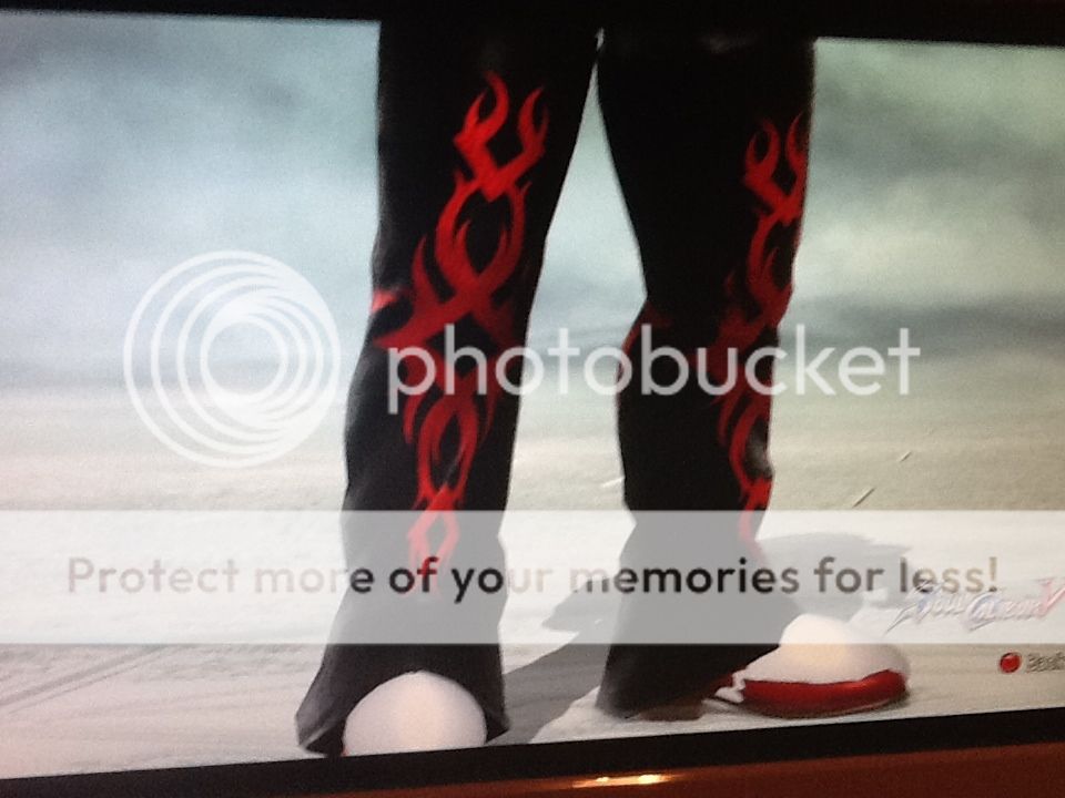
Wanted to add a bit of eye-catchingness with a bit of asymetrical see-through sections and make anyone that sees the character wonder if what's underneath is even more scandalous(one of few characters I've made that are boring when broken: just plain black undies). I can't even say how tempting it was to make this tasteless and have a nip slip instead of the flower covering there, it was so difficult to resist D:
EDIT: Oh man, my spelling and grammar was terrible. She uses Raphael style, BTW.
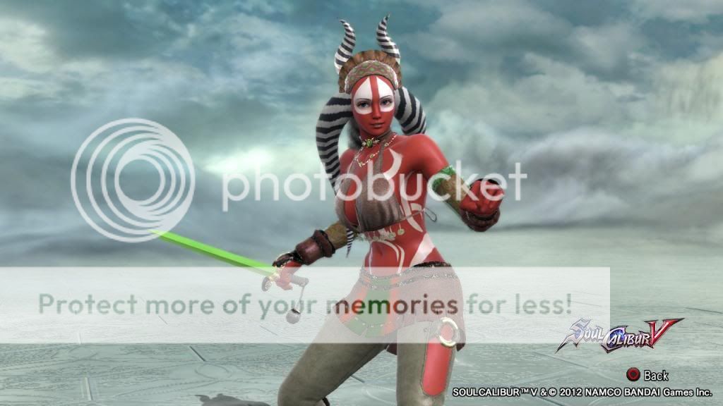
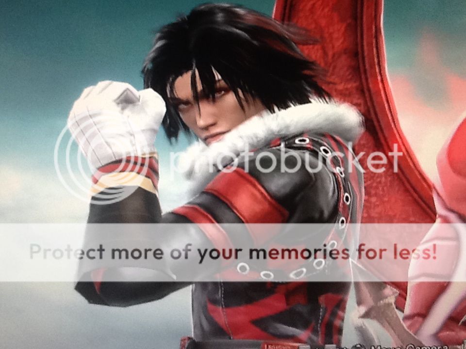
My first response to this was an appreciation of her sultry nature... that is one hell of a slinky dress, the colors are warm and inviting, the choice of sticker placement highlights her natural (digital) curves... I am left with the impression that the woman depicted is a sexually mature, self possessed female who uses her body itself for tactical advantage. Like the red plume on a spear, her curves will dazzle, and you won't see the blade.
also... this comes to mind-
Naked Illusion
The Review-
Aesthetics: I think the sweep on the front of the dress accentuates the form well. The choice of placement on the main lace segment is a great framing device for what makes that specific dress appealing. The main sweep of the lace section takes your eye nicely from chest to hip in a very fluid way. I think the placement of that sweep is the strength of this creation.
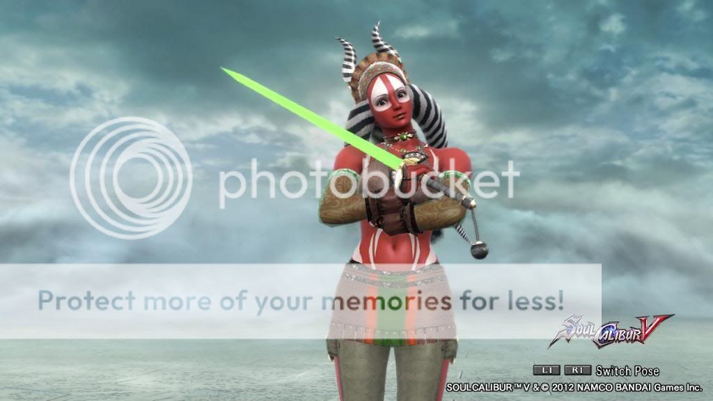
I for one would have preferred to see the nip slip.( .... I don't worry too much about seeming tasteless ..... But...) I believe your design would benefit aesthetically from the removal of the flower wreath sticker. The sweep of it across the exposed breast is visually a bit clunky. Even if you ultimately decided that a nip slip is just too tacky I would go with a smaller sticker that covers only the tip of the breast. (like a pastie .... not tasteless alt all LOL) I think if you visually connect the nipple covering sticker to the edge of the non-lace portion of the dress you defeat the nice sweep you have set up. Also .... and this might just be me but there is a tease play running back and forth and weaving in and out on her. You feature exposed and revealed like light and dark - the covered eye on the same side that the breast is revealed ... the energy that is created by that little strip of flesh tempting you with potential exposure at the top of the tall boots just underneath the high slit of the dress...there is a push and a pull. It reminds me of the Ying/Yang symbol. Like the white dot floating in a sea of black, or vise-versa. It is a balance. I think having a smaller sticker surround by a sea of lace would work to highlight the area and create a nice balance...
I am getting a little too wrapped up in specifics ... so let me move on
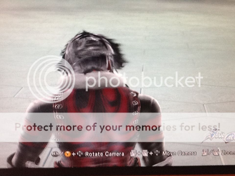
I think the back is not as successful... the design doesn't do as much for the form.
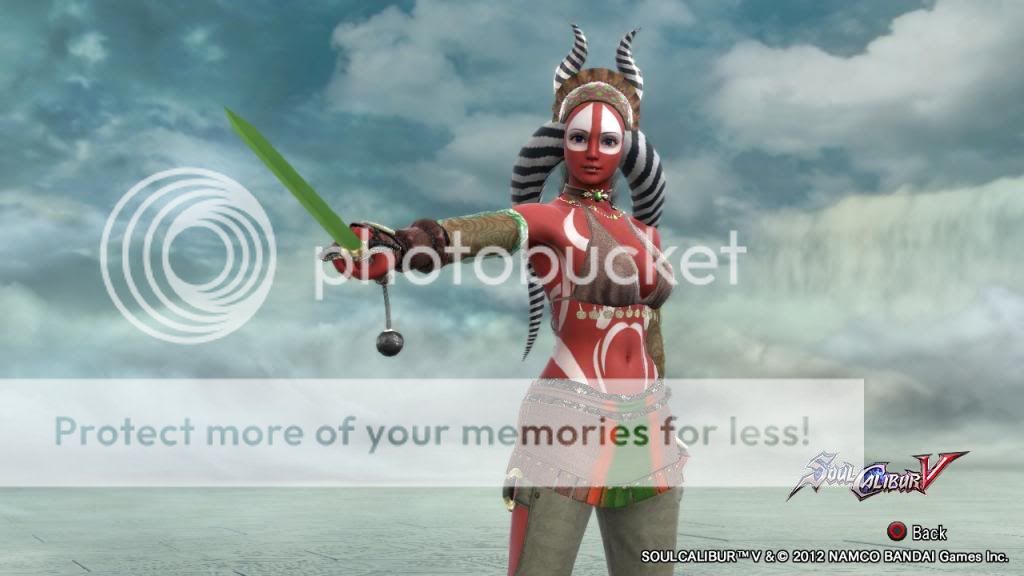
but all and all I think she is elegant.
Creativity... you know I think I mashed everything together up there .... sorry to violate the form of the board like this but I am going to skimp on the last two areas and say ... the lace work was a clever and creative idea... and it seems like a coherent design... :)
I think she is beautiful... if this wasn't the review thread I would have said ... Cool and hit the like button.
I bet she is nice in game.
:)