Navigation
Install the app
How to install the app on iOS
Follow along with the video below to see how to install our site as a web app on your home screen.
Note: This feature may not be available in some browsers.
More options
You are using an out of date browser. It may not display this or other websites correctly.
You should upgrade or use an alternative browser.
You should upgrade or use an alternative browser.
Gauntlet's Cas Gallery
- Thread starter Gauntlet
- Start date
brucege
[14] Master
Glad to seeya back man. Comin' out strong wi'dem cyberpunk creations, 'specially dat Raiden. Why din'tcha just res ur old thread? Oh and stop by the CaS contest thread fo shits n' giggles sometime: http://8wayrun.com/threads/most-esteemed-one-shot-contest-thread.15703/
VILARCANE
[14] Master
Solid RCas on display here :)
Gauntlet
[09] Warrior
brucedge: Thanks bro, it´s good to be back (again...). Nah, I just got bored of that thread already, so I made a new one, nothing really special. As for the contest, I made my entry and really love the idea! Oh, one more thing, I really miss your accurate reviews, so if you ever feel like posting something I would gladly read it :)
VILARCANE: Thanks man, I sincerely appreciate and respect your comments and it's always rewarding to have my old teacher on my thread XD
AustinTheGuy: Thanks dude, glad you liked it!
Now, more cas!
Legends of Camelot (my version of some characters)
King Arthur
Queen Guinevere
Lancelot
Merlin
VILARCANE: Thanks man, I sincerely appreciate and respect your comments and it's always rewarding to have my old teacher on my thread XD
AustinTheGuy: Thanks dude, glad you liked it!
Now, more cas!
Legends of Camelot (my version of some characters)
King Arthur
Queen Guinevere
Lancelot
Merlin
brucege
[14] Master
King Arthur: Surprisingly aggressive color scheme. I always thought of Arthur as more of a blue/gold shounen protagonist kinda guy, but the red/gold does grow on me. You put those clunky gauntlets and boots to great use here. I generally have a difficult time using them due to their bulkiness and plainness. However, you balance the bulkiness of the limb armor with the large custom crown and the fur lining on the cape. Oh, and for a cool ruffled/ragged texture on furry equipment like the raccoon tail, use a bump mapped pattern like the leather or scale pattern. You also offset the plainness of the limb armor by increasing the detail on the chest and waist armor. Really cool how the pauldrons merge with the golden chains on the chest armor. While I like the bordering effect on the waistcloth, I think the bird insignia weighs down the design by dragging the viewer's attention too much towards the crotch. It's also a bit too close in size to the decoration on the wrestler belt so it looks like two similarly sized objects stack atop one another. I'd replace the bird with some flashy pattern.
Queen Guinevere: Very nice. Exceptionally good technique on this one. I really like how you tie together the stickers on the arms with the Elysium jewelry. You also like how you layered the breastplate over the dancer's underwear for the extra bling. Great use of the raccoon tail for extra coverage too. Try applying some bump-mapping on this one too. The helmet's looking good. Reminds me of Marvel's Scarlet Witch. Again, the one thing that I can't completely agree with is the emblem on the waistcloth. Just a matter of taste though. Alotta interesting techniques came together on this one for a very unique look. Again, she's a lot more aggressive than I might expect of the Queen, but I'm sure your interpretation of the Arthurian Legend is a lot more violent and epic.
Lancelot: Channeling Artorias I see. The turtle shell looks especially good in the way it merges with the breast plate's scarf. I also like how the scaled chest armor merges with the waist armor. Sure, I've seen the same technique on your elf prince, but the attitude's different here. Very Monster Hunter kinda vibe. I don't like the coloring on the waist cloth though. It's way too different from the rest of the design. I understand you're trying to tie him to the red/gold motif, but he'll look much better if you matched it with the rest of the outfit. I do like that cool wavy effect on the pocket stickers though. No idea how you managed that.
Merlin: Very natural-looking facial hair. The upper body is somewhat lacking in detail though. You could try layering or bump mapping it a bit for fun. Cool stickering with the double dragons on the hat. Too bad they're so difficult too see. I like how you applied a gold border to the pants with a giant zipper sticker.
Your creations are looking top notch. You've mastered SpecEq, stickers, and bump mapping. Now you can use your techniques to try weirder stuff. Come check out the School of Advanced CaS technique sometime:
http://8wayrun.com/threads/school-of-cas-advanced-cas-technique.18282/
You'll recognize most of the techniques there, but it'll help you to organize and take inventory of all your CaS knowledge.
Gauntlet
[09] Warrior
No matter how many times I read your reviews I'm always wowed by them, please teach me to write like that dude!
About the Arthurian Legends, you're absolutely right about my interpretation. Well, you see, reading the chronicles of Camelot made me change my mind about the characters. Arthur really enjoys war, he is like a different person in battle. Sure he has his thoughts about justice and equality and bla bla bla..., but he is primarily a pure warrior.
Guinevere is a masterpiece. Sure, she's portrayed as the perfect queen, but for me she's much more like a "femme fatale". She betrays Arthur with her "true love" Lancelot, but plots and manipulates them both, how awesome is that? It's like Game of Thrones in Camelot :D
Anyway, thank you very much for the tips dude! Oh, by the way, the wavy effect it's just putting the pocket stickers "Place by View", adjusting the position and done.
For now, I don't have any ideas about my next patch, so if you guys had any suggestions as well as feedbacks I'll gladly read them.
VILARCANE
[14] Master
VILARCANE: Thanks man, I sincerely appreciate and respect your comments and it's always rewarding to have my old teacher on my thread XD
Man, i forgot, not that i took that many CAS creators under my wings, but actually quite a few, only most have left long ago...but now i remember you...i think what i remember with the biggest smile on my face is the feedback i got from that other guy i made that custom OC based on his background story...fun times, i felt so much respect and love it was cool
It is somehow a joy to see creators are still alive and kicking, while i am completely over and out (well, not 100%, as you can see).
Alas, my magic power was bereft of me (oh well technically, my xbox360 was, but that wouldn't be an excuse, right)
So keep it up, that knights of the round and co. batch is really good and improving, i can't review it because then i wouldn't know what to add to Brucege's, and i don't want you to be as perfectionist as i once was (it is a sickness of sorts, as it completely drains you), so i won't be (nit)picking out the few things i would have done differently design or technique-wise...
Keep it up, padawan :)
brucege
[14] Master
@VILARCANE: As a matter of fact, I really miss your nitpicking/perfectionism. Most of the people round here are too nice to me lol.
@Gauntlet: What's Chronicles of Camelot? Do you have a link for it? Sounds like a fascinating read. I imagine it's got the same vibes as Dumas' works (3 Musketeers, Count of Monte Cristo, etc.) Oh, those would make fun CaS topics too. You might also try more light armor/ranger CaS to practice bump mapping and layering. Like Robin Hood or fairy tale CaS. I'm glad you appreciate the reviews. Watch one or two episodes of BBC's Sherlock and read a couple of the original shorts, and you'll be deducting like a pro in no time.
@Gauntlet: What's Chronicles of Camelot? Do you have a link for it? Sounds like a fascinating read. I imagine it's got the same vibes as Dumas' works (3 Musketeers, Count of Monte Cristo, etc.) Oh, those would make fun CaS topics too. You might also try more light armor/ranger CaS to practice bump mapping and layering. Like Robin Hood or fairy tale CaS. I'm glad you appreciate the reviews. Watch one or two episodes of BBC's Sherlock and read a couple of the original shorts, and you'll be deducting like a pro in no time.
Gauntlet
[09] Warrior
Hey guys, sup?
Well, I've been playing a game called Gems of War (free on psn =D) and I decided to make some sort of recreation/remake (since the images of the troops don't show them properly =/) of some of the game's troops.
Hope you like it!
Bruce: That was a "collection" of some of Camelot's tales from various perspectives, but I really don't remember the writer (or writers) and I found out recently that my mom got rid of it by accident... really sad.
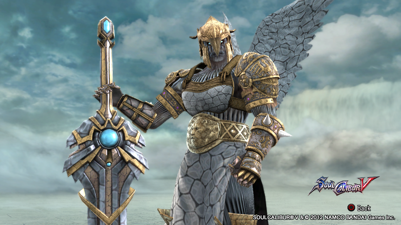
Archon Statue


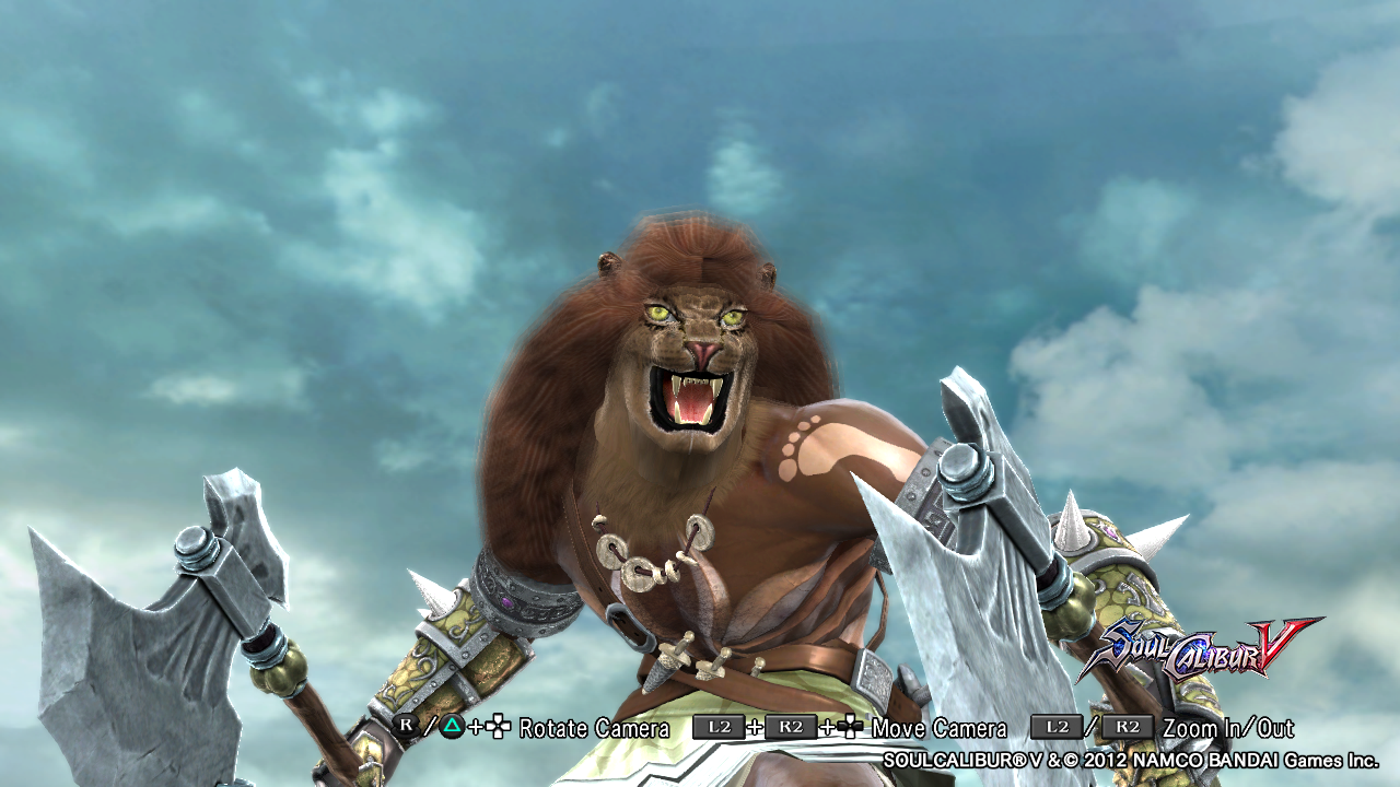
Pride Hunter


Grave Knight
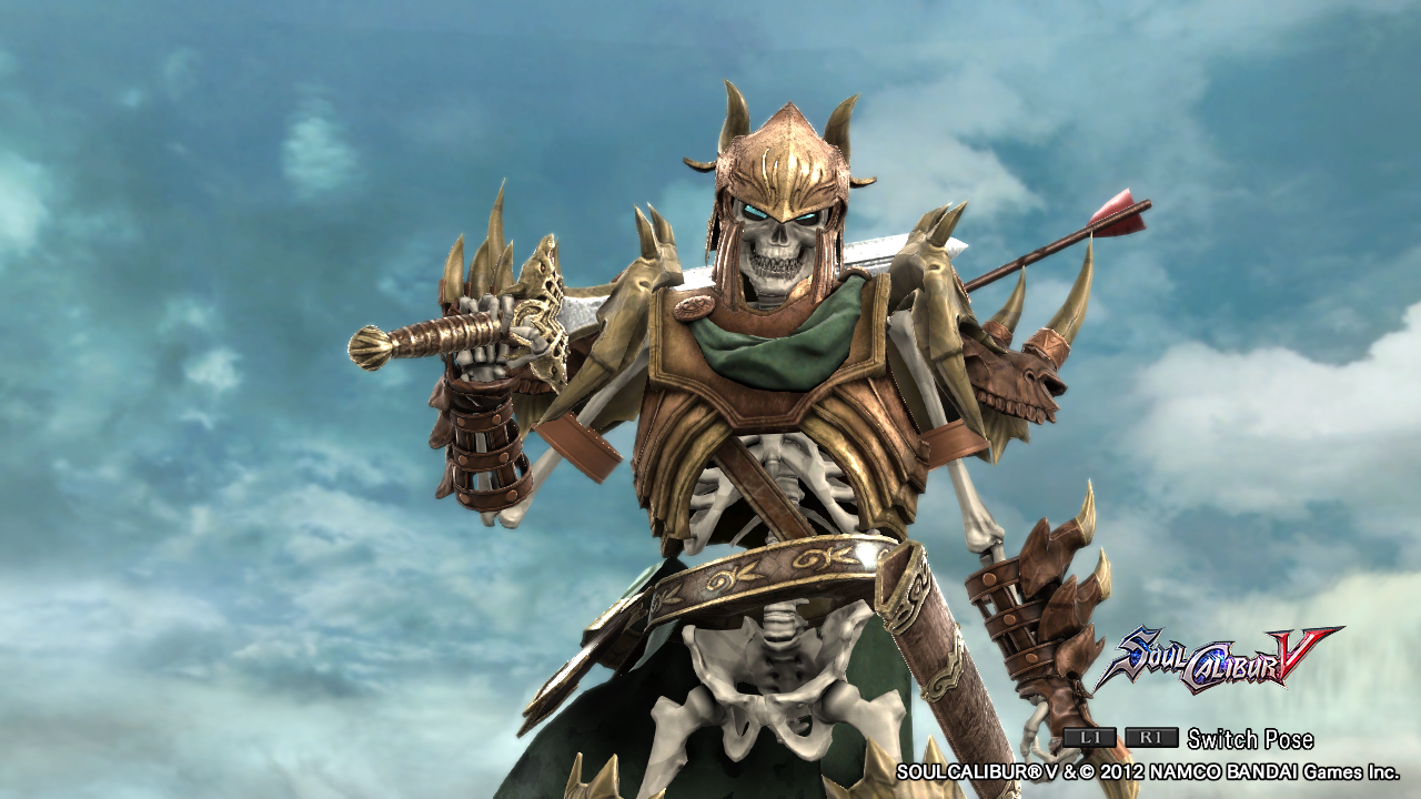


Well, I've been playing a game called Gems of War (free on psn =D) and I decided to make some sort of recreation/remake (since the images of the troops don't show them properly =/) of some of the game's troops.
Hope you like it!
Bruce: That was a "collection" of some of Camelot's tales from various perspectives, but I really don't remember the writer (or writers) and I found out recently that my mom got rid of it by accident... really sad.
Archon Statue


Pride Hunter


Grave Knight


brucege
[14] Master
Welcome back, G-money!
Archon statue: I really like this one. The stony patterns and stickers contribute a lot of detail to the design. I'd tone down the contrast on the patterns to get a more even blend. Nice distribution of gold and grey.
Pride hunter: I've seen many attempts to make a lion's mane, even from some of the most renowned CaS artists here, but three raccoon tails just aren't enough. Clever work on the chainmail skirt though. I'll need to find a way to incorporate that into my own armored CaS.
Grave knight: It's not the most difficult design to pull off (skelly + bone armor), but this one has a great classic feel. You're really good at making colors mesh. Much like something you'd see in, well, Gauntlet.
You actually won the playing cards challenge way back in the day:
http://8wayrun.com/threads/most-esteemed-one-shot-contest-thread.15703/page-42
Check it out if you have the time. Oh, and you might enjoy browsing Tgachi's thread here:
http://8wayrun.com/threads/tgachis-collection-of-creations.19251/.
He's new to the forums, but he seems to be going after a similar style to yours and Quinion's. Best wishes.
Gauntlet
[09] Warrior
Gauntlet
[09] Warrior
Ok guys, before my last batch of the year, I have to say: Happy New Year everybody!!! I wish that 2016 is even better than 2015 for all of us. All of your dreams will come true, Just Do It! XD
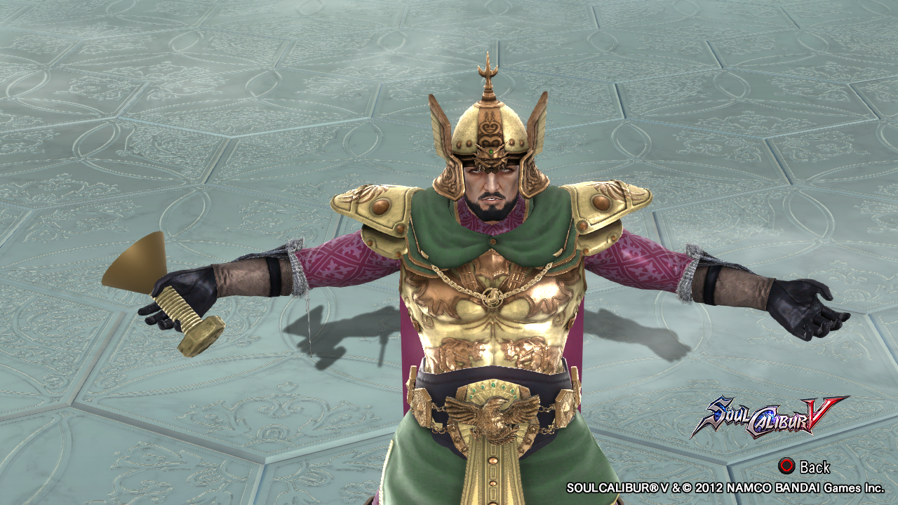
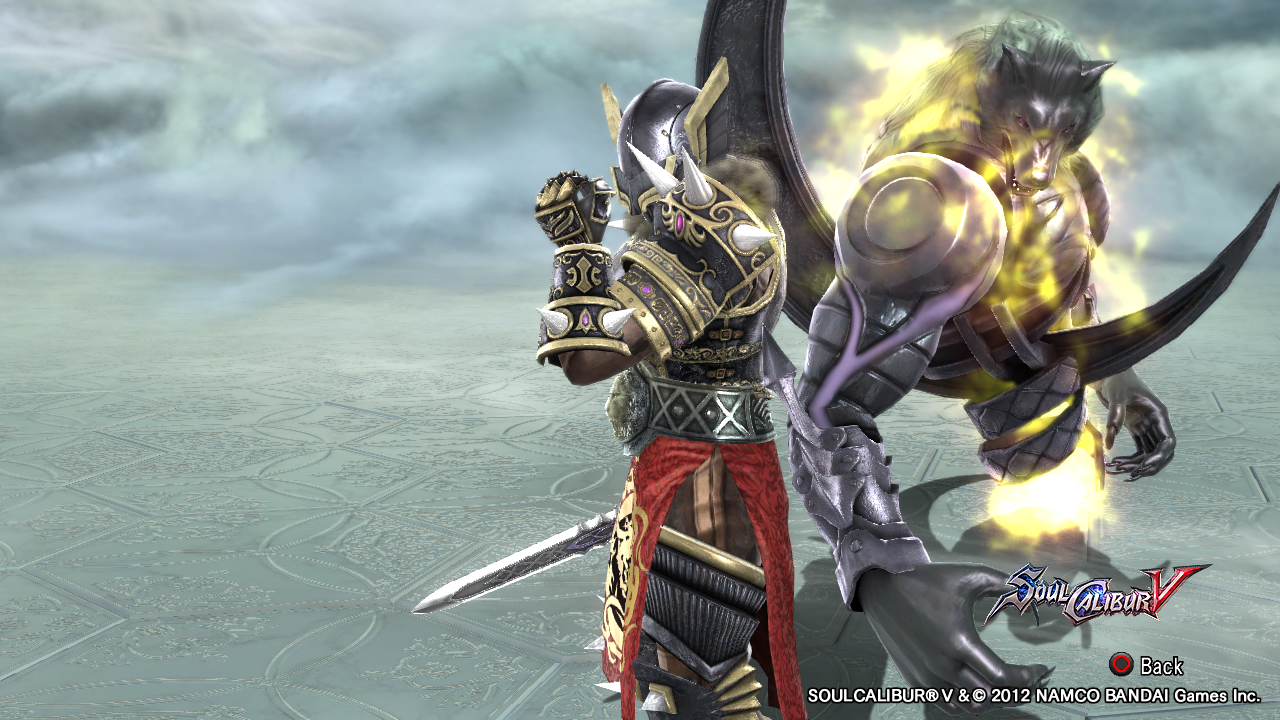
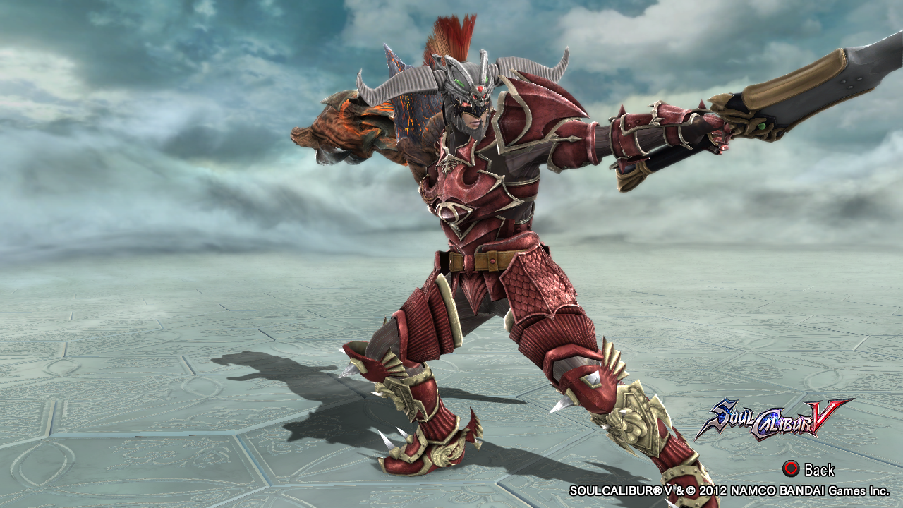
Alright, here's 2 more characters of Gems of War, plus a recreation from the game Hyrule Warriors for Wii U. Hope you guys enjoy it!
Brian The Lucky (yes that's a cup... A lucky charm for him)


Wolf Knight


Volga The Scorching Beserker (or The Dragon Knight XD) - Hyrule Warriors


Until next year guys!
Alright, here's 2 more characters of Gems of War, plus a recreation from the game Hyrule Warriors for Wii U. Hope you guys enjoy it!
Brian The Lucky (yes that's a cup... A lucky charm for him)


Wolf Knight


Volga The Scorching Beserker (or The Dragon Knight XD) - Hyrule Warriors


Until next year guys!
Gauntlet
[09] Warrior
Ok people, new year, new CaS (well, not so new, exactly...)!
Alright, to make a long story short: there's this tale I'm working on since my first thread, but now i'm using my vacation to pumping that up and the idea of making some of the tale's characters on CaS crossed my mind and here we are XD.
So, the first batch is the Nords.
Along with the images, I'll post some of the background as well. Hope you guys like it!
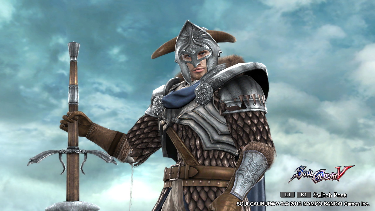
Sigvald as a Winter Rider


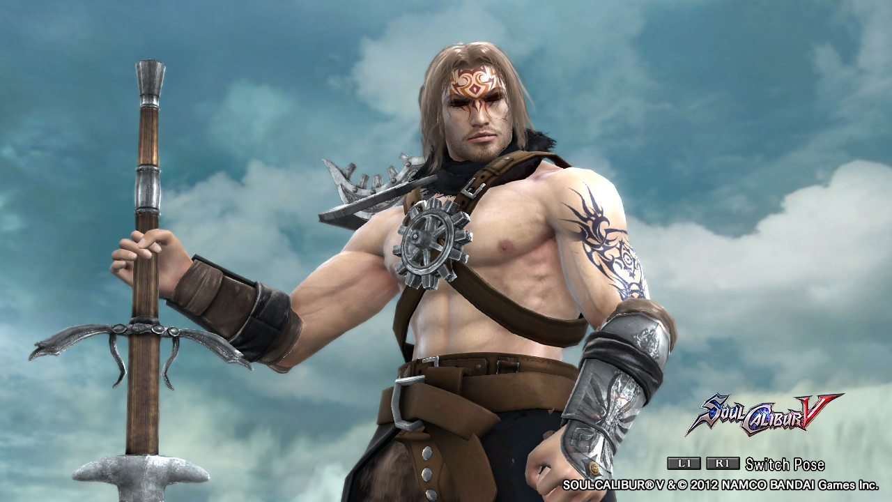
Sigvald as a Legionnaire


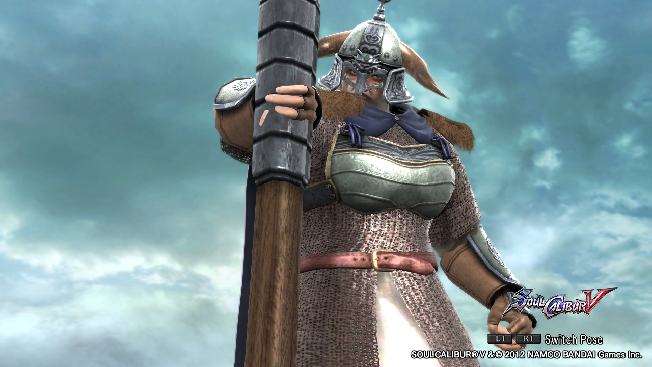
Thorstein as a Nord General


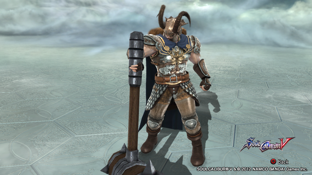
Thorstein as The Jarl of Idonheim


Brenna as a Nord Captain


Alright, to make a long story short: there's this tale I'm working on since my first thread, but now i'm using my vacation to pumping that up and the idea of making some of the tale's characters on CaS crossed my mind and here we are XD.
So, the first batch is the Nords.
Along with the images, I'll post some of the background as well. Hope you guys like it!
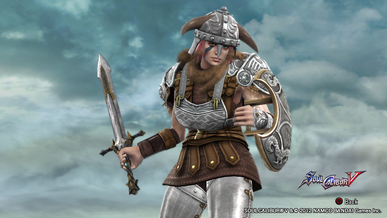
Sigvald as a Winter Rider


Sigvald is an orphan raised in Stern village monastery, one of the many places in the field of capital Idonheim.
As a child, his village was attacked by the Imperial forces , forcing him to join the refugees towards Idonheim, where the boy was recruited and trained alongside others to become a soldier to fight in the war that began.
Even young, Sigvald already demonstrated tremendous skill in warfare , raising quickly among the ranks of the Nordic army.
At the Battle of Seven Summits, Sigvald disrespected his superior to save his comrades from an ambush, and even secured the unlikely victory of the nords. Such an act , rather than earn him a punishment , culminating in his promotion to Winter Rider , a group of elite warriors commanded by the Jarl of Idonheim himself.
Sigvald as a Legionnaire


In the last battle that would drive out the Imperial forces from the Norse lands, Wolfric, the Jarl of Indonheim was killed by an arrow that cutted his throat, leaving the crown to his only son, Fenrir.
However, the last night of camping before returning victorious to the capital, Sigavld had a strange nightmare and woke up with a strange tattoo on his left arm and the lifeless body of Fenrir before him. Blankly, Sigvald was quickly contained and brought to Idonheim for trial.
Sentenced to death, Sigvald waited in his cell, but was surprised by a general, who offered him the chance to become a legionnaire, a group of sentenced prisoners to death who, through their skills and value, have a chance to to redeem their crimes through easement time or conclusions of suicide missions.
Without many options, Sigvald accepted and received in his face the Sign, a powerful label that carries all the old magic of the Nordic and aims to hold the host to its mission.
The mission Sigvald received was to gather a group of legionnaires and assassinate the Emperor Roderic.
Thorstein as a Nord General


Thorstein Hofersson is Wolfric 's brother, the Jarl of Idonheim, and most respected general in the Nordic army. Considered the most brave among the bravest.
At the Battle of Seven Summits, Sigvald, one of his most valiant soldiers left the row without his permission, but Thorstein saw the trap and went after Sigvald with a handful of soldiers , leaving the command to his second.
Once there , Thorstein managed to save Sigvald and his companions, but had to withdraw for taking an arrow in his left eye.
Thorstein as The Jarl of Idonheim


After the death of Wolfric and murder of Fenrir , the throne was left to Thorstein , who took the post of Jarl soon after the arrival of the Norse army to Idonheim.
Thorstein was responsible for sentencing Sigvald to death with no chance of redemption.
However , some time later, Thorstein found that Sigvald became a Legionnaire, forcing him to hold the general who allowed it, and organize a group of warriors tasked with Sigvald capture, dead or alive.
This fact divided opinion within Idonheim, as some did not agree with the decision to not allow Sigvald became a Legionnaire, and also found suspicious the circumstances of Fenrir 's death.
Thus, it began to develop a civil war within Idonheim.
Brenna as a Nord Captain


Scion of an important family of warriors, Brenna was known in training camps as " Fire of the Winter " , alluding to her serious personality and his tremendous skill in battle.
She proved stronger than any boy's training camp except Sigvald , whom she now considers her rival to beat.
However , during the subsequent battles she came to admire and respect Sigvald , aiming always to be at his level , training hard to become a Winter Rider like him.
After some time, it was convened by the new Jarl Thorstein to capture Sigvald, with a chance of being promoted by the deed.
But she never imagined that her feelings would hamper the task ...
Lazy Garou
[10] Knight
Really cool stuff all around. Really liking Thorstein.
Gauntlet
[09] Warrior
Lazy Garou said:Really cool stuff all around. Really liking Thorstein.
Thanks man! And by the way, he's one of my favorites too, especially as Jarl.
Gauntlet
[09] Warrior
Here we go!
Second batch: Elves
Galan as an Elf Prince


Núria as an Elf Ace Hunter


Rukal as a Drow Tribe Chieftain


Rukal as an Imperial Commander
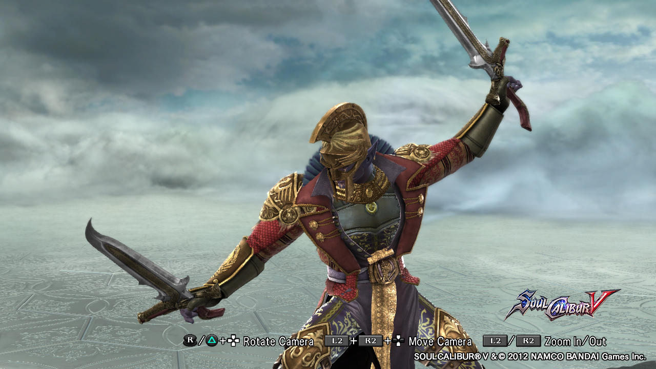


Second batch: Elves
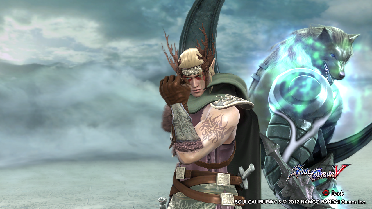
Galan as an Elf Prince


Galan is the last elf of the Raohs' lineage, those who have a strong connection with the spirit world. Raohs are able to take ethereal forms to visit the spirit realm, as well as express their animal spirits in the real plane. For this reason , they generally assume leadership positions within the tribes.
After the defeat of the elves by the imperial forces, Galan tried to rebuild his tribe, waiting for the opportunity to take revenge for the death of so many brothers and sisters. When he learned that the imperial army suffered its first major loss in the nordic areas, the prince quickly gathers his best hunters with one goal: to assassinate the emperor himself and turn the tide against the imperialists.
After the defeat of the elves by the imperial forces, Galan tried to rebuild his tribe, waiting for the opportunity to take revenge for the death of so many brothers and sisters. When he learned that the imperial army suffered its first major loss in the nordic areas, the prince quickly gathers his best hunters with one goal: to assassinate the emperor himself and turn the tide against the imperialists.
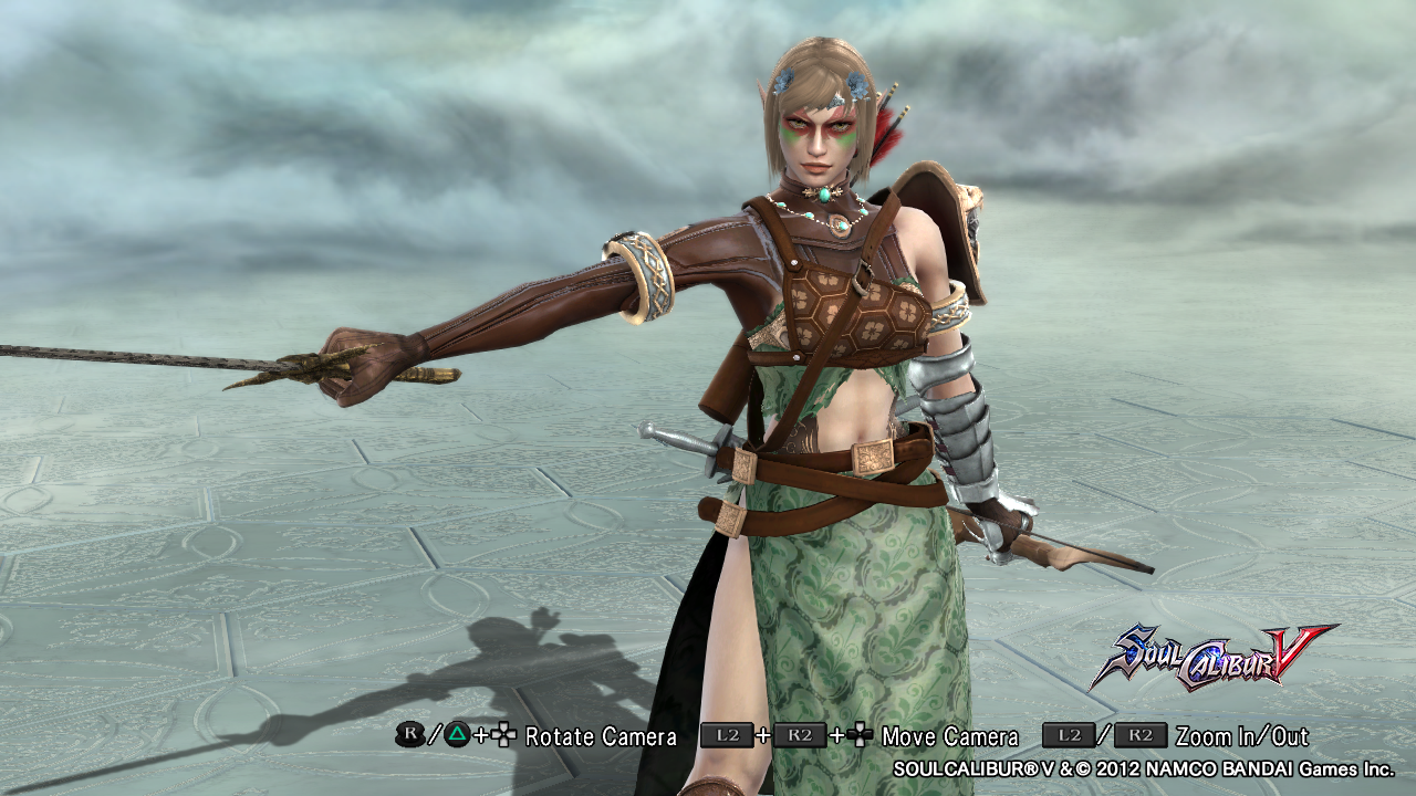
Núria as an Elf Ace Hunter


Nuria is the leader of the Ace Hunters, recognized as the elite of elves' hunters out of all the tribes. After the war between elves and imperial , few survivors of the group.
She is known as "Eagle Eye", referring to her impeccable aim with bow and arrow. Some myths say she is capable of hitting one thousand targets in one thousand attempts.
Although she doesn't completely agree with Galan's decision to attack the emperor, she follows him with devotion, not only to serve her leader , but to protect him. Since from childhood she admires him and it can be said, that at some point, this admiration became a romantic interest.
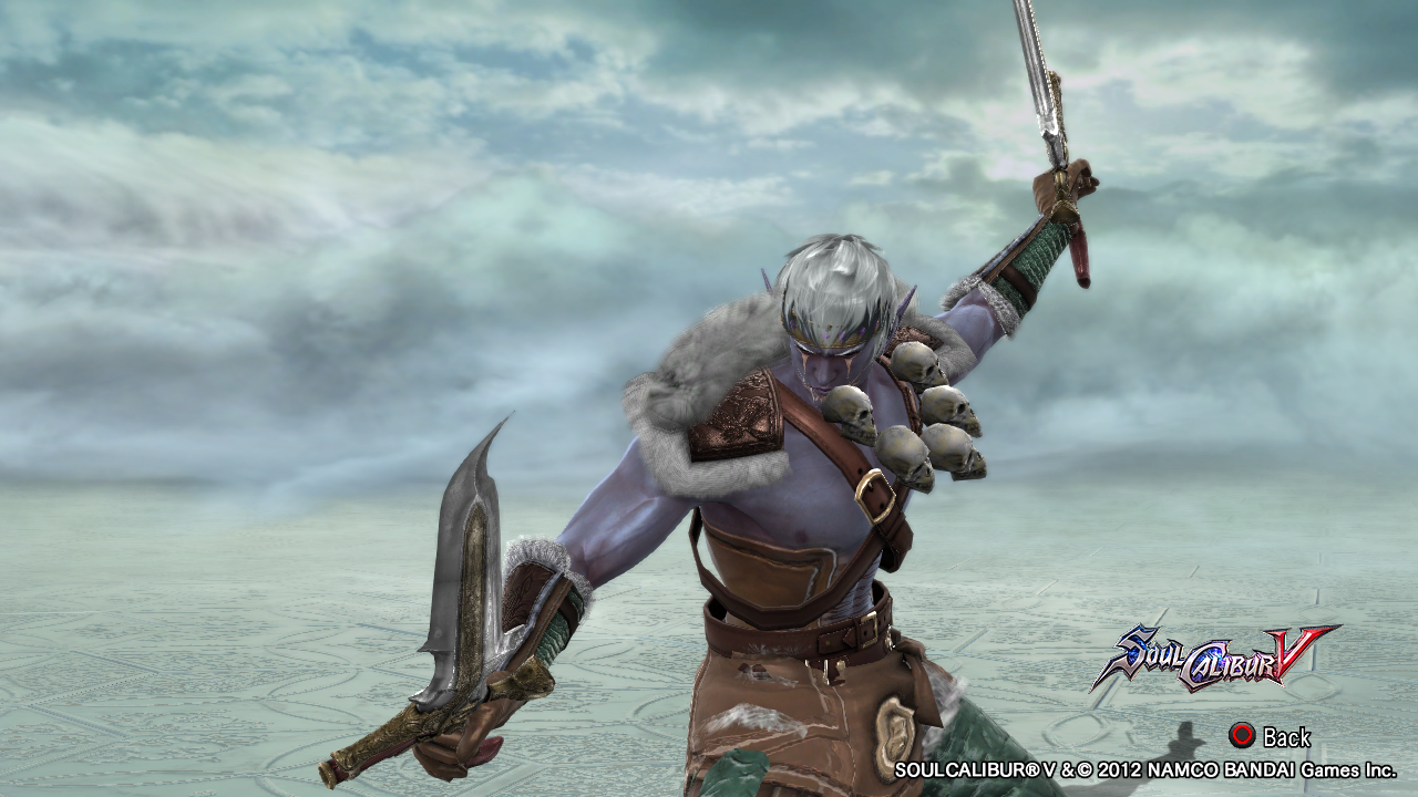
Rukal as a Drow Tribe Chieftain


Unlike their counterparts by their color characteristics, drows and elves are natural enemies that exist since ancient times.
Unlike the elves, drows are much more aggressive and prefer violence than diplomacy. For years, the situation between the two races was always tense, even in times of truce; but with the frequent attacks of the imperial armies against villages of both elves and drows , the two sides decided on an alliance, however difficult that was.
However, Rukal, one of the great leaders of the drow, hated the elves with all his strength, since his father was killed in a battle against them. So Rukal preferred to sell himself to the emperor, delivering all information to the enemy and facilitating the victory of the imperialists over the elves and drows.
Rukal as an Imperial Commander


After Rukal's defection and the victory of the imperialists over the elves, he ended up taking a commanding position in the emperor's army, along with some warriors of their tribe who also defected.
Serving the emperor, Rukal is still waiting to get a chance to betray him and get more power, but the emperor can not be fooled so easily and keeps his eyes on the drow, placing spies in his troops and waiting patiently for Rukal's betrayal.
Serving the emperor, Rukal is still waiting to get a chance to betray him and get more power, but the emperor can not be fooled so easily and keeps his eyes on the drow, placing spies in his troops and waiting patiently for Rukal's betrayal.
brucege
[14] Master
Sigvald1: Classic cold-weather knight look. Nice helmet design. You always make good use of that chain main and waist wrap combo.
Sigvald2: Awesome! The half-naked look fits his gladiator-esque situation. The custom shoulder pad takes the cake. He’s a little bottom-heavy from the waist wrap and the bulky boots, so I’d either give him some slimmer boots or give him some bulkier gauntlets (if you’re trying to keep the whole fur motif).
Thorstein1: Lacks detail in midsection. I’d take out the eye protector (which you used on a previous design) and give him some metal abs using a set of feathers of strength or enlarged screw SpecEq. Stickers might be an option too?
Thorstein2: Great chest and shoulder armor combo. Lots of detail. The horns are cool in a regal way but veering dangerously close to tacky. Maybe shrink them a bit. Try applying a bump-mapped pattern to the raccoon tail for a fluffier/ruffled look.
Brenna: Simple, but effective. I like how you echo the carvings on the shoulder armor with the pattern on the chest piece. Feel free to increase the contrast a bit.
Galan: Looks a lot like @rdmunhoz’s elf. Great design nonetheless. I like the twiggy crown you fashioned for him. Very elf-like. Perhaps try using a leather pattern on it for a more wood-like texture? The fur shoulder guard, which you probably intended to enhance the asymmetry, doesn’t quite fit the design. Perhaps you could swap it out for some kind of crown/headgear?
Nuria: Great use of patterns here. The little splashes of color go along way too. Nice job with the asymmetry. My favorite of the batch.
Rukal1: This one has the most potential. The bluish skin, white tattoos, and skull necklace are great in tandem, reminiscent of Japanese Oni. Again, bump-map those raccoon tails. Figure out some way to get rid of that massive button around his crotch. Try using a very dark shade of green (more contrast) for the corset thing you made too.
Rukal2: Nice detailing on the undershirt. The Cervy-coat does fit the whole traitorous douche bag backstory, but it seems a bit too posh for the Drow. He also still looks like Cervy.
Overall: Looking better than ever. You’ve got a knack for high fantasy/Skyrim-style character design. I’d definitely like to see some Lord of the Rings, Dark Souls, or Game of Thrones-inspired characters from you too.
TsunamiBye
[14] Master
brucege is right, you even inspire me to make fantasy stuff or resurrect a Viking ish custom sometimes.
Gauntlet
[09] Warrior
Thanks @brucege , your reviews are always a learning experience for me. I will consider your tips for my future CaS (updates of old ones and new ones), but I have two questions:
1- What is bump -map? (Noob question XD.)
2- What is the leather pattern? (Another noob question...)
Glad to know that @Pocky-Yoshi . I am very eager to see more of your Cas, so please ressurect yor Vikings.
1- What is bump -map? (Noob question XD.)
2- What is the leather pattern? (Another noob question...)
Glad to know that @Pocky-Yoshi . I am very eager to see more of your Cas, so please ressurect yor Vikings.
brucege
[14] Master
1. 3D-looking (but actually flat) stickers or patterns. https://en.wikipedia.org/wiki/Bump_mapping
2. The pattern you used on Rukal Chieftain's green pants.
Oh, and try to add an occasional splash of bright color like you did for Nuria. Just a little goes a long way.
2. The pattern you used on Rukal Chieftain's green pants.
Oh, and try to add an occasional splash of bright color like you did for Nuria. Just a little goes a long way.
