This is a thread in which I shall showcase the beautiful sexiness that is this angry ass golem. My name is Scyle and well... I like to be creative. I'm a fan of many different things so hopefully you'll find a wide array of schtuff here. All are Astaroth (or maybe most depending on design) and are used on my Astaroth only account Azr_Ss_Trzaous. I'll be doing sets of 3 per post so yeah... Hope you enjoy!
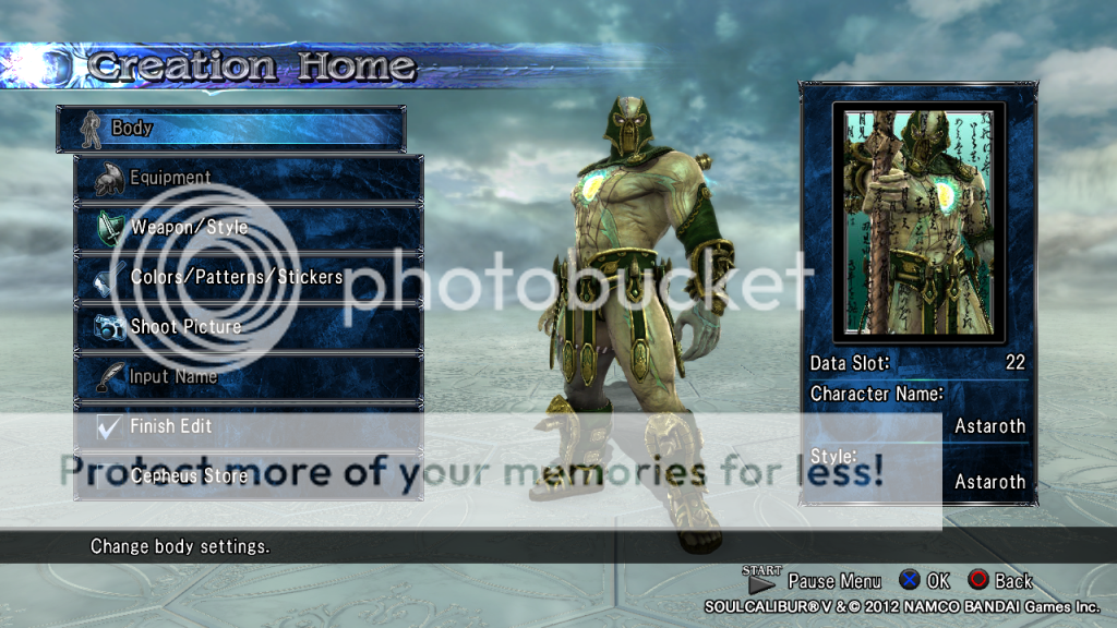
Green and Goldaroth
Starting off we have ourselves a nice and simple color swap. Green with rustic gold highlights.
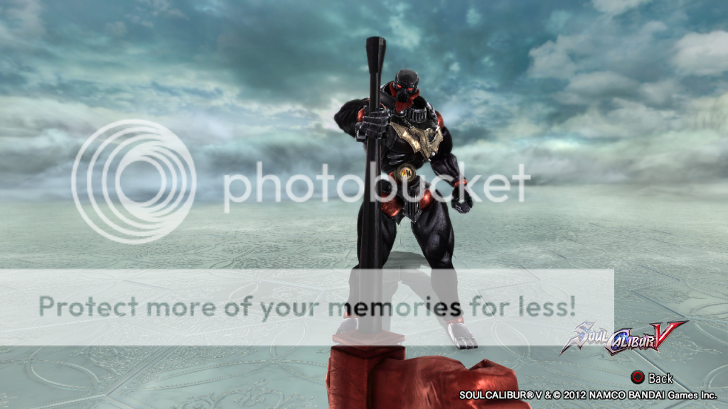
The BROfistaroth.
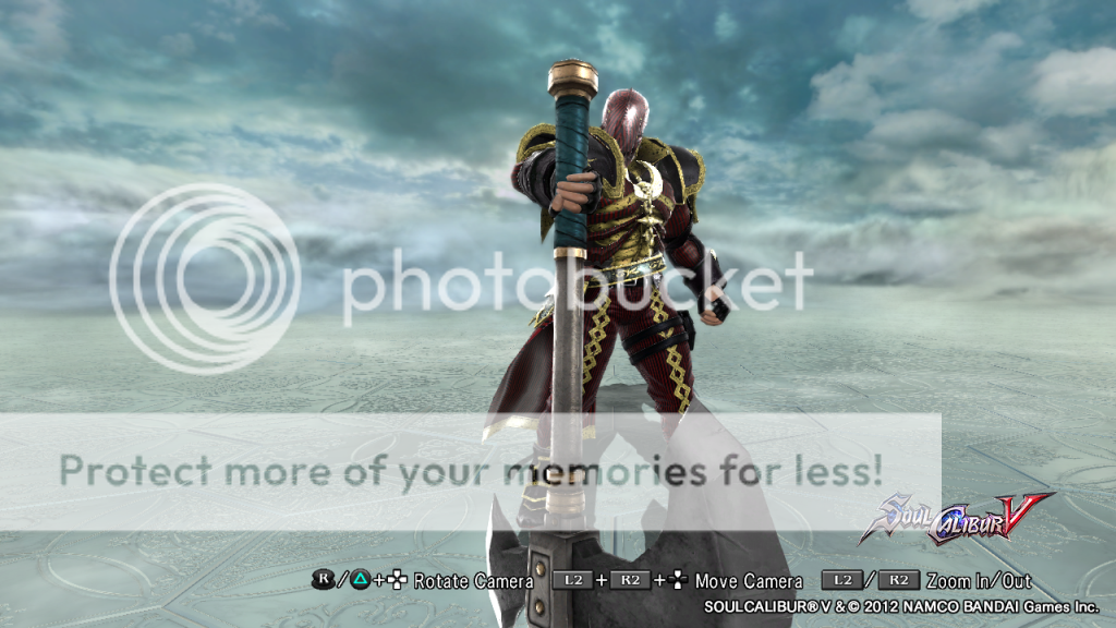
This mechanical titan sports two of my favorite colors (which you will see occur frequently.) Often switches back and forth between red and black, or white and gold.
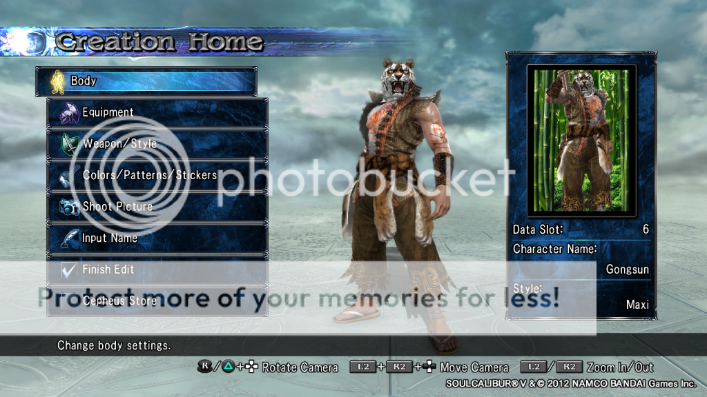
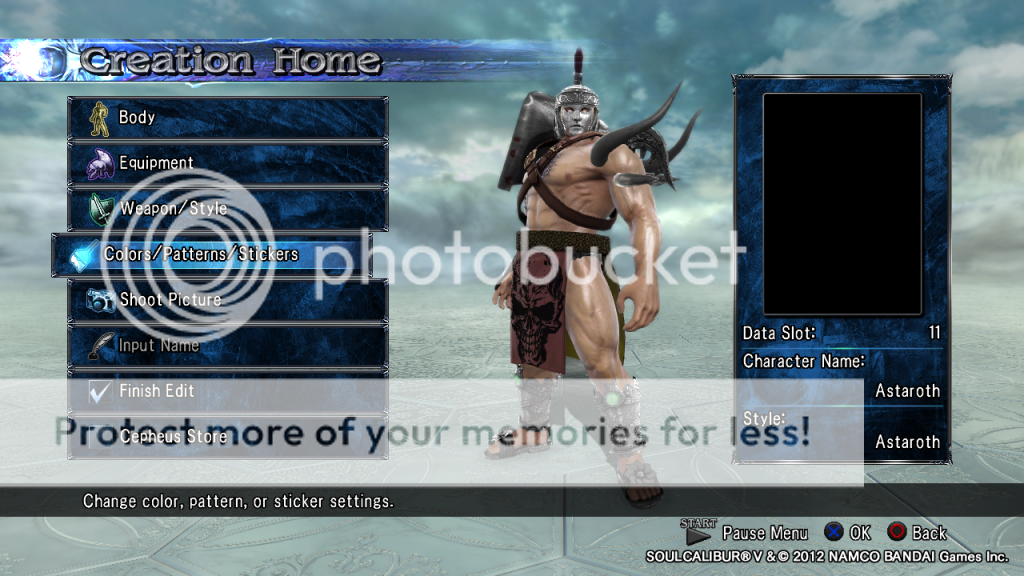
Gongsun
"Gongsun was raised as a monk in a temple off into the forests of 16th century China. He was an orphan, raised by the loving embrace of the temple monks. A disease left him blind as a young boy, rendering his sight incapable of return. He found this similarity in another boy, Lao Xu whom he had garnered a friendly rivalry with as well as incredible friendship. The two were an inseparable duo. The tiger and the phoenix these two blind monks would come to be known as. One with the passion and courage of the tiger, the other with the grace and fire of the phoenix."
Gongsun embodies a small tiger like theme. Gongsun is a heavily decorated warrior monk with an obvious portrait of a tiger upon his chest along with the head of the beast. His design would be more of the informal of the duo between Gongsun and Lao Xu, show casing a lack of finesse along with many injuries. EDIT: Gave him Wilding pants and Wilding Shirt to complete his tiger/rough monk theme.
I like original characters the most, but monsters and mythology are well recieved too.
Vidja, anime or comic characters...are not what I like the most, but are fine if fits the setting, for example I don't mind seeing a Gatsu, a Red Guardian with an arrow in the knee or Conan. But I don't like to see Captains America or Spidermans, mutant turtles or Clouds. If they are well done I recognize the merit of doing them "well" but still I don't like.
Worst chars are those suposed to be "funny" but aren't funny. AKA rainbows cats or nude fat guys with afro and pitch voices
The first recolour is garish and uninspired. The second one is black and gold. Le Bello is certain nobody ever thought of that before, so props for the originality.
That original character is dull, unimaginative and lacking. Le Bello hears "Tiger theme" and sees a mask. By those standards, Dampierre has a zebra theme.
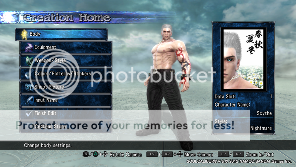
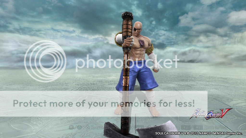
Scythe "Scythe, the son of Scyle, is a brutish rage of primal fury. He is a hulking man originally standing at a massive 6'11" with muscles worked to an obsessive degree. He's a vicious man with white hair and crystal blue eyes. His pale flesh is covered with an intricate blue tattoo that holds more mystery than most would figure. A cold individual, this man is the purest definition of ruthless. He holds no emotions. No bias. Scythe is as his name implies, a weapon of incomprehensible destruction."
Now obviously with the tools at my disposal I couldn't exactly replicate him too accurately so I gave myself some liberties. I gave him a red and black color scheme on his tattoos and a scar on his left eye that would normally be on the right portion of his lip. I also gave him a much different eye color, choosing the haunting crystal blue on top of the black. His design changes rather often, at least in my eyes. At first he sported the samurai vest and the hakama and now is given a more modern look.
Demonoroth
This was a design I did on an Algol on my first account. Originally I wasn't too keen on it but eventually I warmed up to it. The majority of the outfit is covered in a black and red stripe pattern with a gold highlight. I feel he has a bit of a demonic feel, made apparent by the Voldo DLC headgear I used. Overall I feel it has a bit of a demented look.
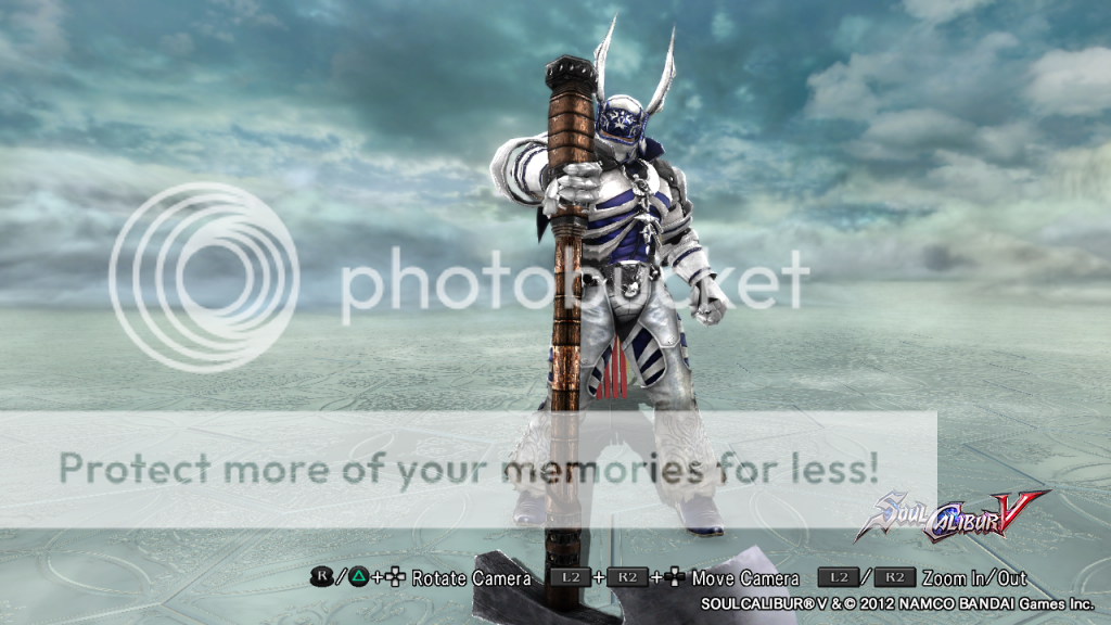
White Knightaroth
This design was a shot at making a different style of knight. A lot of my designs incorporated black or red so I decided to change it up. As you can see he's white with a blue highlight and sporting the Nightmare DLC headgear.
I like to see anything anyone wants to show, and I like to know the reasons they are fixated on their specific ...style? If someone is committed or passionate about what they do I think it comes through.
Personally I don't think that originals are necessarily more creative... and on the opposite end...it doesn't have to be a character I am familiar with to hold my attention.
....that's what I like to see ....
...what I am driven to create is a little different...
Once... we were asked (as a serious mental exercise ) if we could invite any 5 people, living or dead.... real or fictional, to a dinner party for a night of conversation who would they be and what would they say.
... after a long discussion we ended up with something like Carl Sagan ,Thomas Jefferson ,Yoda , and the Hulk....
I am being a bit flippant... But ...
I like to throw all my interests together.... and let them fight it out.
.... I also get a thrill out of making the elements of the CAS system work in an unintended and unique way...
p.s. I tried to vote for Other ... but was blocked
You asked me to tell you how I feel they could be improved, and so I shall:
Recolour the 1st: Using a darker skin tone will make the Black/Gold more menacing, and also less out of place looking. The gold looks rather 'blingy' and takes away from the ferocity of the character.
The second recolour needs more style. Have you considered using patterns to make some more interesting textures? Or adding a bit more gold in a wider range of areas, without being too generous with it? A subtle addition is more interesting to see then glaring gold on boring black. This recolour is but a block of colour with no real thought gone into it.
The Tiger-Monk needs more Tiger. Whilst I wouldn't reccommend using tiger stripes on the pants, the armbands would benefit nicely. And the belt would look better in a more muted colour, perhaps a more faded orange, or even a greyish white? Either way the red on the trousers clashes, and the pattern doesn't suit the tiger mask much at all. There's no synergy here. Consider using pattern 1 to make a gradient on the trousers, going from orange into white, or into black.
Scythe is simplistic indeed. It reminds Le Bello of a wrestler. The bright red of the gemstone stands out too much however, bringing the design from 'smart/casual' to 'a bit confused'. Muter colours almost always look much more appealing than brighter ones.
The Algol-gone-Astaroth is already a promising start, and a rare case in which the brighter colours work - It gives a sense of regality without looking out of place. The stipe pattern shows you're at least dipping your toe, but the patterns can do so much more. Consider making the armoured parts look more metallic is my only real suggestion here.
You do like Zwei's top. When you say "different sort of knight", what does that entail exactly? Because this does have an almost knightly feel to it, it also manages to slip past that. The blue is a bad shade - You might prefer a lighter one. Another thing you could try is to make the blue bits on the top and trousers look like chainmail, using a pattern to achieve that effect. It'll serve to look more armoured and knightly, without being too generic, fitting right into the provided specifications.
I don't particularly like these designs and generally agree with Le Bello, but there is a difference between being "blunt" and intentionally insensitive.
Pocky Yoshi finds the designs rather lacking. It's not that spectacular, because it doesn't inspire Pocky Yoshi much. The reason why is, Pocky Yoshi could pretty much make what you're making plus add on a few things to it.
But to be nice....
Dress pants Asty is like an evil terminator in a suit. The impression it gives is Rip off top and go beast mode business style. Basically, Pocky Yoshi thinks you wanted to make a modern day Astaroth.
The edits are very very simple with no elegance to help out, but edits are edits.
The rest are meh because it's just a bunch of slap-ons, color, and that's it imho. Sure, the tiger one was nice, but again, it doesn't inspire me much since it kinda feels like a cousin to something I could find online.
However, don't take this as discouragement. Pocky Yoshi just wants you to do a bit more than slap on gear and color it. Experiment, explore, and share more CAS for the Asty style.
Lao Xu
"Lao xu was raised as a monk in a temple off into the forests of 16th century China. He was the unfortunate offspring of a local warlord who. He slain Lao Xu's mother and burnt out his eyes, rendering him completely blind. He was abandoned in the local village where the head of the temple found him amongst a pile of burnt rubble. He found blindness in another boy and this tragic event lead to his truest friend, Gongsun, whom he had garnered a friendly rivalry with as well as incredible friendship. The two were an inseparable duo. The tiger and the phoenix these two blind monks would come to be known as. One with the passion and courage of the tiger, the other with the grace and fire of the phoenix."
For Lao Xu I wanted to use a more contemporary Chinese style with the red and yellow. In these colors I also feel portray the phoenix theme I was looking to go with. Although I did want the vibrant coloring, I made them somewhat dulled out as to make sure they weren't too cartoony. If you get a sense of Kenshi from Mortal Kombat, I don't blame you. He was actually one of my very first concepts and one I really have strayed from touching until I know an improvement for him. Overall I'm in love with him. He's majestic and wise. EDIT: Switched up pants colors, made them a tan color to offset too much matchery haberdashery.
Gladiatoroth
This design you'll probably think is the most generic of ALL my designs. He's the stereotypical gladiator, his color scheme isn't impressive, and his sticker work is base. This is exactly what I wanted when I first popped in the game. Yes ladies and gentleman, this is one of my first designs after Lao Xu and the original being Scythe. The manicas (manacas?), the lilly greaves, the helmet and mask. I didn't strive for overly creative here because these pieces fit so well together. I know my designs have been tacky before and this is the most tacky one, but you can't argue that these pieces were made for each other lol. I wanted to give it a -little- more death with the demented protrusions coming from his left shoulder and the proclamation of death exuding from his crotch area. XD Look into that mask and into those soulless eyes and you'll find that although generic, this concept was made for Astaroth. EDIT: Switched his colors to silvers, blacks, browns and the like to switch out of stereotypical red and gold along with adding different colors to my arsenal.
I actually lol'd at all this. I don't think there was anything said that was worthy of an infraction, Le Bello, but even if there were,I couldn't issue it because I'm still not a mod in this forum. I guess maybe they don't really need or want a mod for this forum, or maybe they think I'm spreading myself too thin, or maybe they want someone more active in the CaS forum, (I don't even have my own thread in here like everyone else). Perhaps the Illustrious Le Bello should apply for modship, since with your challenges and compendium and showcase, you've organized more than many mods have.
I would suggest being more constructive in your criticisms in the future. Just saying something looks terrible or unoriginal doesn't really help the person get better, it just puts them on the defensive.
I thought you were a Mod. Or used to be. Or will be one day? Le Bello is confused.
Anyway, we've sorted it through PM and both deleted our offending posts. Le Bello apologises for his original post, which was more sarcastic then helpful, and hopefully everyone will be better for it or something.
Oh, and I sent Brewtus and email, but no reply so far... I also told him you'd be a reference Wombat. <3
Once... we were asked (as a serious mental exercise ) if we could invite any 5 people, living or dead.... real or fictional, to a dinner party for a night of conversation who would they be and what would they say.
... after a long discussion we ended up with something like Carl Sagan ,Thomas Jefferson ,Yoda , and the Hulk....
This is much better. Lao Xu is someone with potential. Imho however, I'd probably try breaking the "matching too much" syndrome. Like try color coordinating.
Pardon these pics of originals, but it's an example of what I mean to break the "matching too much syndrome". The top that has the Red and gold is fine imho. Nothing needs to be changed. But the bottom should instead have a different color and perhaps a change in shoes. Like look at this example of mine. Though it's a girl that's different altogether, but I'll explain a little more in spoilers.
The gray pants compliments the teal like blue. Even though they aren't match match, but they are believable while nice to look at. Look at it this way, Top is but a white shirt with decorations. Bottom is like blue jeans that have decorations but make it a little different.
Your Asta-gladiator is a bit too bright on the gold and equipment and feels a bit cartoonish, desaturate a bit or you can go ahead and steal this color schemes of a gladiator and roman officer I made. Dull, but mostly believable.
Other than that, it looks just fine equipment wise. No worries, Pocky Yoshi likes gladiators and using Asty style with it can remind me of a giant warrior whose an unstoppable force.
And your Lao Xu that was inspired from Kenshi may be a common cliche, but it's a good cliche since I also like Kenshi. One that could give me ideas. But try out the big bamboo hat that many shaolin peeps wear. It usually gives off that veteran badass factor or so.
But in general, three colors usually make the best out of CAS imho. Like red and black is a simple cliche that is common. But if you throw in another color to help it like say white, then it actually adds more flavor to it. Just try to make sure every piece coordinates and compliments each other like an outfit. If not, just re-post and I'll try to help with what I can.
Imho, I think you or Le Bello should apply for modship here just keep peeps in check while being helpful. I could help too, but then would peeps really want me to mod a CAS forum?
Le Bello, I'm mod of the casual forum and its sub forums, the online mode and story mode forums. CAS has a link in there, but its apparently actually part of the image and art distribution forums. It makes sense that I would have mod powers here too, but I don't and they never responded to me about it. Maybe they just think that people mostly play nice in here, or there's nothing that needs organized here and there's no need, or maybe like Brutus and Antony, they fear my ambition. (LOL)
Pocky, I think everyone on this forum loves you. It's just a question of what the admins want, and I'm not even sure about what that is.