Navigation
Install the app
How to install the app on iOS
Follow along with the video below to see how to install our site as a web app on your home screen.
Note: This feature may not be available in some browsers.
More options
You are using an out of date browser. It may not display this or other websites correctly.
You should upgrade or use an alternative browser.
You should upgrade or use an alternative browser.
My Noob Creations
- Thread starter Javan
- Start date
TsunamiBye
[14] Master
Having to look at all them, the best things about them is they're not like those highlighter CAS I see a lot online. However, the bad news is they need more work.
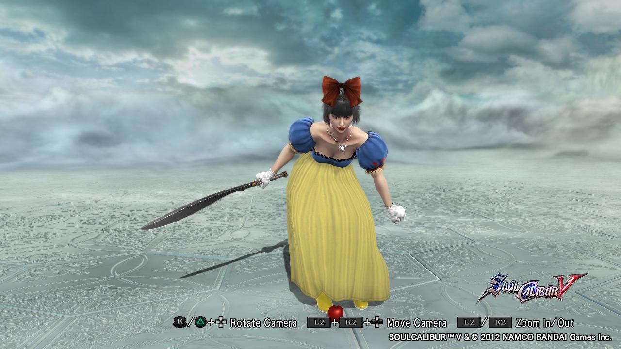
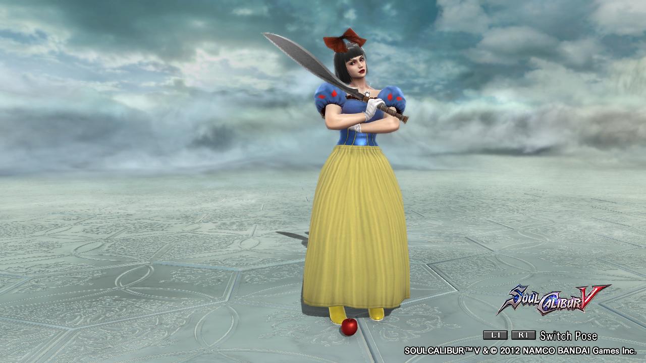
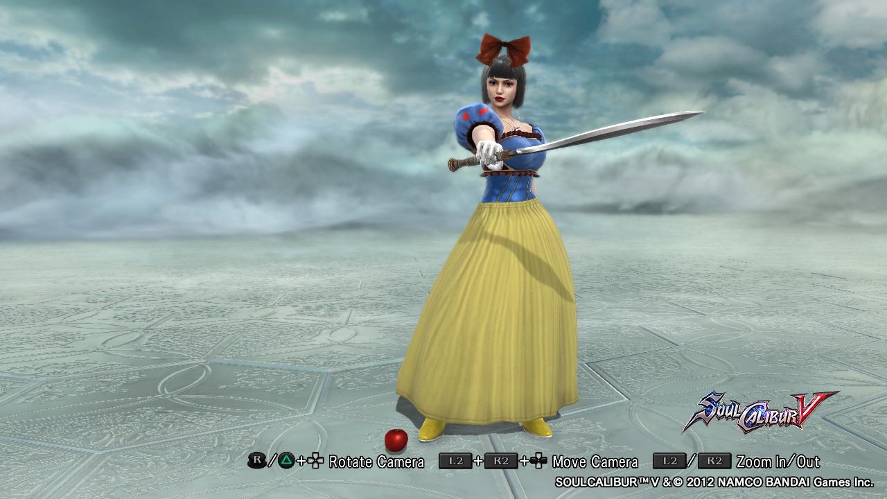
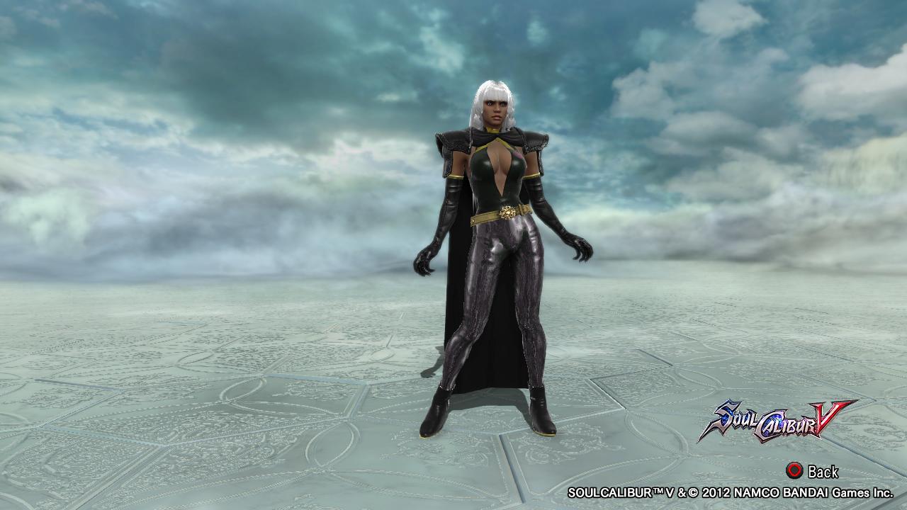
I've seen Snow White and Storm a couple times online, so I usually don't count those as originals. I know who they are, yet yours feel so "generic" like the rest. Like nothing pops out to wow me. It's just wow it's Snow White and Storm. Not wow what a unique Snow White and Storm!
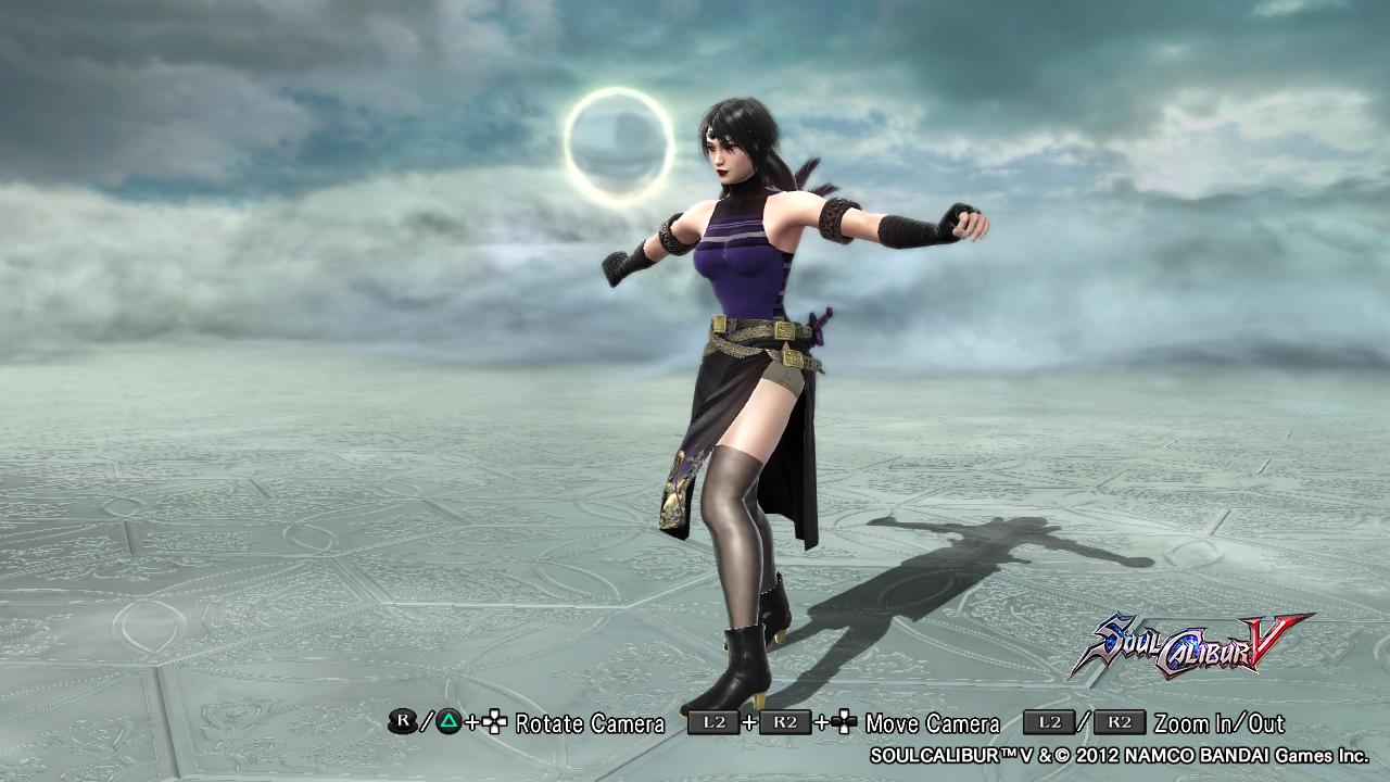
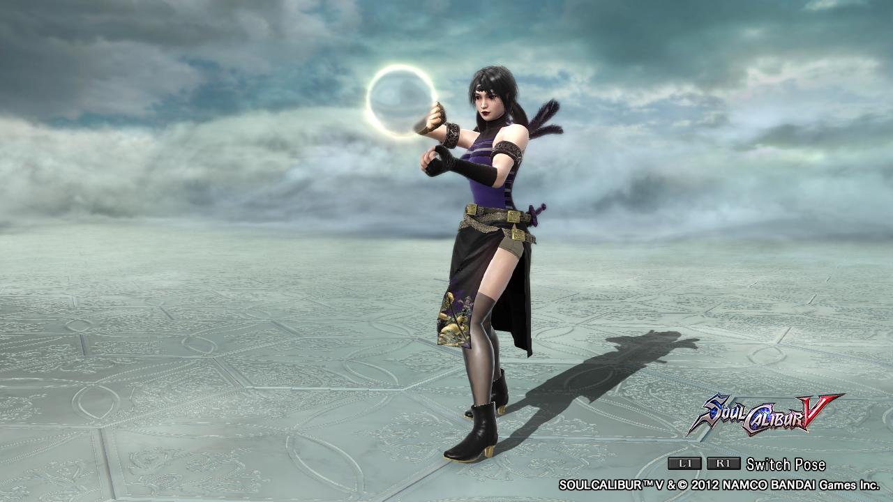
The black and purple doesn't seem too bad, but it also doesn't pop at all with me.
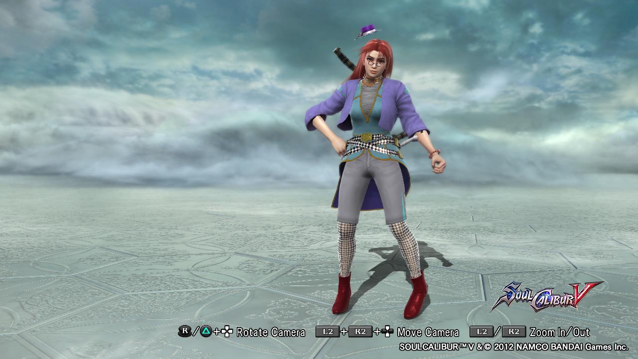
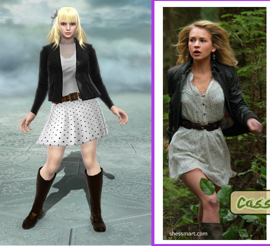
The first one feels like a "thrown-together". Everything doesn't seem to compliment each other. Out of all your CAS, it's the weakest one of the bunch.
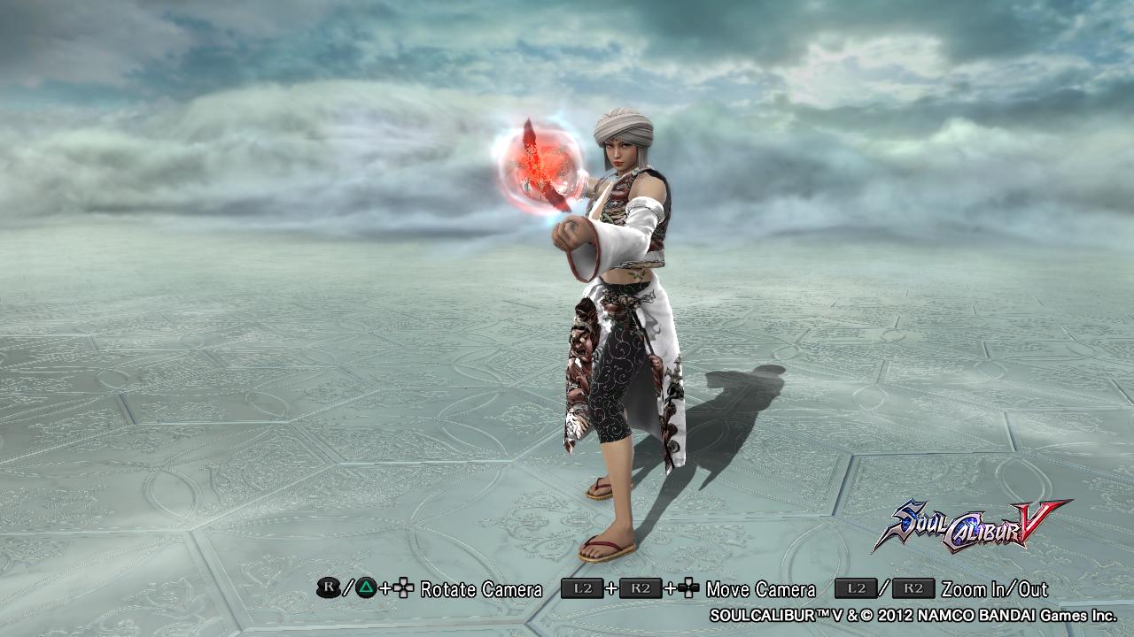
The last one for instance is going in the right direction, but what is she supposed to be? A female middle eastern with mystical powers? For now though, this one is probably the strongest one you have out of the rest.
Right now, try to lurk around and use the Link thread to help. Believe it or not, everyone borrows ideas and puts their own spin to it. They also try to make something no one has made before, or you can also try making a generic ninja and upgrade it to be a charismatic ninja.
Anyways, keep on sharing.
ThePascuzzi
[13] Hero
I have to echo Pocky-Yoshi's criticisms. Your color choice is okay (except for the first design, it almost looks as if you didn't color anything at all), but you need to do some work on adding in detail. Your Viola-style designs aren't too bad in this regard. That last middle-eastern one is actually pretty good and the second black-and-purple-colored one is alright. It just needs a little touching up, like expanding the purple sticker on the midsection to max size to it covers all 360 degrees on the torso. Everything else looks very plain and uninspired.
I also want to address your positioning of special equipment. I don't get why the hat on your first design floats several inches above the head. Same deal with Snow White's ribbon, which is also skewed at a weird angle. Then there's the apple at her feet, which I can imagine just looks strange during in-game animations.
As far as part choice goes, I see some things I like, here. The Cropped Jacket and Noble's Dress as seen in the first design work well together. I also like the Corset and frilly shirt-bra thing combo seen on Snow White.
Finally, some advice:
1) Go into creation mode and run every tip and trick mentioned in here: http://8wayrun.com/threads/dampierre-and-cos-cas-tips-and-tricks-compendium-curio.12735/
A good bit of them are in the spoilers on the first page, but it's been a while since the thread's been updated.
2) Look at other peoples' CaS, zero in on details that you notice, and figure out how they did them. Pay attention to things like part choice, coloring/stickerwork/pattern usage, and special equipment use. Challenge/contest threads are a good place to start. Those can be found in the Link Thread that Pocky-Yoshi mentioned. After that, go into the personal threads of people whose contest entries you liked.
That's how I learned CaS, at least. You do those two things and I guarantee you will see at least a 50% increase in your CaS ability or your money back.
oh wow. I wasn't expecting such detailed critiques :o
The 1st one was supposed to be a little weird, hipster and mis matched. It was actually my 1st creation and it is one of my favourites. I know it's not my best but I love it.
As for detail. I like to keep my creations simple. I think doing a lot can be good sometimes, but most of the time it comes out weird for me.
I understand that my storm and snow white are generic. But they are remakes. With the clothes that SC offers, there isn't much I can do about that. And I don't buy dlc :/
Anyway. I haven't made any new ones since that post. But here are some more of my others.
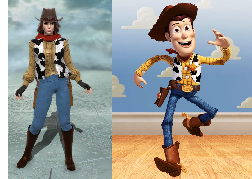
Generic? I know. But I love it
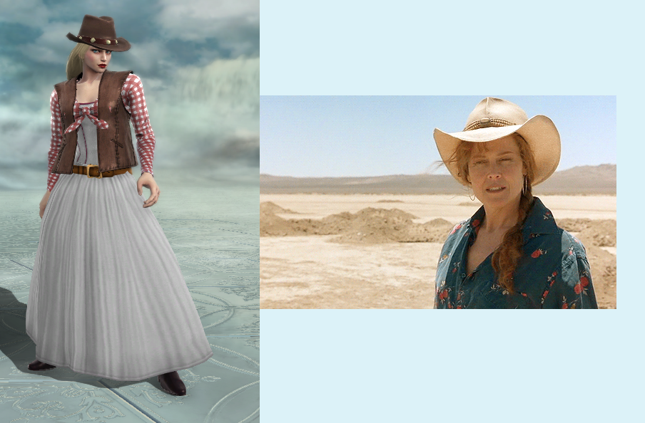
It doesn't look like her at all. But that wasn't the image I had in my head when creating the character. The is the 1st time in a couple of years that I actually looked to see what this lady looked like. So I used imagination to creat this char.
It looks pretty basic in the picture, but it looks really good when she moves.
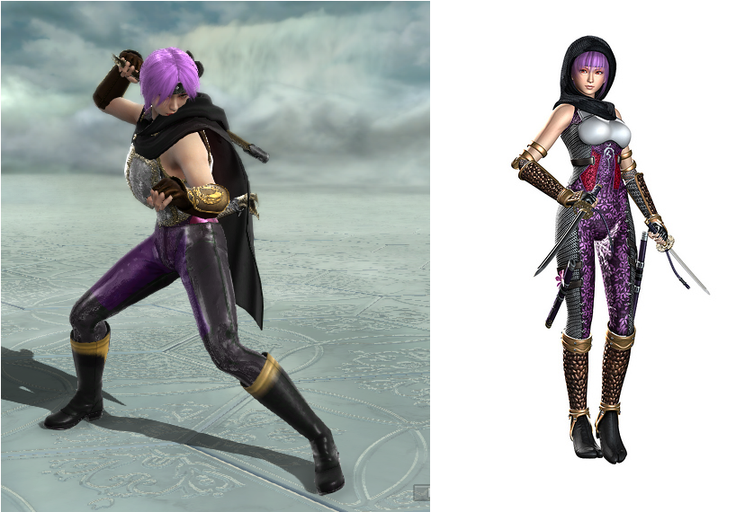
One of my favourite creations.
What do y'll think?

The 1st one was supposed to be a little weird, hipster and mis matched. It was actually my 1st creation and it is one of my favourites. I know it's not my best but I love it.
As for detail. I like to keep my creations simple. I think doing a lot can be good sometimes, but most of the time it comes out weird for me.
I understand that my storm and snow white are generic. But they are remakes. With the clothes that SC offers, there isn't much I can do about that. And I don't buy dlc :/
Anyway. I haven't made any new ones since that post. But here are some more of my others.

Generic? I know. But I love it

It doesn't look like her at all. But that wasn't the image I had in my head when creating the character. The is the 1st time in a couple of years that I actually looked to see what this lady looked like. So I used imagination to creat this char.

It looks pretty basic in the picture, but it looks really good when she moves.

One of my favourite creations.
What do y'll think?

Norik
[14] Master
Those are actually pretty awesome, specially female Woody.
WindupSkeleton
[14] Master
See now, I'm all for keeping it simple, but sometimes simple goes hand in hand with bland.
Without changing too much then, try to use patterns where the colours are flat to give it that extra detail. It doesn't detract from the design, but augments it. Makes it less bland without being OTT.
The general rule of thumb is:
Tiger Pattern for fabrics/Leathers etc.
Cow Pattern for armour and other metallic pieces.
Just make them the same (or a very similar) colour and you'll see the detail pop out at you.
Also; why is No 1's hat floating above her head?
