Yeah, totally missed end of P3...
I fo like your necro, facepaint does convey the decaying / rotten skin look. I like the work on the hands too, and the necronomicon is neatly positioned in the palm of said hand.
Thanks! That's good to hear about the hand: I've gone back and forth on it. I really like the necronomicon where it is in the left hand for purposes of the animations/postures, but in many ways it would make more sense if it was in the right, because that is the hand that I've been able to really give a super decayed look to (with the additional nice touch of the partial cloth wrap) by virtue of the //redemption leather armor//. Actually, if you look closely you can see the body decays more heavily on the right side in a majority of the variants (but not all). So it would be nice if that matched the side where the necronomicon is held. But I guess we might venture to speculate that the left side is realtively untainted because the necromicon has paradoxically preserved it? I guess that works as head cannon
-shrugs-.
Initially I used a more encompassing sticker on the left hand, but I discovered eventually that I could create an effect that looks either like exposed muscle and sinew or some sort of taint spreading from the book, depending on the colour used, so I went with that. I've also done other variants where I used bandages or gloves and patterns/stickers to create a decaying effect similar to that which I used for the face, for both hands--but using that approach, I lose the awesome mostly decayed hand effect on the right hand, and I really like that. So I'm satisfied with the version you see used predominantly amongst the variant--decayed mummy hand right, left hand looks mostly as if it could be alive, but has peeling skin/a spreading taint from the necronomicon, which is grasped in that hand.
Maybe i would add some sticker work to the bland looking robes like runes (tab 3) or other skull based sticker (also tab 3 for the best ones).
I considered runes, but I ultimately decided they would make him look to pop-fantasy, whereas I wanted him to have a more classic dark wizard vibe. I did trial several versions where the robes were also showing signs of decay via discolouration, suggesting he had been undead a very long time, but I ultimately decided he looked more menacing in genuinely black robes. This also helps preserve the "how dead is he" question for some versions. But I did add some subtle blood red undertones to his robes in places in some versions, to create even more implication of blood magic--though I think this gets lost (like a lot of detail in the face) because of the somewhat low resolution of the images I have uploaded. I also used a subtle closely-related two-tone pattern on the robes to give them a slightly more lustrous and deep texture. I agree it needs something more to give it just a tad more detail, but I haven't yet figured out just what will serve.
You could consider doing a face based on the skull stickers as i did on my Lich-lde and Hildevil, but i like what you did.
Actually, while it is difficult (or virtually impossible in some cases) to tell, one of the skull stickers is used in some (but not all) of the face variants. But when it is used, it's always the bottom layer on the face, beneath 1-3 others. I actually don't find it creates a very realistic impression of a skull, even for more cartoony designs, let alone the more quasi-relastic look of a decayed/flayed face that I was going for here. But if you use it underneath certain other stickers with a deep crimson, it can help create that sense of underlying bone structure that pulls burnt/peeled/diseased/decayed/whatever look together. Or just another colour tone spaced out across the face in the more outright jackson-pollocked versions. Actually, I think it's part of the pastiche in one way or another in about 3/4 of the variants--although it's size, positioning, and colour actually vary considerably between versions.
You have 2 ExEq slots left iianm, why not add another necromancer artifact : i would recommend a floating eye made of a ball and (guess which ExEq is best) for the pupil (slightly protruding from the front of the ball). I don't have the game as i am on vacation but i have a pretty good mental representation of how it could be done.
Think gradients and transparency if you go for my idea (you can have a look at my cyclops for some ref. but i am sure you don't need it and want to figure it out on your own)
Unfortunately, I am out of ExEq in about 4/5 of the variants. The necronomicon is an object of course, but the exposed teeth on the right side of his face actually require two laboriously positioned white brims to create. And any versions which have one eye missing also require a flower brooch to block out that eye while creating the optical illusion of depth in order to simulate the empty socket. I also created versions with no eyes or distorted features to create the impression one side was wasting away, but ultimately my favourite versions are those where the face is completely ravaged but mostly symmetrical and maybe that of a living (if obviously diseased) person, and those where the face is mostly exposed (some of which also feature the one side more heavily decayed, missing an eye and or/having the exposed jaw or teeth.
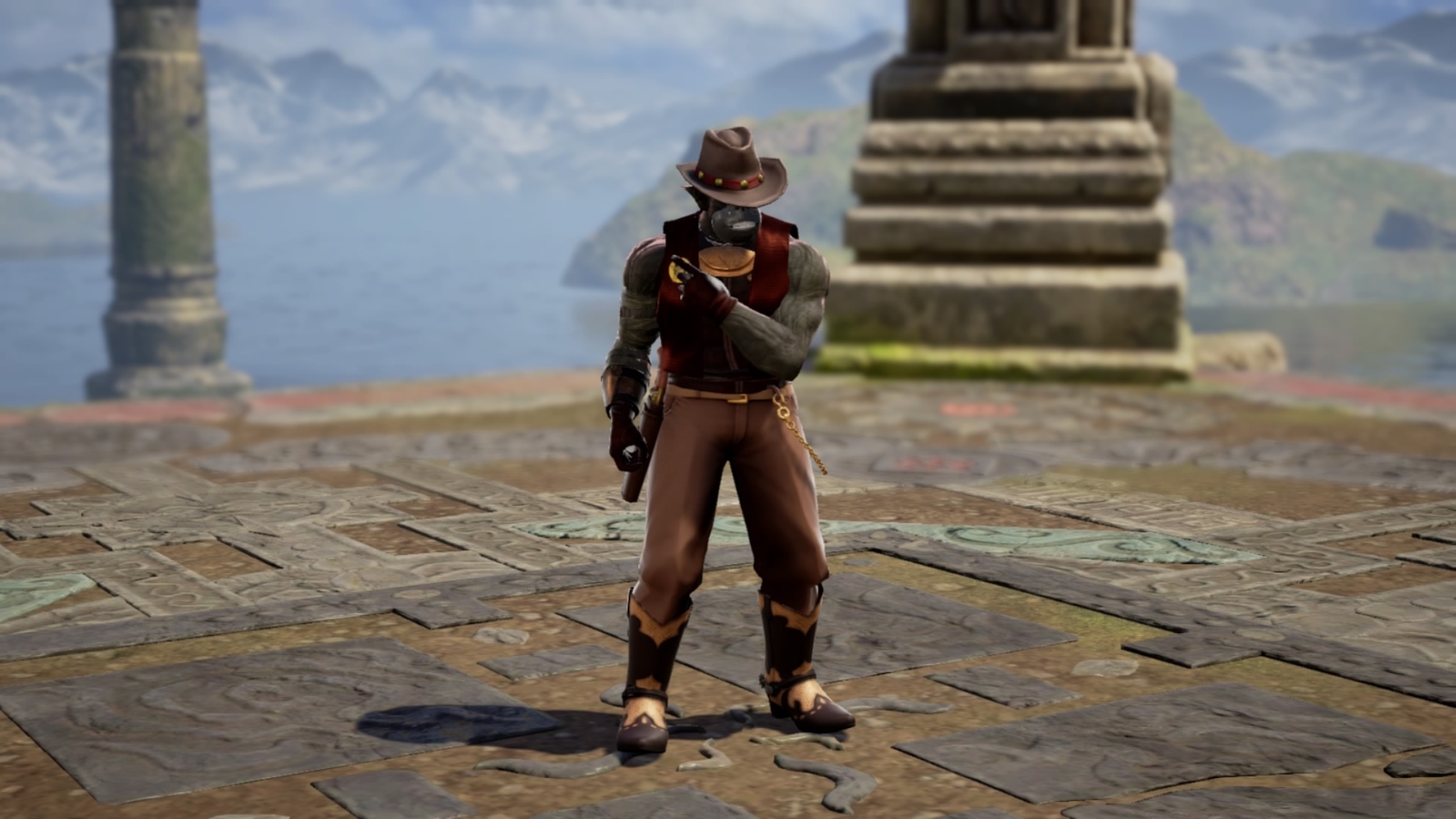
Lizard recolor, ok, but i prefer the reddish version, if one needs tuning, using a cool gradient in the feathers could bring more depth to the CAS too :)
I did try a colour gradient at one point, but I just couldn't find a colour continuum that worked well with the overall scheme of the characters, so I ultimately just settled on using a semi-solid pattern with just dark flecks. I agree it kind of looks muddy as a result, though. Personally I can't tell if I like deep swamp shaman or volcanic badlands shaman more. I think they both wear the basic design pretty well. :)


