Photoshop

Well, I used to take a class on Graphic Design back in my Sophomore and Junior years, but since then I've gotten rusty. Lately, I've been messing around with it, and I really miss photoshop.

Anyways, I would like some feedback on some of the images I've made, and criticism on how I can improve.

Thank you in advance.

Edit:

I'll take requests from members of the site that have been here for at least a year. The exception being Dando because he asked before I said this. I only do this because I already have a lot of requests to fulfill, and I want to do something to payback the site until I can afford a premium account.

BlazingTiraRedone3.jpg


CarvsTira.jpg


Redo.jpg


VolWet3.jpg


voldo.jpg


wtfisthis.jpg
 

Attachments

  • VolWet2.jpg
    VolWet2.jpg
    247.2 KB · Views: 244
Wow, these suck ass. :D

JKJKJKJKJK, they are great :).

Anyways, I think some of them are too texture heavy in some areas which makes it hard to look at. (Mainly the first 3) Now if you were going for texture heavy, then screw my message :D. Also, on some of the pictures, you can see where you cut the character out of another picture i'm guessing (the jagged edges around their body.) You could either try using the lasso tool or pen tool and make an outline, making points as close together as possible so there are no straight lines. You could also use the selection tool, but that usually doesn't make a clean selection. There are also some other ways but I have forgotten and can't remember them all. I just started learning recently myself, so I don't know that much. If anyone wants to correct me, go ahead :D.
 
They're cool but I think they have a lil TOO much contrast.
I personally love a lot of light stand out colors, but I know most people will tell you to tone it down a bit.
Pretty good though!
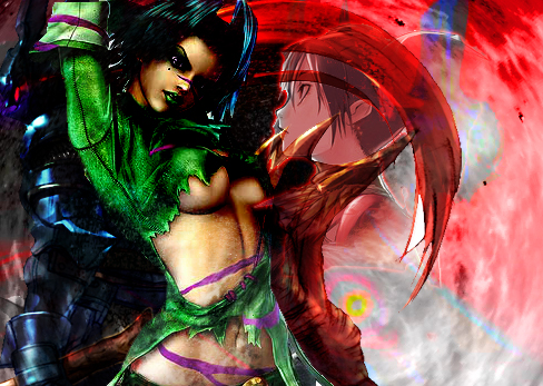
On the first Tira pic, I might suggest on brightening up the OG art so it'll match the effects. Really high tone colors with a more earthy/calm tones don't really match.
 
Thats good stuff DIME. and i for sure couldnt do any better.

but looking at it as a "regular joe smoe" there just seems to be a whole lot going on in those pics.

I cant use all them there fancy terms that tag was using, but I think she and I are on the same page.

Pretty cool tho. When you grow up to be a big boy, Ill let you make me a maxi avatar.....LOL

HRD
 
1st:
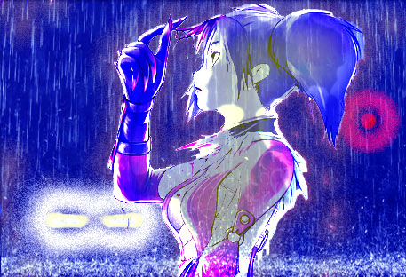
  • Perhaps colorize her, it's odd too have all that color and contrast and then have her suddenly saturated and low contrast.
2nd:
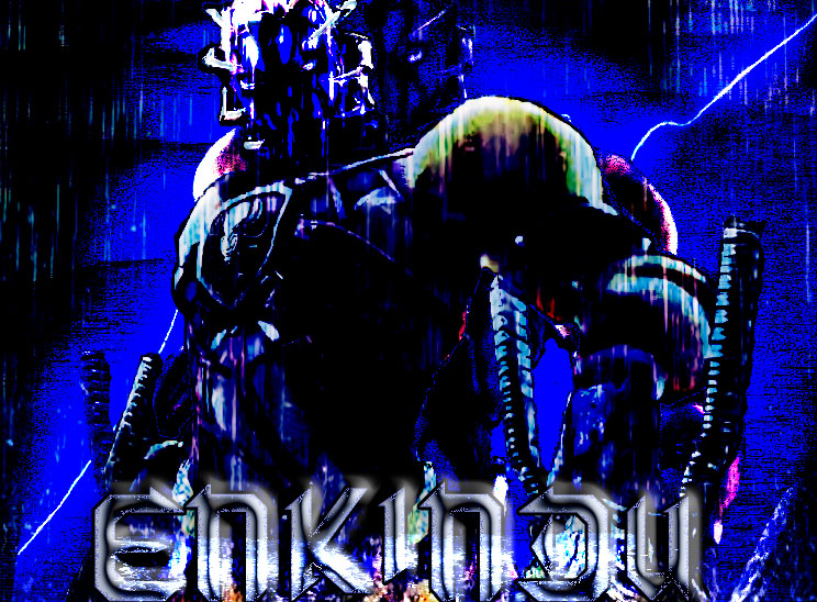
  • Clean up the edges around nightmare. You can see jagged outlines.
  • The eye color doesn't reflect all the fire around it. Tweek it to seem as part of the fire through blend modes and some color adjustments.
  • With the way NM is set, have the glow of the fire reflect on him somewhat or create harsh shadows. Right now there's a light on top of him so it would suggest the fire should reflect on the edges and inward.
  • The Death typography needs more effects. It's very flat on a very deep background and doesn't pop away from it. Consider drop shadows or a glow to isolate it more or go the other way and use blend modes and opacities to merge it.
3rd:
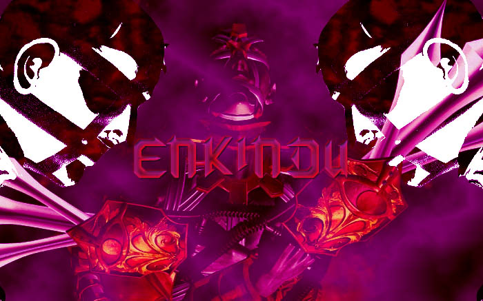
  • Contrast is a little harsh, take it back some.
  • Tira and NM stick out but the middle is too complicated and it's hard to make out, play with that.
  • The typography is unreadable with that treatment, I sadly say you may want to consider redoing it as it clashes harshly. find ways to pronounce more of the outline and reconsider the color effects or how they are applied.
4th:
  • Pretty good, but work with the grey girl again. Her saturation and low contrast fights the image and obscures Tira's face. Play around with blend modes and colorize again. Perhaps consider moving her so the arm doesn't cover Tira too much.
 
Anyways, I think some of them are too texture heavy in some areas which makes it hard to look at. (Mainly the first 3) Now if you were going for texture heavy, then screw my message :D. Also, on some of the pictures, you can see where you cut the character out of another picture i'm guessing (the jagged edges around their body.) You could either try using the lasso tool or pen tool and make an outline, making points as close together as possible so there are no straight lines. You could also use the selection tool, but that usually doesn't make a clean selection. There are also some other ways but I have forgotten and can't remember them all. I just started learning recently myself, so I don't know that much. If anyone wants to correct me, go ahead :D.

Yeah, I was going for the high texture. I like that look, for whatever reason. And I noticed that line around NIghtmare... I can't believe I never realized what that line was.

They're cool but I think they have a lil TOO much contrast.
I personally love a lot of light stand out colors, but I know most people will tell you to tone it down a bit.
Pretty good though!
On the first Tira pic, I might suggest on brightening up the OG art so it'll match the effects. Really high tone colors with a more earthy/calm tones don't really match.

I agree completely. I realllllly should've put some kind of brighter colors on the Tira, to show the glow from the flames. Thanks for the compliment!

Thats good stuff DIME. and i for sure couldnt do any better.

but looking at it as a "regular joe smoe" there just seems to be a whole lot going on in those pics.

I cant use all them there fancy terms that tag was using, but I think she and I are on the same page.

Pretty cool tho. When you grow up to be a big boy, Ill let you make me a maxi avatar.....LOL

HRD

Haha, I'll make you a Maxi avatar, for sure. No promises as to when I'll get around to it though.

1st:
  • Perhaps colorize her, it's odd too have all that color and contrast and then have her suddenly saturated and low contrast.
2nd:
  • Clean up the edges around nightmare. You can see jagged outlines.
  • The eye color doesn't reflect all the fire around it. Tweek it to seem as part of the fire through blend modes and some color adjustments.
  • With the way NM is set, have the glow of the fire reflect on him somewhat or create harsh shadows. Right now there's a light on top of him so it would suggest the fire should reflect on the edges and inward.
  • The Death typography needs more effects. It's very flat on a very deep background and doesn't pop away from it. Consider drop shadows or a glow to isolate it more or go the other way and use blend modes and opacities to merge it.
3rd:
  • Contrast is a little harsh, take it back some.
  • Tira and NM stick out but the middle is too complicated and it's hard to make out, play with that.
  • The typography is unreadable with that treatment, I sadly say you may want to consider redoing it as it clashes harshly. find ways to pronounce more of the outline and reconsider the color effects or how they are applied.
4th:
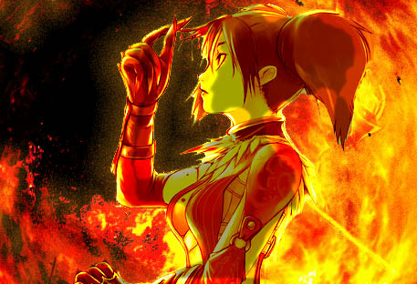
  • Pretty good, but work with the grey girl again. Her saturation and low contrast fights the image and obscures Tira's face. Play around with blend modes and colorize again. Perhaps consider moving her so the arm doesn't cover Tira too much.

1. Yeah, I can't believe I didn't think about doing that. That's kind of a facepalm for me.

2. Okay, I didn't even notice those jagged lines. I'm going to fix that, definitely. And I'll definitely have to add some kind of glow...again, a facepalm moment. Also, sadly, I'm not very good with text effects. I should probably look up some tutorials.

3. I was going for such off-the-wall contrast. Hell, you should see this other picture I made... the contrast would have you shitting bricks. I've been meaning to fix the middle, I just haven't had any ideas. And what's wrong with the text? I like the look.

4. Yeah, I'll have to play around with it some more.

Thanks man, all that is going to be a big help.
 
Np, post the updates when you can. I'm a professional graphic artist, so if you need help ask, tho I'm mainly a Flash artist

On the text issue, it's mainly a matter of the treatment fights what's going on outside of it too much. You have a lot of high contrast darks and there a sudden jump to intense white with harsh flat tones. Also with some areas there's not enough hinting on the edges so you eye only completes some of the text and you have to stop and think about other such as the "MY" and a little with the "DEATH" because of how much is going on around it and the font. Also look on the 1st "E" in "EYES" and it has a flat red very similar to the background red behind it and it's hard to separate at first glance.

I would hint the edges in a few more areas and maybe the isolate it with a stroke/glow/dropshadow/etc... It's too different from the background to merge so i say isolate it more.

For sure, I'll come to you for help. You seem to know your photoshop.

Okay, I'll take your advice and play with the text later.

But for now, I'm working on the Tira image.

NMTIBG.jpg


As of now, I've erased her hand and ring blade so the ghostly image doesn't show up on the SC3 Tira's chest, and I've given the SC4 Tira a red outer glow with a red satin overlay. She seems to fit in much better now with the whole picture.

Redo.jpg
 
A great piece of Photoshop work considering you say you haven't picked it up for a while; The Mage appreciates your Photoshop skills.
 
Back