Photoshop

Cool recolours.

What is the process, if you were to describe it to the photoshop-inept ?

I'm thinking creating a layer, then carefully painting/erasing it with a slighty transparent film of the colour you want over the original picture ? Is there a more clever way of doing so ?
 
Cool recolours.

What is the process, if you were to describe it to the photoshop-inept ?

I'm thinking creating a layer, then carefully painting/erasing it with a slighty transparent film of the colour you want over the original picture ? Is there a more clever way of doing so ?

Well, there's two processes I normally use:

The quick and easy method, which is basically what you described. Creating new layers with the "color" blend option, and painting over the object you want to recolor. Doing so is much faster, but it does present problems. Often outside-the-line coloring, choppy mixes of color, white space, and so on. I usually do this before doing any recolor as a rough draft to see what the product will look like ahead of time.

The long but most effective method is to, using the lasso tool, cut out every piece you want recolored into a new layer. From there, you can change the layer properties to your liking, adding patterns, color overlays, shadows, and a bunch more. This way is time-consuming, but the end result looks really nice. I can upload the PDF for that Cassie recolor so you can see what I mean, if you would like.
 
All righty. You can download here: http://www.filedropper.com/rbcassie

Notice all the layers? Well, I had to open every item I wanted to recolor in a new layer. If you mess with the eye next to every layer, you'll see that. You can edit the colors and whatnot if you want by changing the layer properties.

When you decide to do a recolor using this method, be sure to use apply a thin stroke to cover the missing outline. Also, be sure to erase the crop lines (to see what these are, make all the layers in in the Cassie recolor invisible except for "Cassandra" and "BG". You'll see small lines. I forgot to erase them, but those are crop lines.)
 
.. snip ..
Cool thanks for the detailed instructions. Let's put it to application:
8wrart.png
 
Okay, I wasn't sure. The red looks nice, though. I'm curious, did you draw that image of Raphael? It looks different from the official art.

Also, notice the gray outline around the picture? That's from cutting the image from another image. If you add a stroke with a 1 or 2 point thickness, it'll fix that.

The black part of the cape all the way to the right looks like it was jaggedly cut out.

And there's a tiny square next to the hilt of the sword that was cut onto a new lawyer for no good reason.

That's all of the problems I noticed right off hand. All in all, not too bad.
 
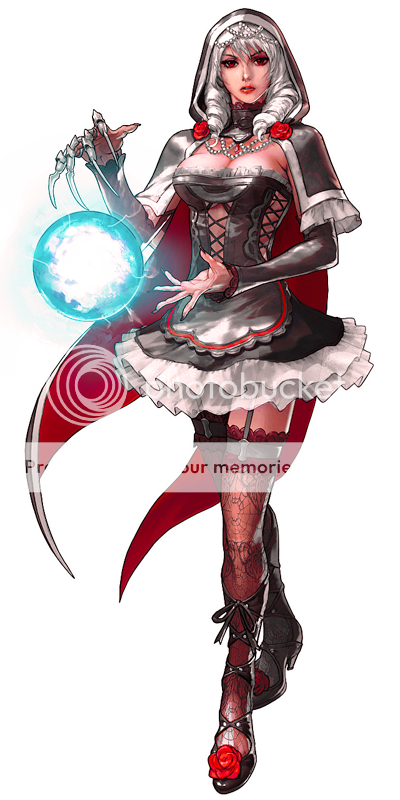
If I may add my 2 cents, another fun way to recolor is making use of the Hue/Saturation and Selective color Filters. Sometimes I'll paint over the image using layers but I find it quicker and cleaner using the former method. Here's a quick recolor I did of Amy.... ahem, I mean Viola!

ME0001449620_2.png


Nothing fancy, just a simple red, black, and white color scheme. I did take some liberties with her orb though. I think it looks more magical and infused with power.
 
Jeez, getting a full time job back in november seems to have absorbed most of my time/drive to photoshop. Still though, I'm starting a new project, and I'll work on it when I can.

I plan on designing my own Yugioh playmat just for the fun of it.

I started with a Graceful Charity edit, and here it is. Its rough, very rough, but that's fine for now.

gc.jpg
 
Jeez, getting a full time job back in november seems to have absorbed most of my time/drive to photoshop. Still though, I'm starting a new project, and I'll work on it when I can.

I plan on designing my own Yugioh playmat just for the fun of it.

I started with a Graceful Charity edit, and here it is. Its rough, very rough, but that's fine for now.

View attachment 10104
Yeah man, quiet time is definitely a luxury as you get older, it has to be achieved like a round in a match. Looks good. Still looks a bit rough around the edges but I like it. It looks similar to the art style of Vampire Hunter D (the one from the 80's)
 
wow. i'm amazed. i enjoy looking at the art work i do. fun stuff. to the guy who cut up the raph, i suggest working on the alpha layer to tweak that up.. well i don't know you did to cut out the image but i would have suggested using a mask or creating an alpha layer to work out the edges. meh.. brightness contrast color correcting hue saturation lighting folks, fun stuff! would be nice to see you paint on the image a little bit to tweak some areas where things get a little too saturated but other than that,

plus 1.

wow. i haven't seen anybody's art from here in a long while. quite refreshing actually. i like! keep up the good work!
 
Well, I was going to post edit by edit, but I didn't.

So here's the playmat. All that's left is the background.


playmat.jpg


What do you guys think?
 
Back