Quinion's Customs House

brucege pretty much making all the points you could want and more there, I literally just wanted to add that I love how the pattern on the belt completely changes it's shape at the back, as though it's made of connected squares rather than a huge solid wrap of leather. Just a little detail I wanted to comment on.
Oh shit, good call! I couldn't tell cuz I don't have that belt. Btw I've edited my previous post with some notes about her face.
 
brucege pretty much making all the points you could want and more there, I literally just wanted to add that I love how the pattern on the belt completely changes it's shape at the back, as though it's made of connected squares rather than a huge solid wrap of leather. Just a little detail I wanted to comment on.

@brucege, @Le_Bello, first off thanks. As far as Sophi goes, the pattern on the belt had the immediate effect of breaking up the solid leather, but I also mimics the pattern on the Valkyrie arms. And then there's the face.... I think the default face is closer to Cassandra, so to me using that one would make her look like Cass in a Sophitia outifit. The closest face is 1 I think (same face that @Gatsu and @EnduringSoul used), but that face looks so young, I find it kind of weird. Oh well, I suppose for true authenticity, I could make her an Eysium 3P. At thi spoint I'm messing around with some face paints and stickers to see if I can change Face 1 just enough...if I get it right I'll post the updated version.

Going back to the Tengu Yoshi (and to a lesser extent others above), instead of using primarily color to link differnt parts of the whole thing together, I tried to use shapes, though without necessarily matching the colors. For Tengu Yoshi, it's the similarity of the structure of the shoulders with the pattern on the pants; the sun on the vest ties the shoulders in with the color, but the swirls coming off the sun were intended to tie into the swirls in the waist cloth (too much contrast in that pattern though); then there is the flag symbol, wrist guard and eye sticker, all basically ovate, hollow black shapes with jagged points on a dirty white/gray background.

There are a couple more as well, but you get the idea. The idea was to see if an admittedly patchwork design could become a cohesive whole through visual cues that you wouldn't necessarily pick out at first glance.

That and make him look like a Tengu.

PS Thanks for the reviews @brucege
 
Last edited:
New stuff

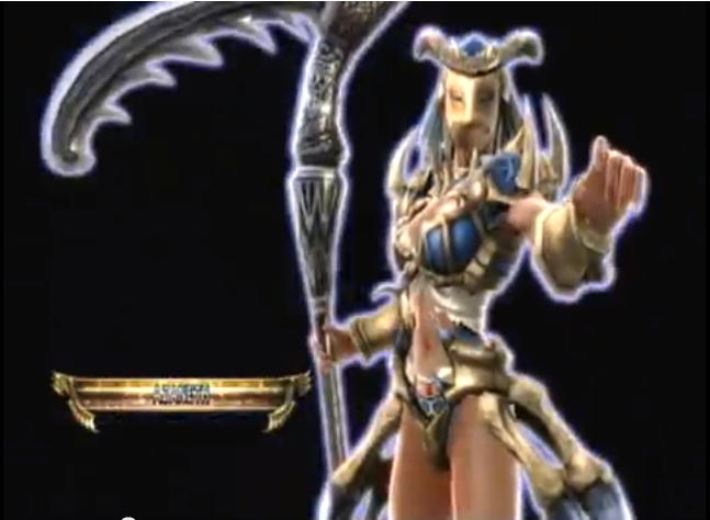
The Egyptians didn't actually have any kind of owl-headed deity, so this one is based on nothing real. Maybe she worships Olcadan?

Striga
Striga.png


Penelope
Penelope.png


and some tweaks to an old CAS, @Gatsu's highland swordsman, Dougall.
DougallREV.png


The earlier version looked a little plain, plus there were some details from the original design that I didn't really capture the first time. Plus that duffel bag on the belt just really wasn't getting it done anymore. The result feels a lot truer to the original illustration even though it's still not an exact recreation.
 
That Striga is refreshingly cool!

She does have the benefit of looking different, and I don't think I've seen anyone attempt "Egyptian-like owl-armor woman" before........though most would agree there is a good (and obvious) reason for that. These days, trying too hard to do something "new" is a one-way ticket to derpville, but I'll leave it to others to let me know whether I've reached that destination.

She was one of those things where I was trying some parts I hadn't used much before; basically throwing shit against the wall to see what would stick..........I kinda like the end result; she looks way better in game than in these pics. The colors came out overbright, but that's sometime the inevitable result when you get several inalterable and incompatible colors. Still, looked better on my TV.

Well it certainly isn't in Derpville territory. More like Cooltown.

See, it shows that there're a lot of different methods you can use to create something, be it having a pre-plan or just throwing parts around. I love her a lot :D
 
Well it certainly isn't in Derpville territory. More like Cooltown.

See, it shows that there're a lot of different methods you can use to create something, be it having a pre-plan or just throwing parts around. I love her a lot :D

I had an idea where the helmet was going, and getting what I liked there kind of directed the rest, like balance the mass of that big heavy helmet with big shoulders, wider (armored) legs.

Funny part is, change the details (colors, textures, etc) , she has almost an identical silhouette to Elysium's 2P. Not by design (at least not consciously), but no doubt helps give her that " looks right" kind of feeling since in a lot of ways its just a fresh/new veneer on an established/ familiar design.
 
that's a pretty good approach to take, and potentially one of the best as you have a sort of reference for the rest of the design, so it's certainly a more coherent way of doing things.

I never noticed that until you pointed it out, but she really does. It guess that does help her 'fit', but I'd attribute that more to the toned and balanced palette and texturing, and that fusion of real world and fantasy.
 
Funny you'd say that, because I did a very similar character waaaaaay back when the game had just come out and we had no DLC.

Interesting. Definitely similar helmet...is there a chance I've seen it before? Is it posted in one of the threads on this forum?

Like I said, I don't think I've seen it attempted before, and I'm cautious in that regard, because at this point I would never say "has not been attempted before" .......that's a boast that has a 99.99999% chance of being proven wrong in about 30 seconds.

But more on point, since being around here for the last year or so, I'm very curious where ideas and inspiration come from, especially my own. I understand my own process.......I work on it til I think it's "right", and if not an intentional recreation, it's as much a feeling as anything else. And with the owl-woman, there's definitely a real similarity with Elysium's 2P, though I know distinctly that it was never intended consciously.

Did I see yours and I just don't remember it? I wouldn't exclude the possibility .....virtually that exact thing happened with one of @brucege ' s CAS ( I even liked it and commented as much when I first saw it), then I turned out one that was a dead ringer for his; not a copy, but overall theme and color scheme were the same. Are some of the CAS I do the result of seeing something and making a subconscious note regarding a particular combination of parts or a look that I like? Am I working from dimly remembered templates?
 
Well, the majority of my characters are from a horrible fanfic I made when I was 12 (of which I'm horribly ashamed, but posted anyways for the lulz), so there's that... I did post them, and you did see them (there's a like from you in one of my posts).

As for how I came up with that particular design, she's supposed to be an amalgamation of all the different Egyptian deities, a premise much more evident back in SCIV when this helmet was compatible with the ninja fox mask. So it's really more of a Horus/Ra inspiration than an owl theme... again, the fox mask complemented this really well because it looked like a reference to Anubis, so the Ra helmet plus the Anubis mask and the color scheme all reinforced the Egyptian motif, which is not as readily apparent in the SCV version. Stupid conflicting equipment :(

1bea406e453dbb8759c8ad24dd2c3e88.png


As for making characters similar to someone else's, it happens to me all the time. I once made a character that looked exactly like one of Gatsu's but with a different color scheme, and I didn't even realize until after I uploaded it. Photographic memory I guess.
 
Yeah, that stuff happens all the time. Somewhere in the way back of your head, you store some really cool idea, forget about it for like 3 years, and then spontaneously recall it while snarfing down a bowl of cereal, possibly choking yourself in the process. And the same holds true for CaS!

As far as the two avian CaS's go, the look and feel are totally different. Quinion's Striga looks stately/ceremonious with its clean lines and ornate carvings while Norik's Horus/Ra amalgamation looks cruel/savage with all its spikes and bones. The logic behind the two CaS's helmets is inevitable, really. You start with an Egyptian helmet, and then you make it otherworldly/godly/too-badass-for-eyesight by hiding the face. Simplest way? Feathers of strength.

I like how Quinion added those Crescent moons to emulate the owl's lower beak. Cool tip for making two separate but identical objects perfect mirror images of one another: conserving RotV while reversing RotH and Angle.
 
I like how Quinion added those Crescent moons to emulate the owl's lower beak. Cool tip for making two separate but identical objects perfect mirror images of one another: conserving RotV while reversing RotH and Angle.
Love to take the credit for wrestling two of those crescents (what a pain in the ass that crescent is sometimes) into that lower "beak", but just long horns with dimensions manipulated to give that same sweeping curve (though with only half the effort).

As for these next two, the first has obvious precursors, including @Gatsu's Trishna and @Matty82 's Padmajal, plus several others, as this is a case where the clothing combination (Elysium top and the waist wrap) is really the way to go for an authentic look; I think I added enough of my own to make her stand on her own.
Manasa
Manasa.png


An earlier iteration had Xiba's style, because I liked the acrobatic-style moveset, but ultimately I felt it didn't fit the character. I liked the idea of Tira's ring blade as an oversized chakram as culturally appropriate, and the parts I settled on gave her something like a thematic duality, which fit the cultural origin...ultimately the personality that came with the moveset seemed right. Now if only we could convince PS to give us a dual chakram-wielding fighter for the next SC.

Couple of oddball items..... the stickers are only on her left arm; they mirror onto the right arm but cut off coincidentally where i put the snake horn armband, and then they disappear in game (I guess both are due to the Elysium pieces) until armor break, when they're only on the left arm, where they were placed.

Next up, a redux of @Gatsu's Viking warrior, Yrsa the rendition of whom appeared on the first page of my thread. Felt she could use a freshening up (like Dougall above), using techniques I've learned since first coming around here, though this time probably not any closer to original illustration....... just a better CAS than my first attempt.
Yrsa.png
 
Great job, only thing i may reconsider if i was you is the metal eye protection color, i think a darker gray-with-pattern iron colour (trying to imitate helmet "stripes") may give you better fusion result and from far make it contrast more with skin colour

Said that, again, very good job
 
Great job, only thing i may reconsider if i was you is the metal eye protection color, i think a darker gray-with-pattern iron colour (trying to imitate helmet "stripes") may give you better fusion result and from far make it contrast more with skin colour

Said that, again, very good job

I liked the eye protectors as a nice little authentic touch, and tried a couple of different patterns to really make it blend with the gray helmet details.

Looked very good, except this is one of those items that retains a default color when applying a pattern. Neutral tones (white/gray/black) end up blue-green, and only a high contrast color as the base in the pattern comes out as intended.

Sure, I could do the color all trick , but as a a last little detail to a finished CAS........ehh, too lazy.

I appreciate the thumbs up, but I take very little credit ...... a good CAS because of a good Calibur design as the base. I just added a few details.
 
i really enjoyed the female pirate. there is a ton of details on her which i liked, but im not sold on the color scheme. other then that i thought it was very good.
 
i really enjoyed the female pirate. there is a ton of details on her which i liked, but im not sold on the color scheme. other then that i thought it was very good.

Glad you like her. She's kind of based on an SCIV CAS I looked at recently, and as always an experiment, and with an eye towards avoiding replication and making her more individualized.

Eh, to me color scheme is just a color scheme.....I would never contradict anyone who faulted me for my color sense, and specific color choices are almost always my lowest priority. I don't remember how many times I picked a color scheme based on the weapon choice.

I would offer this to think about, though........she did catch your eye. Keep in mind the color scheme helps bring out those details you did like, even if the specific colors were not to your liking...take out some of the contrast and those key details can fade into the background.

Feel free to make your own version and try some things out........she's an easy copy, nothing particular about her that is difficult to replicate. I'd be curious to see a color edit based on someone else's take.
 
Eh, to me color scheme is jusrt a color scheme.....I would never contradict anyone who faulted me for my color sense, and specific color choices are almost always my lowest priority.
Very true. A trained eye can make ANY color combination chic, even weird ones like green-yellow or purple-orange. The big challenge isn't coordination; it's characterization. The subdued color palette and butch face clearly show a storm-weathered, pragmatic woman making it big in the manly pursuit of pirating. I do admit that a little color contrast would go a long way in accentuating the lil' details (that really make this CaS shine) like the flower, gun, belts, and boot extensions. Maybe change the hair color so that it doesn't blend into the coat. However, I am aware that I'm heavily biased towards to anime/pop, so I won't be surprised if my opinions lie in the minority.

Manasa's very pretty. Good color contrast between the white, red, and blue. I'd consider having more white to brighten up the design. Nice use of the additional ribbon on the arm. Also nice how you fashioned a sleeve out of the snake horns.

Nice take on Yrsa. That wing sticker really goes well with that cowgirl vest. I'd lighten up the skin and darken the fur to increase the contrast, change the hair color to red (shifting color away from yellow hue of outfit), and saturate the blues a bit more.
 
Back