SCVI Mitsurugi Edits

My Mitsurugi costumes

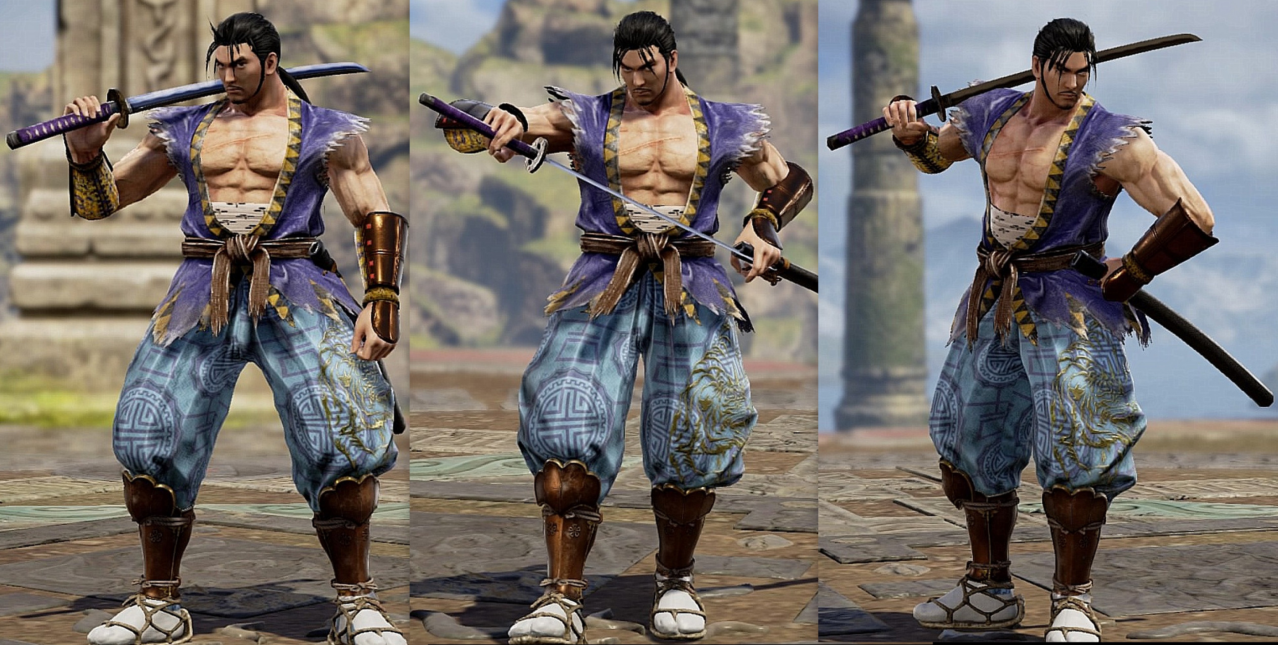
2p
mitsurugi 2p.jpg

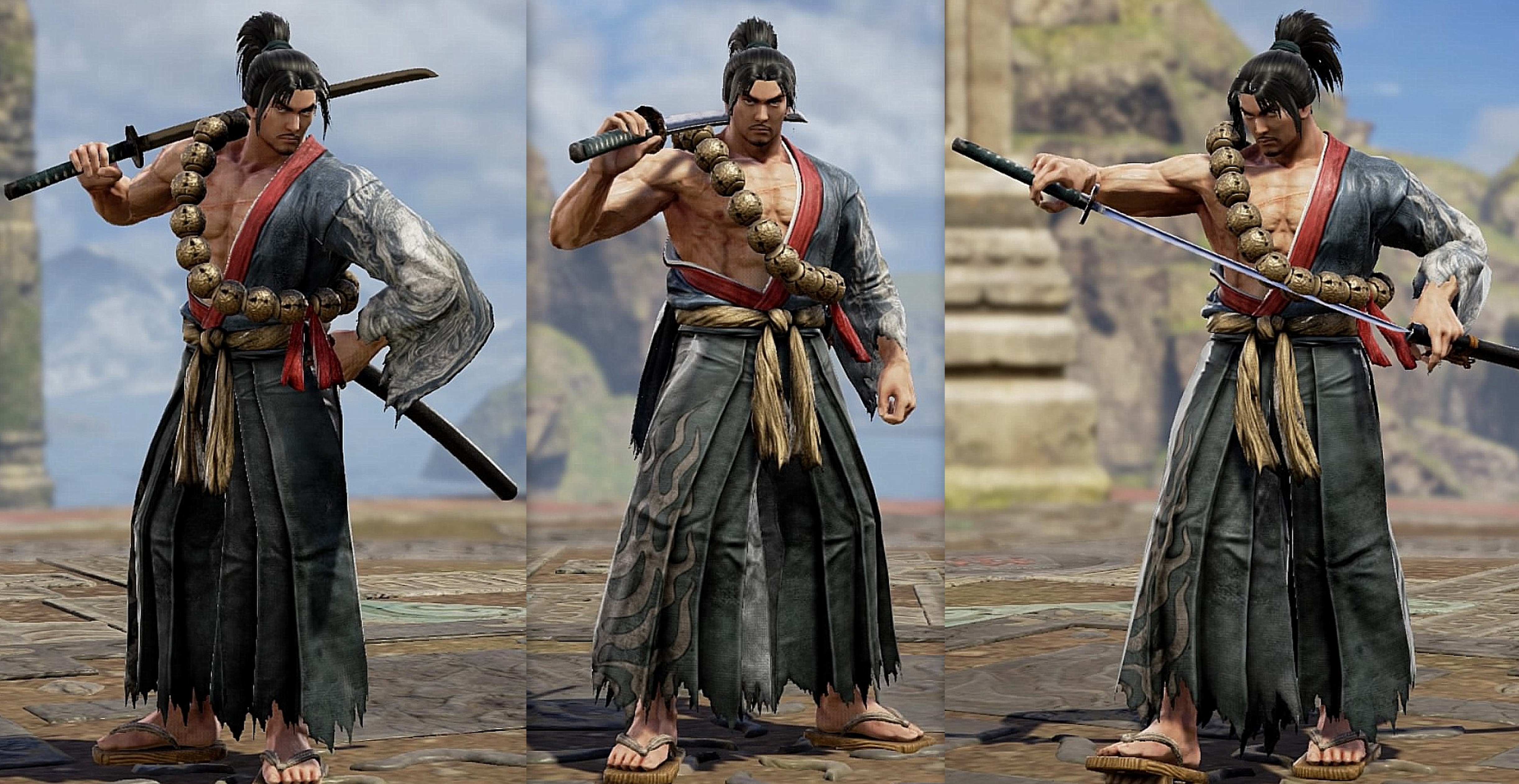
3p
mitsurugi 3p.jpg

4p
mitsurugi 3p.jpg


You can watch my full SCVI CaS thread here: https://8wayrun.com/threads/my-soulcalibur-vi-creations-gallery-the-complete-edition.21259/
 
Last edited:
I've seen a few takes on this costume, but figured mine is different enough to be worth posting

Is that one of the concept art designs, or a SCIII XP I am forgetting? Oh, nevermind, it says in the spoiler tag, duh!

Either way, I like it. The only issue (and this isn't anything resulting from your approach, but rather just a quirk of the editor) is how different the color depth of those blues look on those different equipment (wardrobe) pieces. Why opacity, intensity, saturation and sheen can't be separate settings so that we still get texture variety but can also get colors to match more consistently when necessary, I will never understand. I'm not the first to say it, but I hope we get a major revision (rather than just an iterative marginal variation) of the editor for SCVII--it's time.

But that whingy side discussion done, I really do like the design even with that one unavoidable issue. Actually, I quite like the color scheme in particular.


And I can see now, after re familiarizing myself with that design, that the blues shouldn't be a close match anyway. :) Mind you, I still think that's a flaw in the editor though.
 
Last edited:
Is that one of the concept art designs, or a SCIII XP I am forgetting? Oh, nevermind, it says in the spoiler tag, duh!

Either way, I like it. The only issue (and this isn't anything resulting from your approach, but rather just a quirk of the editor) is how different the color depth of those blues look on those different equipment (wardrobe) pieces. Why opacity, intensity, saturation and sheen can't be separate settings so that we still get texture variety but can also get colors to match more consistently when necessary, I will never understand. I'm not the first to say it, but I hope we get a major revision (rather than just an iterative marginal variation) of the editor for SCVII--it's time.

But that whingy side discussion done, I really do like the design even with that one unavoidable issue. Actually, I quite like the color scheme in particular.


And I can see now, after re familiarizing myself with that design, that the blues shouldn't be a close match anyway. :) Mind you, I still think that's a flaw in the editor though.
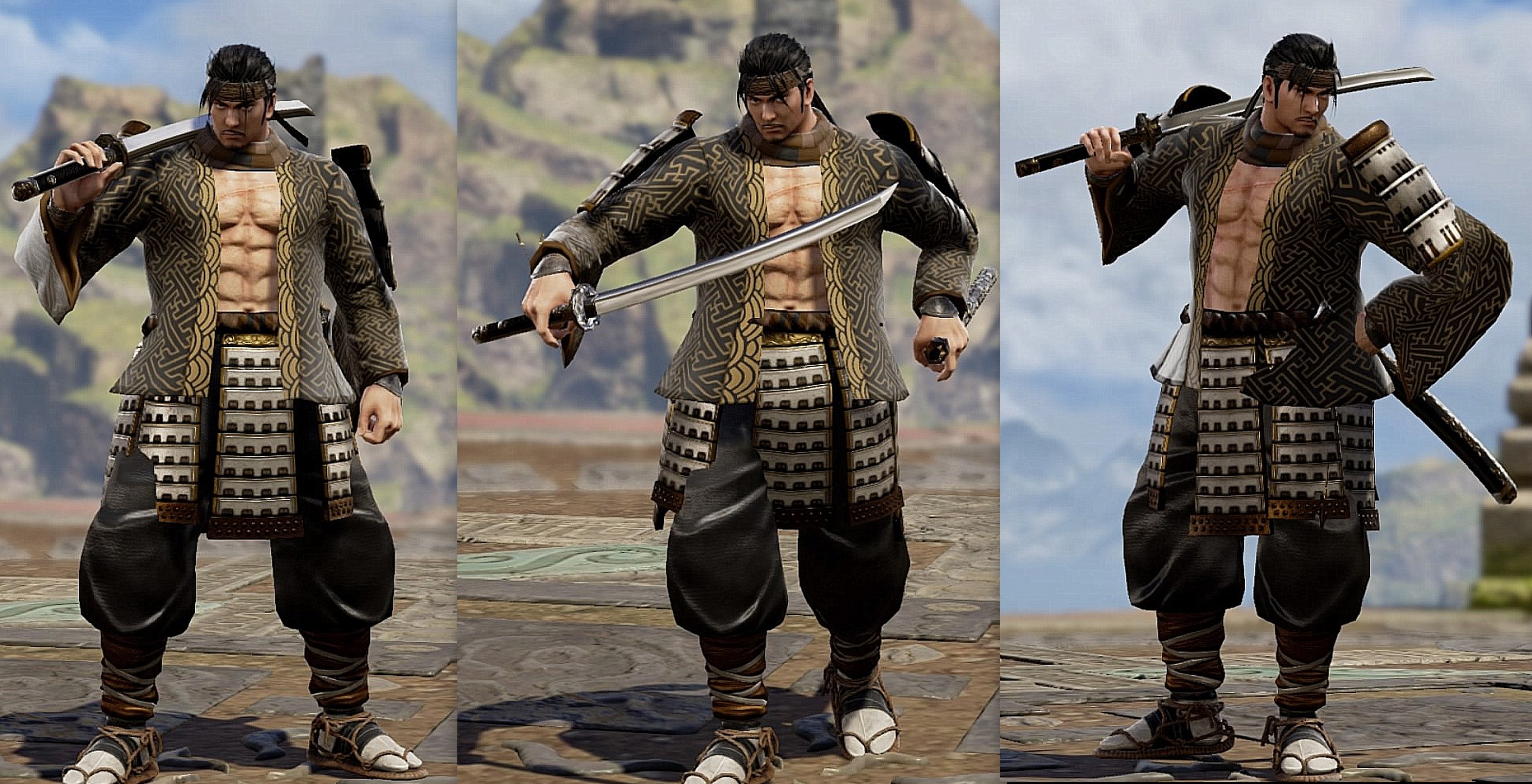
I agree, some pieces of clothing could go well together if it weren't for difference in material.
And yeah, the blues are supposed to be different, I found them a bit tricky to make look good together and I didn't want to spend 15 hours tediously messing with the three values of the pattern.
I also attempted at some point to recreate the top he wears underneath with a tanktop and stickers but couldn't manage to make something that didn't look cheap so I settled with the bandages.
 
Back