In a world...where SpecEq combos and bump mapping dominate our CaS....one man did not give a fuck.
That would be
@HolyCarp with his Rastaroth. He looks exactly as he's supposed to: a co-op weed farmer. I mean, look at him. He's too stoned to bother putting on his goddamn shoes. He does have the forethought to roll himself that thick-ass blunt before heading out to harvest that fresh batch of sticky icky though. That's what I call priorities. Totally in character too. God knows the poor golem needs an occasional break from all that crushing and mangling. Probably why his eyes are always cashed too. Anyways, Rastaroth for number one.
@Quinion
Warthog Yoshi: Solid design. That helmet is really cleverly made. Appropriately earth-toned palette. I like how the spikes on the shoulder kinda follow through with the tusk/warthog motif. I see that you carried the unchangeable blue color on the shoulder pads all the way down to the feet too. Great detailing without relying on DLC. The epitome of CaS mastery. My choice for second. I give first to HC's Rastaroth for two reasons. The first is that it actually got me laughing, one of only three or four CaS's in all my time in 8WR. The second is that it's really hard to make a convincing modern CaS like that in SCV.
Taiga Mitsu: Creative use of the raccoon tails to extend the tiger pattern up the torso. It's a great 3P, but I have two problems with it. The first is that I still see Xiba everytime I look at that shirt. The second is the pants. The geometric pattern, the flames, and the calligraphy are tacky. They remind me of this guy in high school who always wore silk shirts like this:
https://encrypted-tbn0.gstatic.com/...v25wnHqdV7U3fjxe8sLinE01gKklFOTb4oOZUkOQur7dh
@Pocky-Yoshi
Battle Leixia: Basics at their best. Sharp color matching. I think I reviewed this one already. Great job though.
Fencer Yoshi: I really like the angle you're taking this, but the connection to fencing isn't clear enough unless you make the uniform all white. I'd definitely give that a try.
Mummymitsu: Steampunk cyborg/mummy. Not something you see everyday. I
like it. Interesting bracelet.
Natsu 3P: I can't tell where you're going with this one. Those space-age shoulder pads really confuse me. Are you going for cyberpunk ninja or something?
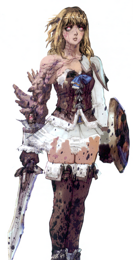
Color Block Hilde: That color blocked pareo is totally chic. Love that color contrast. A ton of detail up top too, maybe a bit too much. But great job bump mapping the neck and torso. My favorite of this group. Very promising.
Kung Fu Farmer Mitsu: Interesting change of perspective for Mitsu. Cool belt buckle. Nice splash of color. Not sure about the flame stickers, but I see that you're adding cohesion to the design.
Hilde-hime: I get the warrior princess vibe you're going for, but that big, billowing skirt just distorts the silhouette too much. Perhaps go for a more Valkyrie Profile kinda look? And is that a reference to Rob Stark? He's got a lot in common with Hilde. Fighting for their families and shit. Naive. Moral to a fault. Wolf theme. Yeah, I can see Hilde on the wrong side of an SCV red wedding.
@Harrawesome:
Captain Raph: Hmm...it's a great foundation. Interesting pirate hate you made. Good job merging the school jacket with the waist cloth into a trenchcoat. I'd recommend filling in that white border with some kind of snazzy pattern for some bling factor. I'd replace those pants with something with more detail. You might opt for the cowboy pants which includes an extra belt. Or you might go for the legit 1700s look and swap in some knickers and stockings with buckle shoes. I see you're getting the hang of hair extensions too. Subtle, but effective.
Pirate Mitsu: Very fun. This samurai pirate mash up is very promising. Try adding a red and gold border along the bottom of those pants using two zipper stickers (position reset and axis to eliminate stretch effect). This will help bring some detail to the lower half. The red and white palette on the pirate/samurai hybrid looks a bit too Gundam. Definitely cut down on that white. With a few tweaks, this one could be really great.
Tekken Yoshi: This is where red and white look great together. You wanted the Gundam look, and you nailed it. Skillful color matching. Very well done, especially the waist armor.
Arabstaroth: Veeery nice. That color palette just screams 1001 Nights. Great sticker/pattern layering. All I'd do is bling out that hat with a goddess feather brooch + jewel or something like that. I could totally see this guy serenading Kim Kardashian as Jasmine on a magic carpet. In terms of character design, he'd be my number two, but Quinion's technique is OP.
Cervy and Sieg 3P's: Nice! I've reviewed these previously.
Edit: this is Rastaroth's BGM. Or really just at 2:39.


 . That can't end well.