KostasGR
[14] Master
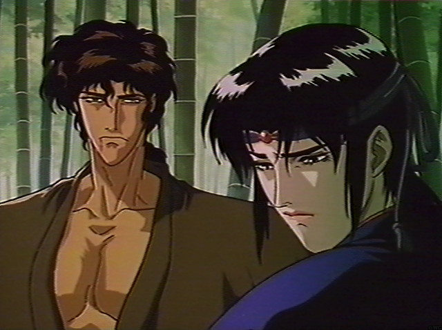
The way you used the Libra of Soul characters with the SoulCalibur minor characters is so cool my friend Gatsu! I really enjoyed that you bring Frederick back as a zombie version, everyone are great again!
Follow along with the video below to see how to install our site as a web app on your home screen.
Note: This feature may not be available in some browsers.
It depends on how major you feel the Libra of Soul story is, I suppose. I agree that they don't have the same development as characters from Soul Chronicle, but even so, they are the eyes and ears of the Aval Organization after the passing of Orzal and Curtis, so they have the legacy to uphold, and I imagine that we'll see them again come SoulCalibur VII. I'm actually a little shocked that they weren't by Grøh's side during Hilde's story.- For Dion and Natalie i'm not sure, tbh before read you mention them i did not even considered their inclusion.
On one side i feel they're veryvery marginal and not charismatic, on the other they're so conceptually weak that they leave lot of room for redesign.
I may consider, but i feel do 2 more with Aval's mandatory points risk to become truly redundant (at first i was'nt even sure about add Curtis).
Maybe one of them, as we speak i have an half idea on how Dion can work
Maybe it is just the stills making her seem more Xianghua-esque than she really is, just... I'd have to see her in action to really approve, I think.- About Lingyu i was looking for a unexpected (->western) piece that could pass as chinese and i just loved these gloves wich required a sleveless tunic.
Overall i like her and feel the height combined with Raph stance give a pretty distinctive look next to Xianghua... i picked on purpose shots that got her in plastic/dynamic pose to have some kung fu vibe, but reality is Raph's animations set them world aparts.
About weapon, i picked the one that gone the most away from a classical european shape and for that i did'nt liked their pick, the Royal Rpier had too much western look on the guard/hilt section. Though the Epee with the right coloration could have sold a more exotic origin, all while looking a more light sword
I did see these things, but I also didn't realize you'd gone so deep with it. It really works well! More creativity than Namco, to be sure.- General consideration on Frederick as i feel is the less immediate concept
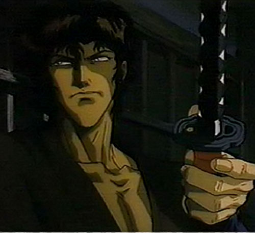
The point here was portrait him as a sort of symbolic nightmare/vision that haunt Siegfried's dreams, so not only he have the i'msofuckingdead zombie look, but also carry the family gravestone to add symbolism to the image.
It make clear to Sieg the accusation on him every second Frederick is on screen, almost like incarnate the murder/sin itself rather than the father
I liked to use the eagle as a decorative statue on the tombstone, making up it being some sort of symbol of the Schtauffen family... linking also to Schwarzwind phoenix emblem
His reference look is obviously SC1 ending one (rather than SC4 cas), but it also reference his canon death: in SC1 Sieg stab him on the belly, while on reality canon wise Sieg killed him by decapitation... for that reason i gave him an huge scar that goes around the neck (not so visible in pics) as if the head has been reattached.
Fun story, an head-less Frederick has been considered by namco as a char back to SC1... i tried to rep that too while doing mine
Oh, I definitely noticed this, don't worry!- Not much visible, but Kong have a bit on red on cheeks, simulating he drink a lot and he's often a little drunk lol
You wanna take a bet on that? I'm pretty certain these two are destined to go the way of most other tertiary Soulcalibur characters and never be referenced again--and especially not as active elements of the ongoing story. Personally, I think that's for the best in this instance--there's been a lot of lazy, goofy storytelling in this franchise over the years, but the Aval Organization takes the cake for anachronistic, generic nonsense. I just can't imagine anybody aside from Groh and Azwel are likely to make any kind of concrete material appearance moving forward and I think that's for the best.and I imagine that we'll see them again come SoulCalibur VII.
More creativity than Namco, to be sure.
The way you used the Libra of Soul characters with the SoulCalibur minor characters is so cool my friend Gatsu!
To be fairas Gatsu ably demonstrates here, even a non-professional can do better than what we got in those modes, let alone what we might expect from one of Namco's character designers with a much richer set of tools.
Very good eye!Question regarding your Shugen Kokonoe creation. Did you give him a one-sleeve top because iaijutsu practitioners tend to remove the sleeve of their dominant sword hand to maximize the speed of their draw?
Not to be blasphemic, but Shugen made me wonder why you opted for Kilik's hair style and hair colour instead of his concept art light brown/dark blonde and a longer or shorter haircut? At first glance I thought "well, that's Kilik", even perpetuated by his outfit.Very good eye!
For same reason i also gave him a leather fingerless glove on same hand, for a more firm grip
Now i'm at work, later today i may add some design notes... Shugen has been the most interessing concept to do indeed
Not to be blasphemic, but Shugen made me wonder why you opted for Kilik's hair style and hair colour instead of his concept art light brown/dark blonde and a longer or shorter haircut?
Thanks very much for the insight!About Shugen
- i designed him to fit Setsuka, considering her likely shaped up her "japanese look" living with him
For that reason i gave him some traits she got: elegant even to the point of being flamboyant, but serious badass at same time
I liked give him lot of cloth elements that flap while he move, another similarity with Setsuka
- i tried to think somebody who can fit well her Jyurakudai Villa stage, aside the overall costume style, also the pink flowers on him work as a link
- i liked them give him azure as main color, it counterpart well Setsuka's female pink. Keept it
- i liked that one sketch in particular gave him very very lean look, it work well on the idea of him being more a speed/technical guy next to Mitsu's stocky built power, i keept that
The clouds on his kimono aside being decorative to keep design busy are also a symbol of his style, if the dude had an "element" it will be air/wind... wich made me like Haohmaru's "shoryukens" or his tornados
- As @bagazstormy noticed i gone for single-sleeve to keep the arm free like Setsuka before him, as said also the glove for better grip fit same logic
- Mitsurugi style could have fit specially on relic stance, but considering the dude destiny is to go face Mitsu and die, i wanted to differentiate the two giving him another katana style.
I liked Haohmaru's huge sword as next to Mitsu it create a bit a Musashi(Mitsu) vs Kojiro(Shugen) thing
Plus Haohmaru alternate super where he cut throught the opponent and the screen turns black and white, feels perfect as it remind me Setsuka's CF in SC4
- while at it i tried to give him some Jubei (ninja Scroll) vibe
@weshookhands
It has been a development step by step eliminating options
Hair color: i accept asian characters getting brown to reddish-brown as alt color (to black) because it give variety to design, but that's mostly where i draw the line a bit
Random blond asians (i know Maxi 2P, but 1P is what matter) or on general bunch of over anime/edgy stuff like Groh, Zwei, Natsu, Luna etc are part of what i consider the weak/mediocre side of SC design
I can do characters with "anime" hair colour, but as general rule i need a reason to pick it
To be clear, i don't dislike anime, for a fighting game i infinitely prefer japanese character design over western. I just like when anime is backed by country/cultural roots a bit
If you think about it, Shugen being random blond for no reason ruin the great design detail of Setsuka being a blond (due european blood) girl that color her hair black to fit in japanese society.
Or ever Japan, Arthur being easy foreign target due to his blond hair
Or going Samurai Shodown, Galford
These are doing it right to me
So going between brown or black, brown was closer to the source and i liked it because it reminded me the above mentioned Jubei. I did even a bit lighter considering the SC source, but not by much
About haircut you are right to some extent, there were closer options
Also here we go by elimination
Short hair or long hair, i quickly eliminated the short hair option: it give him a more simple figure and that does'nt end up well with a CaS
Long hair then. Dude at first got one of Azwel hair and after that Siegfried's. Azwel one did'nt gave the right vibes, Siegfred one looked kinda good on static standing figure, but looked problematic ingame doing moves
At the end Kilik's one gave me the right vibe, and it's not much shorter than in the sketch... not clear in the pics i did but i picked the long version, the one with long loose hair on the back that reach/surpass down shoulders level
Well, all that entire post about Shugen alone i guess explain why i don't want do design notes for all LOL
There is. Someone made a whole software (Vodkalibur) that can alter CaS like bypass equipment clashes, use colors that are not normally usable using the in-game's color pallete, and mishmash different parts of different races, among other things.I bet there's a mod for that on PC...
It sucks that I don't have PC, I'd probably have a lot more fun in CAS with something like that. Equipment clashes are really stupid considering some items that are compatible clip anyways.....There is. Someone made a whole software (Vodkalibur) that can alter CaS like bypass equipment clashes, use colors that are not normally usable using the in-game's color pallete, and mishmash different parts of different races, among other things.

